Pop Art Food: Colour and Technique
Year 7-8 Visual Arts Lesson 9: Painting Techniques and Colour Theory Pop Art Food Odyssey Unit
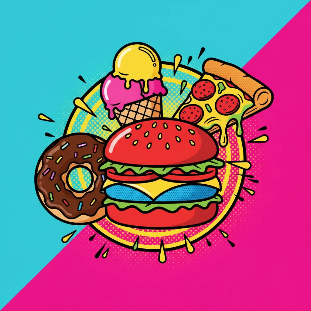
What is Pop Art?
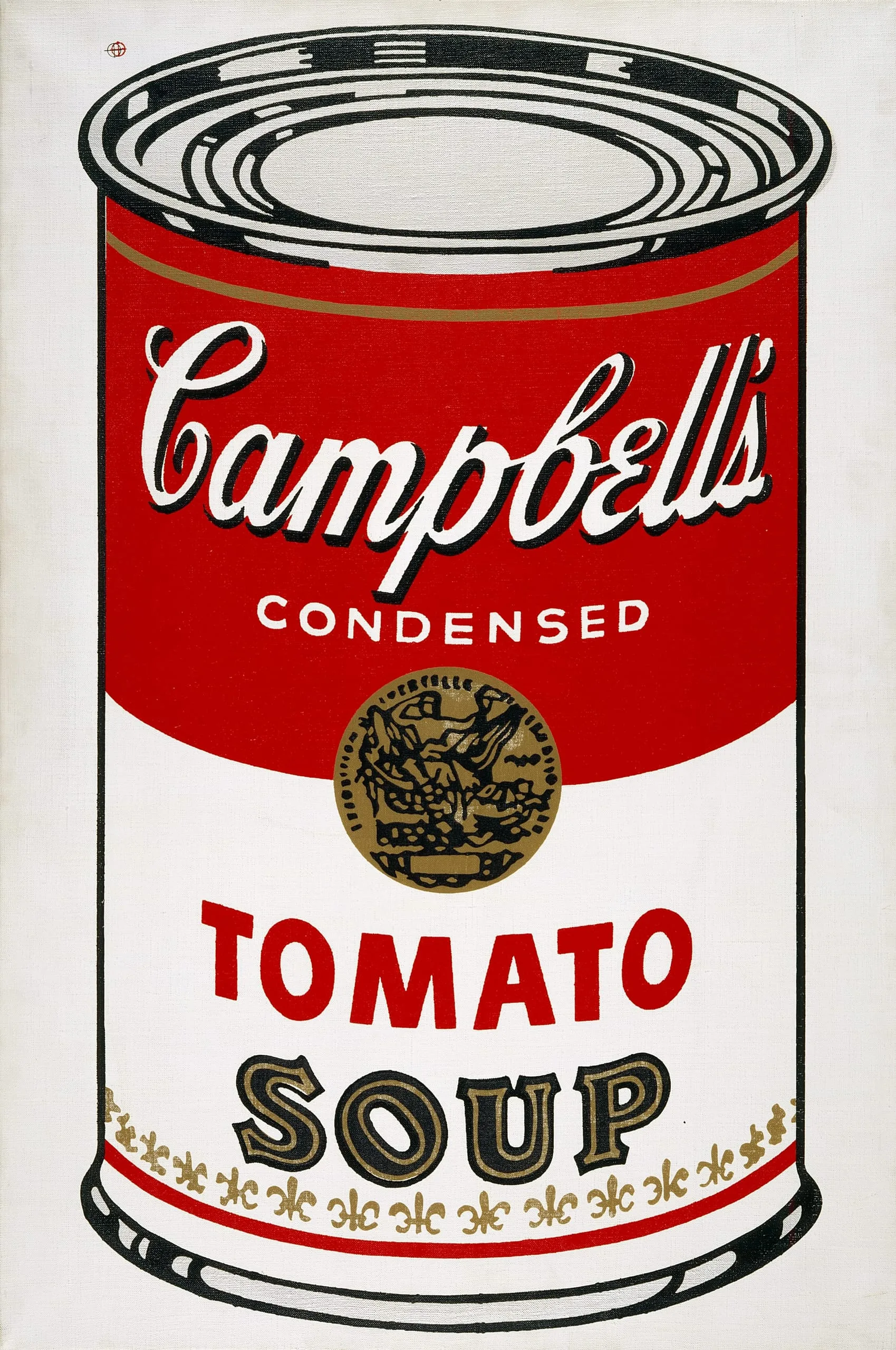
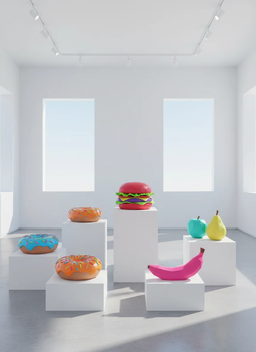
Art movement from the 1950s-60s Used everyday objects like food as subjects Bold, bright colours and simple shapes Made art accessible to everyone Famous artists: Andy Warhol, Roy Lichtenstein
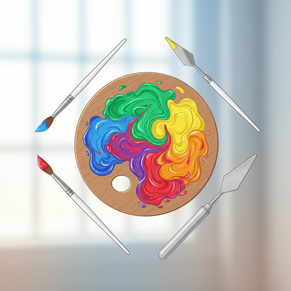
Colour Theory Basics
Primary colours: Red, Blue, Yellow Secondary colours: Orange, Green, Purple Complementary colours: Opposites on colour wheel Analogous colours: Next to each other Pop Art uses bold, saturated colours
Colour Mixing Challenge
Mix secondary colours from primaries Create complementary colour pairs Test different colour combinations Record your favourite Pop Art palette
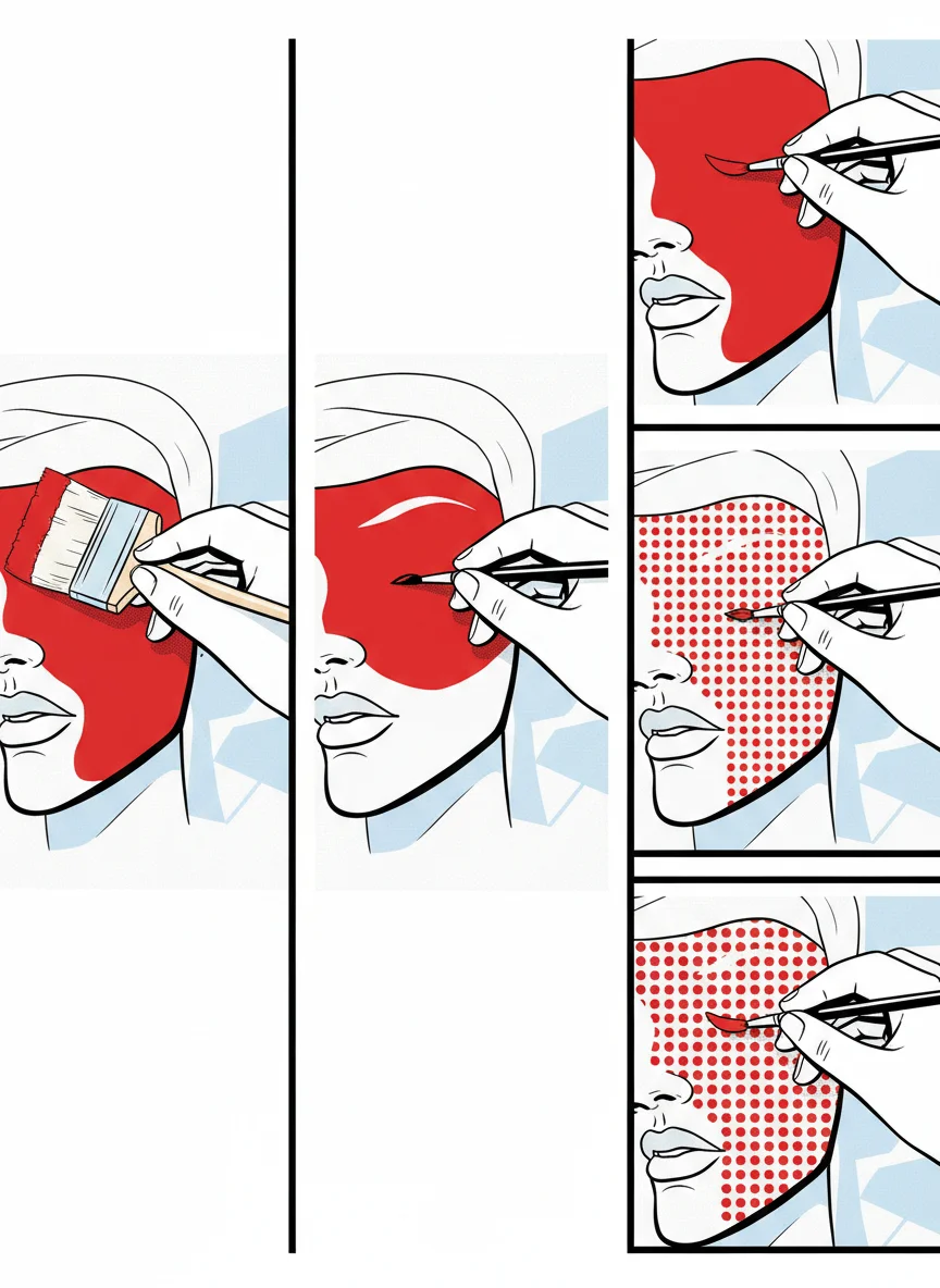
Pop Art Painting Techniques
Flat colour application - no gradients Bold black outlines for definition Ben-Day dots for texture and shading Repetitive patterns and motifs High contrast and bright colours
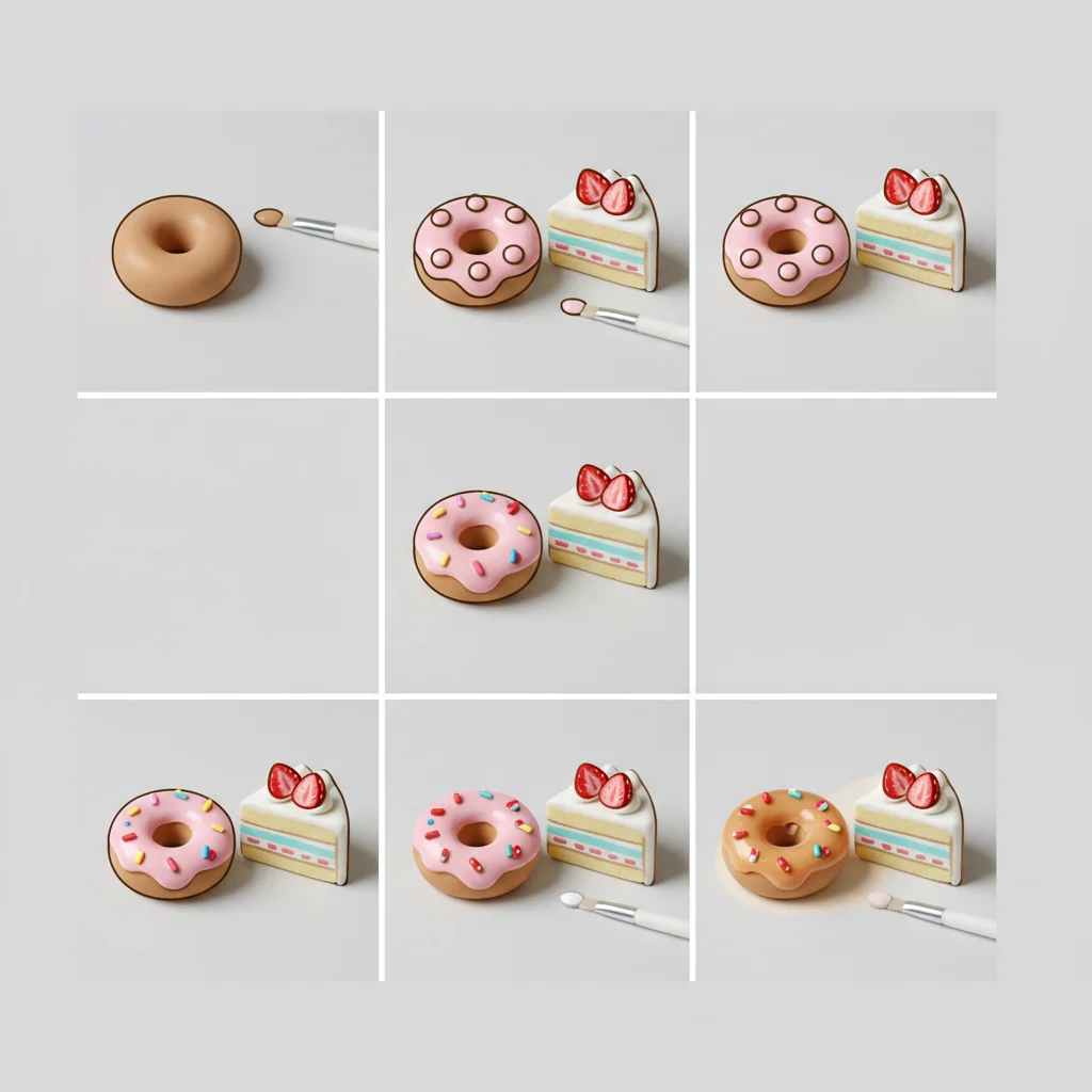
Painting Process Steps
{"left":"Plan your colour scheme\nApply base colours first\nAdd outlines and details","right":"Include Pop Art patterns\nLet each layer dry\nBuild up visual impact"}
Paint Your Pop Art Food Model
Choose your colour scheme Start with base colours Add Pop Art details and patterns Use bold, confident brushstrokes Think about the message you want to communicate
Reflection Questions
How do your colour choices communicate meaning? Which painting techniques work best for your food model? How does your work connect to Pop Art style? What would you do differently next time?
Next Steps and Assessment
Complete final details next lesson Prepare for unit showcase Assessment focuses on technique and colour use Document your artistic process Celebrate your Pop Art creations!
1 more slide available after you open the deck.
Download all 10 slides