It's Monday night, the lesson is half-planned, and the stack of clipart in front of you looks cheerful enough to impress an administrator but useless enough to confuse a child. That's the trap with educational visuals. A friendly picture can still leave the actual concept untouched, and by the time you notice, you've already spent the hour.
Illustration for education works when it carries learning, not just decoration. That idea has deep roots, from John Amos Comenius and Orbis Sensualium Pictus in 1658, one of the first illustrated textbooks for children, to today's guidance that pairs text and graphics, labels values, reduces clutter, and uses plain language so the visual says something clear and memorable. The point hasn't changed much over centuries, images should make learning more concrete, not more crowded. The historical and design thread is laid out in the U.S. education visualization guidance.
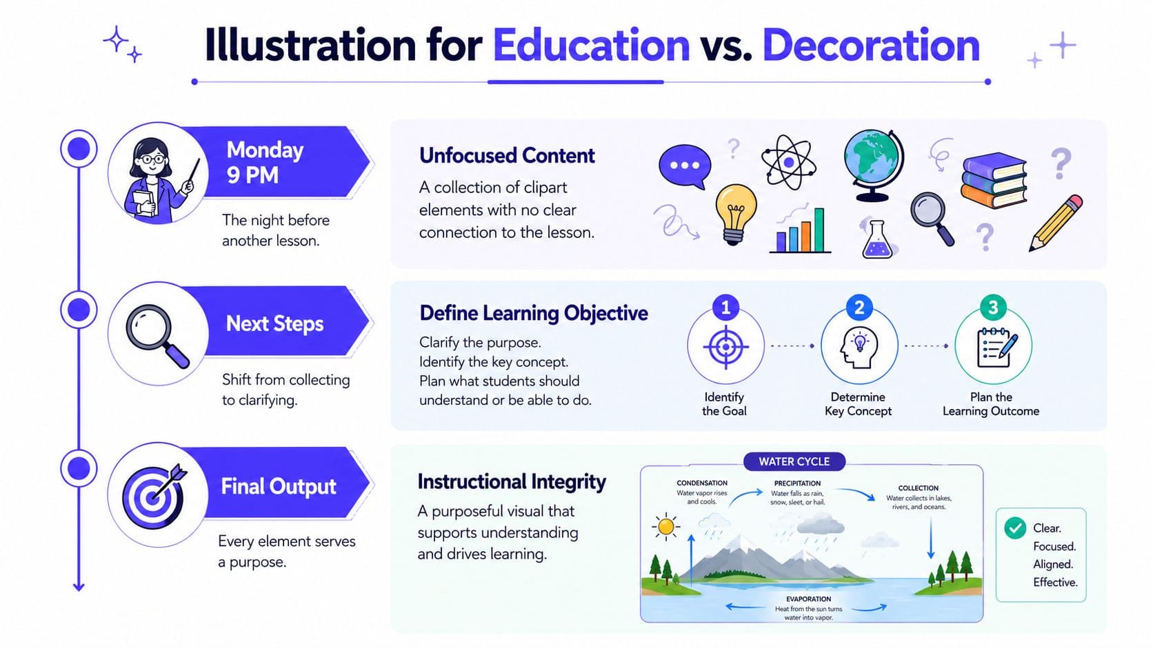
Practical rule: if the picture could disappear and the lesson would stay the same, it's decoration. If the picture helps the student name, sequence, compare, or explain something, it's doing instructional work.
The difference shows up fast in the classroom. A clipart apple beside a vocabulary word may look clean, but a labeled diagram of a seed cycle, a number array, or a timeline with cause and effect can move a lesson forward because the visual carries part of the thinking load. That's why the question is never “Is the image attractive?” The question is, “What does the image teach that the text alone would leave fuzzy?”
Why Illustration for Education Works Differently Than Decoration
A lot of teachers have been handed a folder full of “engaging” images that do almost nothing for comprehension. The colors are pleasant, the characters are smiling, and the actual learning target is still buried. That's the moment to remember that illustration for education is an instructional decision first.
Words and pictures should work together
The strongest educational visuals don't sit beside the text like wallpaper. They connect tightly to the learning goal, so the student can use both at once. That matters because the modern design guidance attached to educational data visuals emphasizes integrating text and graphics, labeling values, reducing clutter, and writing in plain language so the image communicates one clear point. The same principle is visible in the long arc from Comenius to current educational design guidance.
A decorative image often tells you only that someone wanted the page to look friendly. An instructional image tells you where to look, what to notice, and how to think. If a fourth grader can answer the lesson question faster because the image is on the page, that image is earning its space.
The cleanest test is simple. Ask whether the visual helps a learner compare, identify, order, or explain. If not, it's probably taking up cognitive room that should belong to the content.
The visual has to do real work
Educational design often fails when people treat the image as a reward for the learner instead of a partner to the explanation. That's why a pile of stock photos can be surprisingly unhelpful, even when it feels lively. The more the image competes with the text, the less it helps students build the concept.
A better habit is to read the page like a student. Find the one point the visual must make, then strip out everything else. That's the difference between a page that looks polished and a page that teaches.
If the visual doesn't improve recall, identification, sequencing, or explanation, it belongs somewhere else, or not at all.
The old lesson still holds. Pictures can support thinking, but they can also distract from it. Good teaching visuals don't ask for attention, they direct it.
Planning the Illustration Before You Open a Canvas
The fastest way to waste time is to start drawing before you know what the drawing has to accomplish. A lot of teachers do this under pressure, and I get it. The lesson is due, the worksheet is blank, and stock art looks like the quickest fix.
Start with the function
The first question is always what the illustration must do. Should it define a term, show a sequence, compare two things, or help students explain a process? That single decision shapes everything else, because a water cycle diagram, a multiplication array, and a historical timeline each serve a different kind of thinking.
A water cycle visual should show movement and repetition. A multiplication array should make groups visible without extra decoration. A timeline should support order and cause, not just list dates. The visual should fit the task, not the other way around.
Place it where the student needs it
The second move is to decide where the illustration belongs in the lesson. Some visuals belong before reading, to build vocabulary. Others belong after instruction, to check whether the student can apply the idea. A diagram can do very different jobs depending on its placement.
A teacher saves time. If you know the visual is supposed to support the explanation of evaporation, for example, you don't need a search through a giant library of generic science art. You need one clear image at the exact point where the concept gets abstract.
Define the content and the cues
The third and fourth steps are the ones frequently skipped. Decide what must appear in the image, then choose the cues that will make the idea recognizable. The ERIC study on instructional materials says adding detail improves identifiability, while sparse line drawings are less readily recognized, so the goal is cue-rich, not cluttered. That cue-rich principle is spelled out in the instructional materials study.
Useful habit: identify the target, strip the image down to diagnostic cues, then check whether it still makes sense without labels.
A teacher who plans this way spends less time fixing bad visuals later. The image starts as a teaching tool instead of becoming a rescue project.
Matching Style and Detail to the Learners in Front of You
The same illustration won't work the same way in every classroom. Young children need simpler forms they can decode quickly, while older students can handle more nuance and detail. The lesson target matters, but so does the learner sitting in front of it.
Build complexity to fit the age band
For younger learners, bold shapes and clear outlines usually do the heaviest lifting. A child in K-2 should be able to tell what the image is without a long verbal explanation, so the drawing needs strong cues and limited clutter. Older elementary students can manage more texture, more layered information, and more labels when the task asks for it.
Middle and high school learners usually need visuals that respect abstraction. A science diagram, map, or historical graphic can include more terminology and still work, as long as the relationships stay clear. A visual that looks “cute” can feel insulting at that level if it strips out the concept's complexity.
Match detail to the learner's needs, not to your taste
The point of detail is recognition, not ornament. The more the image signals what matters, the less students have to guess. That's especially important for multilingual learners and students who need visual support without extra verbal noise.
For inclusive materials, representation matters too. Diverse learners should appear as part of normal classroom life, not as isolated symbols of diversity. Avoid stereotypes, exaggerated features, and tokenism. If the visual is showing a student in a wheelchair, a child wearing hearing support, or a culturally specific setting, the image should feel ordinary and accurate.
One visual, many learners
A mixed-ability classroom doesn't always need five separate versions. Often, one well-built visual can serve everybody if the labels are clear and the structure is stable. Consistency helps too, especially across a unit or series, because familiar formatting lowers friction and keeps attention on the concept rather than the style. Guidance for children's educational publishing also recommends consistency and cultural inclusivity.
Use the same image as a base, then adjust the amount of text support around it. That lets an ELL student lean on the picture while a more advanced student uses it as a prompt for explanation.
Accessibility Rules Every Educational Illustration Must Follow
A visual can look clear on your screen and still fail for a student using a screen reader, a low-vision student, or a classroom printer that softens every edge. Accessibility is not a final polish step. It determines whether the illustration can teach.
Treat contrast and text as hard requirements
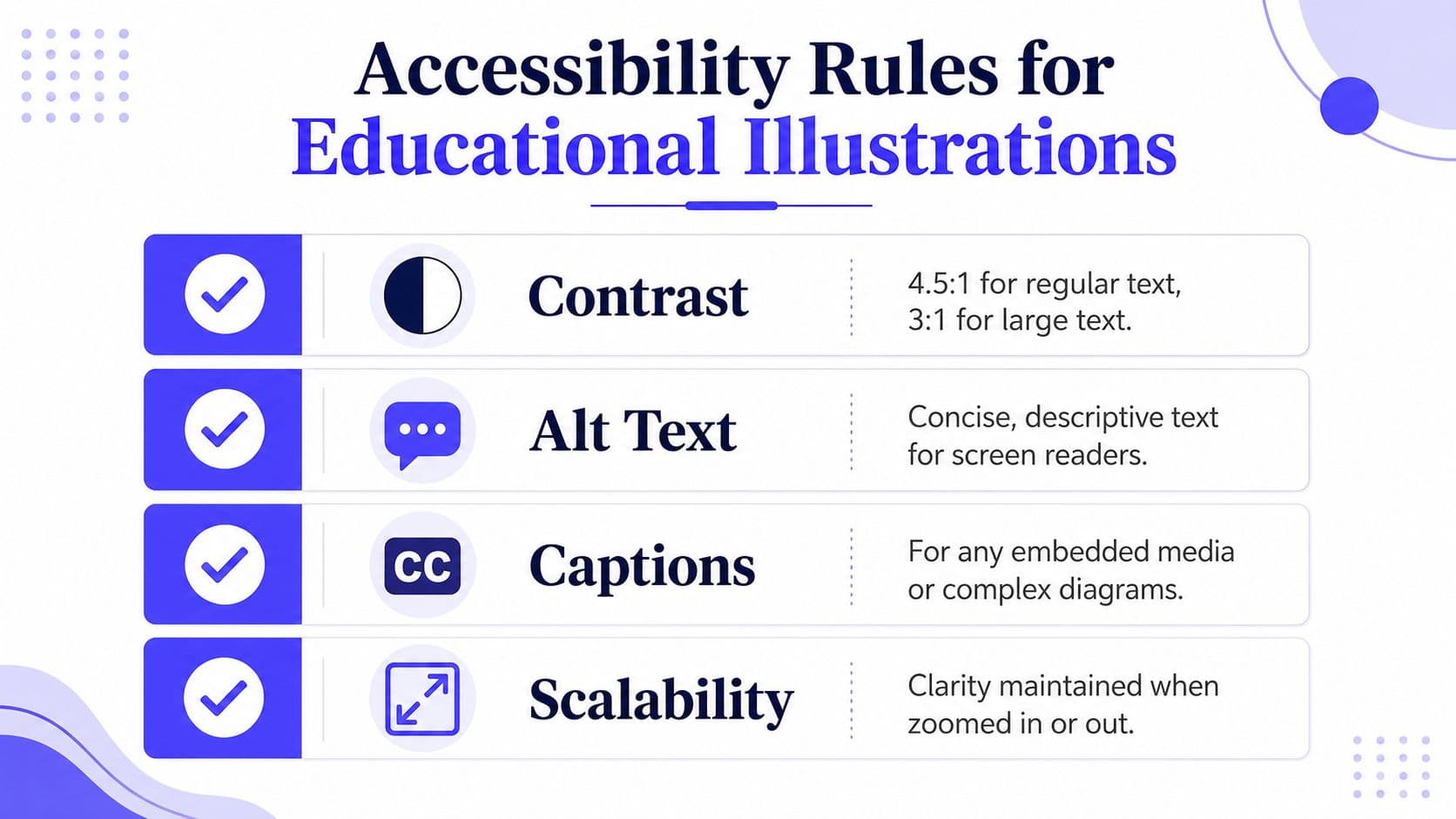
WCAG Level AA requires a 4.5:1 contrast ratio for regular text and 3:1 for large text, and any image that carries information needs an equivalent text description through alt text, captions, or a linked long description. Those standards are laid out in the universal design guidance for images and colour. If the text is too faint or the image depends on color alone, students lose access to the content.
A usable classroom graphic keeps the reading burden low. A science diagram with crisp labels, enough contrast, and a short text alternative gives students a clear path through the idea. A decorative version that hides labels in pale gray type, leans on color as the only cue, and skips alt text leaves the lesson out of reach.
Caption it so the image stands on its own
A useful caption does more than name the picture. It tells the learner what the image shows and why it matters. For a diagram, that may mean a short line that names the relationship or process. For a complex visual, the caption should direct attention to the part students need to notice first.
Instructional images should carry their own meaning. Decorative images can sit in the layout and do very little, but the moment a student needs the image to understand the point, the visual needs readable text support. That matters even more on school networks where heavy graphics can load slowly or render awkwardly.
If you want a practical cross-check before you publish, the guide on improving visual accessibility is a useful reminder to test what the eye may overlook.
Screenshot test: zoom the page, turn on a screen reader if you can, and ask whether the image still communicates the same lesson.
Teacher checklist
- Contrast: Check whether the text and key shapes stay readable.
- Alt text: Write a concise description that carries meaning.
- Caption: Add a short line that tells students what to learn from the image.
- Scalability: Make sure the visual still works when projected, printed, or zoomed.
A Fast AI Workflow for Custom Educational Visuals
A teacher shouldn't have to spend forty minutes hunting for a nearly-right picture. AI can help here, as long as it stays under instruction and not over it. I've found the best results come from short prompts, fast edits, and a clear sense of what the visual has to teach.
Write the prompt like a lesson objective
Start with subject, grade band, style, and learning goal. “Grade 4 science, simple labeled diagram, show the water cycle in clear steps” gives the model a better target than “make a water cycle picture.” That extra precision reduces the odds of getting something pretty but vague.
Tools such as Kuraplan can fit naturally into that workflow because they generate lesson materials and educational visuals together, which saves time when you need the image to match the worksheet or slide. The main advantage is not speed by itself. It's that the illustration can be tied to the lesson structure instead of arriving as a separate artifact.
Edit for recognizability and bias
The ERIC study on instructional materials is a useful filter here, because it reminds us that sparse drawings can lose the concept. If the AI output is too clean, too minimal, or too abstract, add the cues that make the object or process identifiable. If the output introduces odd artifacts, inconsistent features, or a stereotype, fix it or discard it.
For consistent characters across a sequence, a practical guide is Aicut's note on consistent characters, especially when you're building a repeated classroom mascot, recurring problem character, or a small set of lesson figures. That kind of continuity matters more than flashy style.
Two quick classroom examples:
- Math: Prompt for a grade 3 array with equal rows, bold counters, and labeled groups. Then check that the grouping logic is obvious before you add any color.
- Science: Prompt for a middle school food chain diagram with arrows and labels. Then remove any extra background objects that don't help the student trace energy flow.
Export for the real classroom
Once the image works, export it in the format the lesson needs. A worksheet image should print cleanly in grayscale when needed. A slide image should stay sharp on a projector. An LMS upload should load fast enough that students aren't waiting on a spinning icon while you talk.
If the visual only survives one context, it isn't finished. A solid classroom image should travel from a screen to paper to a shared platform without losing its instructional purpose.
Using Illustrations as Reasoning Tools, Not Just Wallpaper
The most useful illustrations are the ones students use to think, not just to look. That's where diagrams stop being pretty extras and start becoming evidence of understanding. In STEM, especially, visuals can produce measurable learning gains, but the benefit isn't automatic for every learner or every task. The math and learner-generated visual explanation research makes that caution clear.
Three classroom moves that actually work
A quick science exit ticket can ask students to label a diagram of a process and explain one arrow in a sentence. In math, a student can sketch an array or number model to show how they solved a problem. In history, a mini-map of cause and effect can help students show what led to an event and what followed it.
These are not art assignments. They're reasoning surfaces. The student has to externalize a relationship, and that gives you something concrete to check without adding a heavy grading load.
Why the visual belongs in the thinking
When students draw or annotate, they have to translate an idea into structure. That process can reveal whether they understand the concept or just memorized vocabulary. A learner-generated diagram also gives you a clean way to spot gaps, because missing labels, wrong arrows, or mismatched sequences show up fast.
Classroom habit: ask students what the picture proves, not just what it shows.
That simple move helps especially in mixed classrooms, where a well-designed visual can support language development, comprehension, and memory at the same time. A classroom poster can serve a different job than a reference sheet, and both can be more useful when the visual and the task match. For teachers comparing those uses, choosing effective classroom posters is a helpful lens because it keeps the focus on what the visual is supposed to do.
Use one format across subjects
| Subject | Illustration Type | Primary Learning Goal |
|---|---|---|
| Science | Labeled process diagram | Show sequence and mechanism |
| Math | Array or bar model | Represent groups and relationships |
| History | Timeline or cause-effect map | Organize order and connection |
The table above is simple on purpose. Students don't need clever visuals as much as they need visuals that make thinking visible. When the format matches the goal, the illustration becomes part of the explanation instead of a distraction from it.
Your Teacher-Ready Checklist and Common Pitfalls
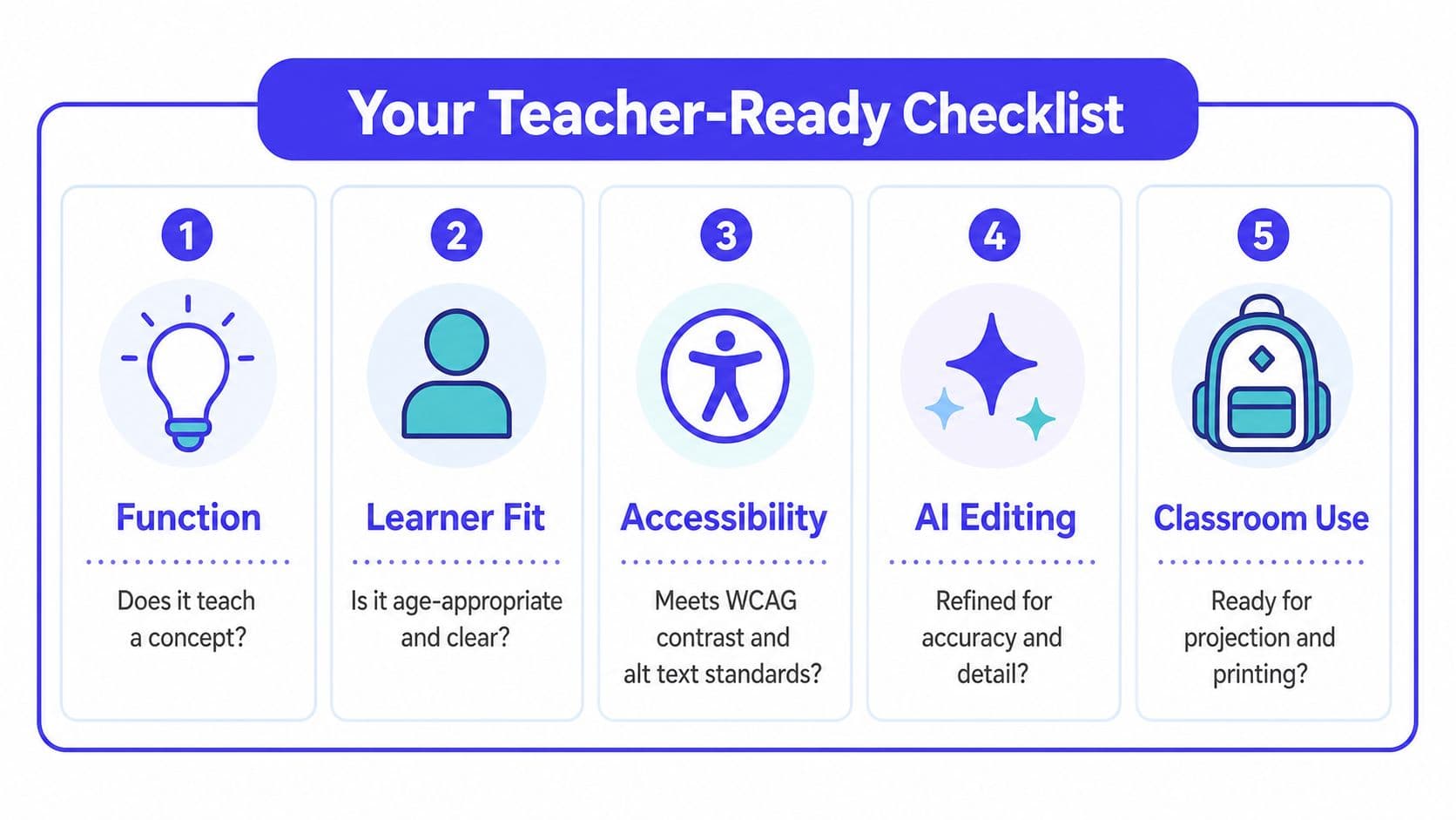
The best educational visuals usually come from a short, disciplined routine, not from inspiration. Before you publish, ask five questions. Does it teach a concept, fit the learner, meet accessibility rules, survive AI editing if you used it, and work in the classroom on paper or screen?
Save these two takeaways
- Printable takeaway one: if the image can't be explained in one sentence, it's probably too busy.
- Printable takeaway two: if a screen reader or grayscale printout breaks the meaning, the visual isn't ready.
The common mistakes
Decorative clipart is the easiest trap, because it feels fast and harmless. Missing alt text is another one, especially when the visual carries actual information. Sterile stock photos can also miss the point if they show polished scenes but no instructional cue. And any image that reinforces stereotypes or excludes students subtly weakens the lesson.
The fix is usually not a bigger visual library. It's a tighter routine. Start with function, check learner fit, verify accessibility, refine the image, then use it in a task that asks students to think with it.
A school year gives you room to improve. Most teachers get better at illustration for education by reusing a small set of visuals, editing them carefully, and noticing which ones students use. That's the win, a classroom set of images that keeps paying rent because it keeps teaching.
If you want a faster way to build visuals that match your lesson goal, Kuraplan can help you turn a topic into worksheets, diagrams, and age-appropriate classroom images without rebuilding everything from scratch. Visit Kuraplan and use it to draft, refine, and reuse educational visuals that stay tied to the learning objective.