It's Monday morning, the slide deck is open, and the water cycle lesson starts in an hour. You need a clean diagram, a few labels that won't confuse your multilingual students, and something that won't fall apart when you print it for the lab table groups. That's where a science diagram maker stops being a shiny tech tool and starts acting like a quiet teaching assistant.
In K–12 science, the diagram is never just decoration. It's a vocabulary support, a comprehension check, and sometimes the only way a student can make sense of an invisible process like evaporation or the inside of a leaf. The right tool helps you build that image fast, but the win is choosing a diagram that matches the learning goal, the grade band, and the misconception you're trying to catch before it hardens.
What a Science Diagram Maker Actually Does in Your Classroom
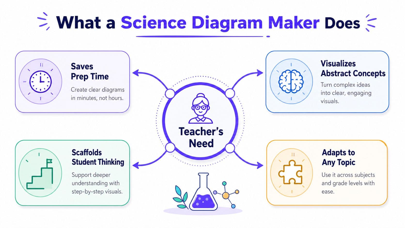
A Tuesday-morning science teacher usually doesn't need “design.” She needs a labeled image that matches the lesson before the bell rings. The modern science diagram maker grew out of earlier diagramming software, with Microsoft Visio first released in 1992 and browser-based visual tools later shifting diagram work into shared, cloud workflows; by the mid-2020s, AI tools were advertising “seconds” to create publication-ready figures, which shows how quickly the category moved from manual drafting to prompt-based generation. That evolution matters in classrooms because the diagram is now part of instruction, not an afterthought, and tools are being built around structured outputs like flowcharts, cross-sections, network diagrams, and labeled scientific illustrations rather than general-purpose graphic design source context.
Why this is different from a regular drawing app
A regular drawing app lets you make almost anything, which sounds nice until you spend ten minutes nudging arrows that still look crooked. A science-focused tool starts with the job science teachers have, making a visual that is accurate, labeled, and easy to read at a glance. That's why this kind of tool fits worksheets, slides, lab reports, and even quick review pages far better than a blank canvas.
I think the clearest test is this. If the image needs to help students explain a process, compare structures, or identify parts of a system, a science diagram maker is the right move. If you're just looking for a quick sketch to warm up a conversation, a hand drawing on the board can still be faster and often more personal.
Practical rule: use the tool when the visual has to carry content, not just look nice.
That's also why resources such as generate student art with AI can be useful when you're thinking broadly about classroom visuals, but science diagrams still need a tighter standard for accuracy. For a teacher-built workflow that keeps those visuals tied to lessons, Kuraplan's image generation feature fits naturally because it's built around educational content, not loose design.
Building Your First Diagram From Prompt to Print
The easiest way to make your first usable diagram is to treat it like a classroom task, not an art project. Start with a plain-English prompt that names the concept, the grade band, and the diagram type. A Grade 5 prompt for the water cycle should not sound like a university lab note, because the output needs to match the readers in front of you, not the content standards folder on your desk.
A simple workflow that actually holds up
A good routine looks like this: write the prompt, review the component list the tool gives you, check whether the sequence or labels are in the right order, then export the version that fits your lesson. Tools like Kuraplan make that feel less like a separate design task because the diagram can sit beside the lesson plan and the worksheet draft, so the same learning target drives both the text and the visual. Other AI diagram generators work too, but the teacher-friendly part is when the prompt can travel with the lesson instead of living in a separate app.
Ask for the diagram the way you'd ask a colleague to sketch it for your class, not the way you'd brief a graphic designer.
The details matter more than people expect. If you're making a process diagram, say you want labeled arrows. If you're making a comparison image, name the two items explicitly. If the visual is going on paper, ask for clear contrast instead of decorative styling, because a pretty diagram that photocopies badly is still a bad classroom tool.
For an educator, the goal isn't perfection on the first pass. It's a clean draft that can be checked quickly, corrected once, and put in front of students before the lesson goes flat.
Choosing the Right Diagram Type for the Learning Goal
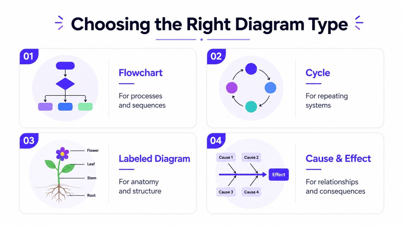
Much generic advice gets vague, leaving teachers with the wrong visual for the job. The safest habit is to match the diagram type to the thinking skill you want students to use. A flowchart helps with sequence, a cross-section shows internal structure, a Venn diagram pushes comparison, and a labeled illustration anchors vocabulary and naming.
Match the shape to the thinking
If you're teaching the rock cycle, a flowchart usually makes more sense than a decorative poster because students need to see how one stage leads to the next. If you're teaching photosynthesis in a leaf, a cross-section gives students access to what can't be seen from the outside. If you're comparing two ecosystems, a Venn diagram keeps the conversation on similarities and differences instead of letting the class drift into random facts.
For an extra layer of visual literacy, I sometimes point teachers to resources like physics based animation when they're thinking about motion or forces, because dynamic visuals can help clarify a process before you freeze it into a diagram. Still, for most classroom work, the static diagram has one job, to make the concept legible and manageable.
The common mistake is using a diagram because it looks familiar. A flowchart is terrible for a lesson where students need to compare and contrast, and a labeled illustration won't help much when the point is cause and effect. Pick the structure first, then prompt the tool.
| Learning goal | Best diagram type | Classroom example |
|---|---|---|
| Sequence or process | Flowchart | Rock cycle stages |
| Internal structure | Cross-section | Leaf anatomy |
| Compare and contrast | Venn diagram | Two ecosystems |
| Vocabulary and parts | Labeled illustration | Plant cell parts |
That table is the shortcut I'd hand to a new teacher. If the shape doesn't fit the thinking, the students will feel the mismatch long before you explain it.
Differentiation Moves That Make the Same Diagram Work for Every Student
A single science diagram can do more than one job if you build it with your class in mind. That's especially important in inclusion rooms, where one student needs language support, another needs stronger structure, and a third needs a harder task than the rest of the group. The trick is not making three different lessons. It's making one diagram that can flex.
Three ways to adapt the same visual
For English language learners, simplify the labels without stripping away meaning. Instead of crowding the diagram with dense academic terms, keep the parts short and predictable, then add only the key vocabulary students need to talk about the concept. For students with IEPs, a symbol key or vocabulary box can reduce the reading load and keep the visual from turning into a decoding task. For gifted learners, the same diagram can become an analysis prompt, with questions that ask them to explain a relationship, predict a change, or justify why one part depends on another.
A teacher can build both a scaffolded and an extension version from the same prompt, which is one reason tools tied to lesson planning are so practical. Kuraplan's differentiation guidance sits in the same planning flow as the rest of the lesson materials, and that makes it easier to generate a simpler class copy and a more demanding discussion version without starting over. The visual stays the same, but the thinking attached to it changes.
Keep the image stable when you can, and change the language, task, or support level around it.
A good before-and-after example is a plant cell. The scaffolded version might use short labels like cell wall, nucleus, and chloroplast with a small word bank. The extension version can ask students to explain which parts control movement of materials or why one structure matters more under certain conditions. Same diagram, different cognitive load.
For a practical teacher guide on adapting instruction, Kuraplan's differentiation strategies fit neatly with this approach, because the visual is only useful when students can use it.
Export, Print, and Accessibility Checks Before Students See It
A diagram that looks sharp on a laptop can still fail on paper. That's why export isn't just a final click, it's part of the teaching decision. In practice, PNG works well for slides and many handouts, while SVG is the better choice when you need the image to scale cleanly for a poster or a larger display. The sources on scientific diagram tools also emphasize vector export and label accuracy as the most important quality checks, because a classroom image needs to survive resizing, projection, and photocopying best-practice comparison.
A quick pre-flight routine
Before you print or project, check whether the labels still read clearly at the size students will see. Then look at color contrast, especially if the diagram uses color to separate parts or show a process. I also scan for connector lines that cross each other, because that's where students start asking the wrong question.
Accessibility matters more than people admit. A colorblind-safe palette isn't an extra polish step, it's basic fairness. Digital versions should also include alt text, because students and teachers use shared materials in more ways than one.
| Use in class | Best format | What to check |
|---|---|---|
| Slides | PNG | Clear labels, strong contrast |
| Worksheets | PNG | Readable at photocopy size |
| Posters | SVG | Clean scaling, no pixelation |
| Editable classroom visuals | SVG | Label placement, line clarity |
If you're working inside a planning workflow, Kuraplan's accessibility tools are a natural place to keep this check close to the lesson. I like that approach because it forces me to ask one simple question before students ever see the file: can every student read it?
Three Classroom Activities That Put the Diagram to Work
A diagram on its own is passive. Once students touch it, talk about it, or redraw it, it becomes evidence of thinking. That's the whole point of using a science diagram maker in class, the visual isn't the lesson, it's the artifact you build the lesson around.
Warm-up, station, exit ticket
For a quick warm-up, give students a partially blank version and ask them to label what they already know. That works well as a pre-assessment, especially when you want to find out whether a class can name the main parts before you launch into the explanation. It also gives quieter students an easy entry point, because they can point, whisper, and write without having to lead the room.
At a station rotation, put a different part of the diagram in front of each group and ask them to explain it to the class. One group might focus on the sequence, another on the labels, and another on what would happen if one part changed. That turns the diagram into a peer-teaching tool, which is usually where the misunderstandings show up in a useful way.
An exit ticket can be as simple as a memory redraw. Students sketch the diagram from memory, then circle one part they're still unsure about. That gives you a fast formative check and tells you what to revisit tomorrow.
If a student can redraw the structure and explain one label, you've probably got understanding. If they can't, the next lesson writes itself.
The teacher move here is simple. Don't just project the image and move on. Make students use it, talk through it, and reconstruct it. That's where the learning gets durable.
Your One-Page Checklist for Next Week's Lesson
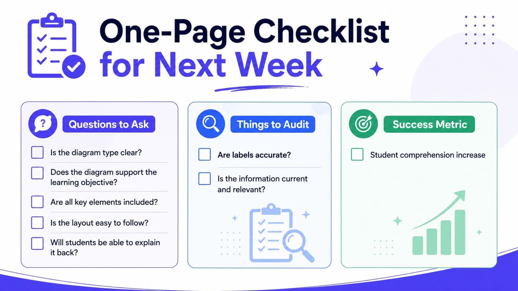
A good diagram saves you time only when it starts with the right questions. Before you prompt anything, ask whether the diagram type matches the learning goal, whether the labels fit the reading level, whether the image needs to support comparison or sequence, whether the export will still look good on paper, and whether you need a scaffolded version as well as an extension version. Those five checks keep most of the avoidable mess off your desk.
After generation, audit two things first, label accuracy and line clarity. If one label is off or one connector line is confusing, fix that before you think about color, icons, or anything decorative. Then lock the export choice to the format your class needs, not the format that just looks neat on screen.
The classroom move that makes the whole thing worth it is simple. Put the diagram in front of students and ask them to do something with it, not just look at it. Label it, compare it, explain it, or redraw it. That's the difference between a classroom image and an instructional object.
Kuraplan keeps that whole flow in one place, so the lesson plan, diagram, worksheet, and assessment stay linked instead of drifting apart in separate files. If you want next week's science lesson to feel calmer and more intentional, try building the visual first, then use it to shape the activity. A few minutes spent on the right diagram can spare you a lot of reteaching later.
A CTA for Kuraplan.