You've probably been there. The lesson objective is clear, the text is decent, and students still stare at the page when it's time to organize their thinking. So you grab a Venn diagram, a story map, or a sequencing chart from an old folder and hope it fits.
Sometimes it does. Sometimes it becomes one more worksheet students complete without really using.
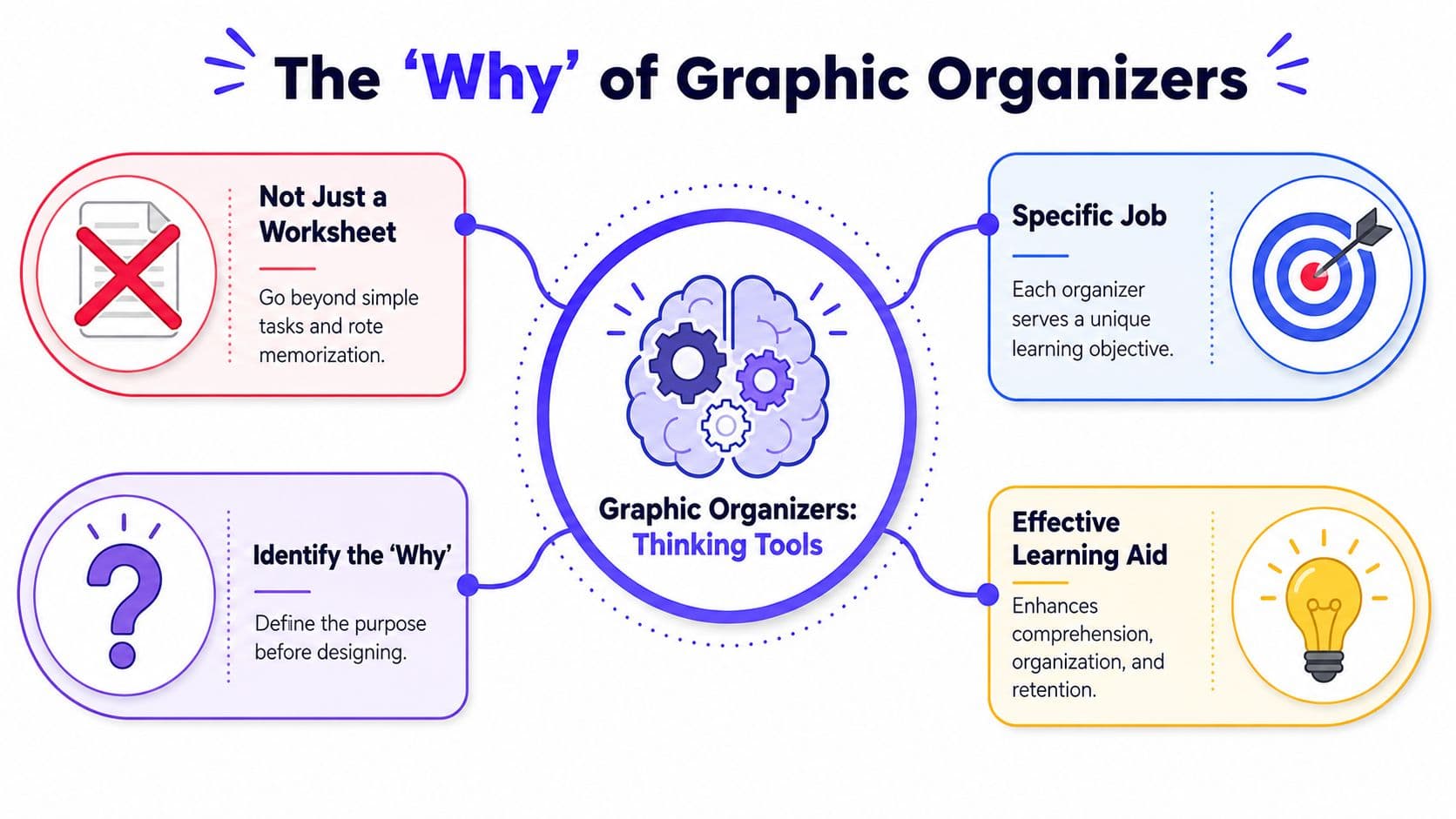
That's the difference worth paying attention to when you're thinking about how to create graphic organizers. The organizer itself isn't the strategy. The thinking it enables is. When teachers match the visual structure to the actual mental work students need to do, organizers stop being filler and start becoming scaffolds students can lean on.
Start with the End in Mind
Monday at 8:15, students are settling in, and the organizer is already on their desks. Before you print it, answer one question: what should students know or be able to do by the end of this lesson?
That question saves time. It also prevents a common problem. Teachers often pick a familiar template first, then try to make the lesson fit it. The stronger move is to start with the objective, name the thinking students need, and build from there. That is how an organizer becomes a scaffold instead of one more page to complete.
Ask what students must do with the content
A useful organizer begins with the mental task, not the format.
Ask:
- What will students do with the information?
- What evidence will show they met the objective?
- Where are they likely to get stuck?
Those questions matter because two lessons on the same topic can need very different supports. A science class studying ecosystems might need students to classify organisms by role in a food web. An ELA class reading two texts on the same topic might need students to compare claims and evidence. Same broad content area. Different thinking. Different organizer.
One practical test I use is simple: finish the sentence, “Students will use this organizer to...”
If that sentence comes out vague, the organizer is still vague.
Build backward from the objective
Start with the standard or lesson target. Rewrite it as a student action. Then choose the structure that makes that action visible.
For example:
- Objective: Define and apply key vocabulary.
- Student action: Describe a term, identify examples, and separate them from non-examples.
- Helpful structure: A Frayer Model template for vocabulary learning
Or:
- Objective: Explain how a bill becomes law.
- Student action: Order the stages and note what happens at each point.
- Helpful structure: A sequence chart or flowchart
This backward planning step is especially helpful when you want students to develop critical thinking skills. Critical thinking does not grow from a decorative worksheet. It grows when the organizer asks students to sort evidence, justify a choice, trace cause and effect, or explain a pattern.
Plan for the learners, not an abstract class
Many guides conclude their advice too soon. The objective matters, but so do the students in front of you.
If the goal is analysis and you teach multilingual learners, the organizer may need sentence frames, a word bank, or partially completed examples so language demands do not bury the thinking work. If you teach students with disabilities, the same objective may call for fewer boxes, larger text, clearer labels, or one step per row instead of a dense page with multiple directions. The target stays the same. The access points change.
That trade-off is real. A more detailed organizer can support independence, but too much built-in support can lower the level of productive thinking. A sparse organizer can reveal student understanding, but it can also overload students who are still building language, executive functioning, or background knowledge. Good planning sits in that middle space.
Keep the purpose tight
The cleanest organizers usually do one job well.
Trouble starts when one page asks students to brainstorm, summarize, cite evidence, reflect, and write a conclusion all at once. That may look efficient from a planning standpoint, but in practice it often creates confusion. When students have to figure out the sheet, they have less energy for the content.
A tighter organizer gives you cleaner evidence too. You can see quickly whether students understand the concept, need a reteach, or are ready for more independent work. That matters on a busy week when you need tools that clarify learning, not materials that add one more stack to sort.
Choose the Right Tool for the Cognitive Task
Monday, third period, students are staring at a graphic organizer that looked fine during planning. The problem is not effort. The page asks them to compare, sort evidence, trace cause and effect, and summarize all at once. At that point, the organizer has stopped supporting thinking and started competing with it.
Tool choice matters more than teachers are often told. In classrooms, I see the same pattern: a solid organizer gets reused for a task it was never built to handle because time is tight and familiar materials feel safer than starting over. That choice is understandable. It also changes the quality of student thinking you can see.
A reliable rule is simple. Choose by the thinking move in the objective.
If students need to compare, use a structure built for similarities and differences. If they need to sequence, use a timeline, flowchart, or step chart. If they need to classify, use columns, labeled categories, or a branching concept map. If they need to explain how ideas connect, a concept map usually gives better evidence than a worksheet with isolated boxes.
That match matters because organizers should support analysis, not reduce it to filling blanks. Used well, they help students develop critical thinking skills by making reasoning visible enough to discuss, revise, and assess.
Graphic Organizer Quick-Reference Guide
| Organizer Type | Best For (Cognitive Task) | Classroom Example | Subjects |
|---|---|---|---|
| Venn diagram | Comparing and contrasting | Compare plant and animal cells | Science, ELA, Social Studies |
| T-chart | Sorting two categories | Pros and cons of a historical decision | Social Studies, ELA |
| Sequence chart | Ordering steps or events | Life cycle stages or lab procedure | Science, Early Elementary |
| Flowchart | Tracking a process with branches | Solving a multi-step word problem | Math, Science |
| Cause-and-effect chart | Explaining relationships | Causes of the American Revolution | Social Studies, ELA |
| Concept map | Showing connected ideas | Branches of government and their roles | Social Studies, Science |
| Main idea and details web | Supporting comprehension | Key details from an informational text | ELA, Science |
| Frayer-style organizer | Deepening vocabulary understanding | Analyze a content-area term | ELA, Science, Math |
Vocabulary instruction is a good example of this principle. A four-square word sheet works when the goal is precise word learning, category thinking, and application. A general web usually does not. If you want a repeatable structure students can learn quickly, this Frayer Model guide for classroom use is a practical planning reference.
The trade-offs are real. A T-chart is quick to teach and easy to scan, but it flattens complex relationships. A concept map captures nuance, but many students need explicit modeling before they can build one independently. Flowcharts help with process thinking, yet they can oversimplify a text or event that has multiple causes happening at once.
Grade level and content also shape the choice. In primary grades, sequence charts and picture-supported sorting mats often produce clearer evidence than open-ended webs. In middle and high school, students can handle more abstraction, but they still benefit from boundaries that keep the task focused. Too much openness often leads to weak responses that tell you little.
One practical test helps: cover the directions and look only at the structure. If the page does not immediately suggest the kind of thinking students are supposed to do, pick a different organizer. That small check saves reteaching time later and makes the handout earn its place in the lesson.
Design Organizers That Clarify Not Confuse
A good organizer feels clean before a student writes a single word on it.
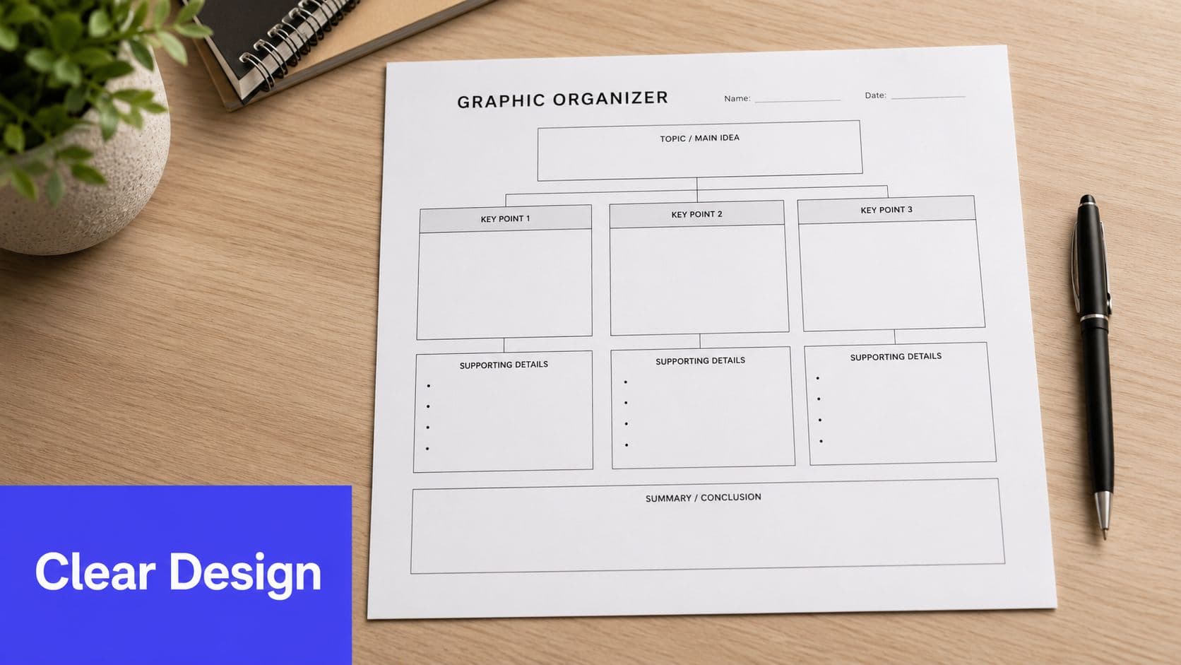
If students need extra time just to figure out where to look, the page is already working against you. Design matters because visual clutter competes with the thinking you want students to do. The strongest organizers are simple, readable, and focused on one job.
Keep the page visually quiet
Start by reducing noise. Use enough white space that students can see the structure immediately. Limit decorative icons, extra borders, and unnecessary color shifts. If you use arrows, use them consistently. If you use boxes, make their purpose obvious.
The text inside the organizer should stay short. Expert guidance recommends avoiding complete sentences and using bullet points or sentence fragments instead, so students focus on relationships among ideas rather than getting stuck in the writing load (Cult of Pedagogy on graphic organizer design).
That single shift solves a lot of classroom issues. Students who freeze during writing can still capture thinking. Students who overwrite learn to distill.
A simple build process that works
When teachers ask how to create graphic organizers from scratch without overcomplicating them, this is the workflow I recommend:
- Write the objective first. Put the learning goal at the top of your planning page, not just in your lesson plan.
- Choose one structure. Resist the urge to combine multiple organizer types on one sheet.
- Label the thinking moves. Use prompts such as “similarities,” “evidence,” “next,” or “effect” so the organizer teaches students how to think through the task.
- Limit writing space intentionally. Smaller response areas encourage key words and concise notes.
- Test it yourself. Fill in a sample with the lesson content. If it feels cramped or confusing to you, students will struggle more.
Print and digital trade-offs
Printable organizers are easy to hand out, annotate, and collect. Digital organizers are easier to revise, duplicate, and adapt for different groups. If you're creating several versions for different reading levels or support needs, digital tools can save a lot of formatting time.
That's where tools like Canva, Google Slides, and Kuraplan can be practical. Kuraplan can generate curriculum-aligned visuals, worksheets, and graphic organizer slides without having to rebuild the layout manually, which is useful when you need a quick draft you can still edit for your class.
A strong organizer should make the content feel more manageable, not make the page look more sophisticated.
Signs your organizer needs revision
Watch for these red flags:
- Too many prompts: Students answer mechanically and lose the main idea.
- Mixed task types: One page asks for sequence, summary, and opinion all at once.
- Dense wording: Students read the organizer longer than the text it's meant to support.
- Tiny writing spaces everywhere: The page looks tidy, but students cannot use it.
If that's happening, simplify. Remove sections before you add more.
Make Your Organizers Work for Every Student
A graphic organizer can remove barriers, or it can create new ones. That depends on how well it's adapted.
The biggest mistake is assuming the standard version works for everyone. It doesn't. Some students need fewer choices. Some need language support built directly into the page. Some need symbols, objects, or digital response options rather than print-heavy boxes.

Adjust the display, not just the difficulty
For students with significant cognitive disabilities, planning the format is essential. Guidance for inclusive classrooms recommends customizing how information is displayed, including the use of objects, symbols, or simplified visuals based on how a student perceives, engages, and responds (inclusive graphic organizer guidance).
That means differentiation may look like:
- Reducing visual complexity: fewer boxes, fewer distractors, one response path
- Changing response mode: drag-and-drop, matching, circling, pointing, or oral response
- Pre-filling part of the organizer: leaving only the key thinking step for the student
- Using icons or photos: especially when abstract language becomes a barrier
If you're designing digital materials, basic accessibility checks help here too. A practical reference on WCAG standards for cognitive impairments can help you think through readability, clarity, and reduced cognitive load.
Support ELLs inside the organizer itself
English learners often need more than a blank chart. They need language embedded in the design.
Try adding:
- Sentence frames: “Both ___ and ___ have…”
- Transition words: “first,” “next,” “because,” “however”
- Vocabulary banks: especially for compare-and-contrast, cause-and-effect, and explanation tasks
- Labeled visuals: so students can connect words to concepts quickly
For broader planning around support levels and scaffolds, this guide to differentiation teaching strategies is a practical companion.
Some students don't need a different goal. They need a clearer path into the same goal.
What inclusive organizers usually have in common
They are more explicit. They reduce decisions that aren't central to the learning. And they don't make students prove understanding through one narrow response format only.
That's the shift. Instead of asking, “Can this student do this organizer?” ask, “What version of this organizer lets the student show the thinking?”
Move from Handout to Habits of Mind
Even a well-designed organizer can fall flat if the rollout is weak.
Students usually don't become proficient with graphic organizers after one explanation. They need to see how the tool works, hear the thinking behind it, and practice with support before they're expected to use it independently. Guidance on classroom implementation notes that teachers need training to match organizer type to learning goal, and that students often struggle with initial directions and need repeated practice across several assignments before they build confidence and proficiency (Structural Learning on graphic organizer implementation).
Model the first moves out loud
Don't hand out the page and say, “Fill this in as you read.”
Instead, project the organizer and complete part of it in front of students. Name your decisions aloud. Show why one detail belongs in one box and not another. Show what concise notes look like. Show what to leave out.
This matters most with new formats. If the structure is unfamiliar, students need to learn the tool before they can use it for content.
Use a gradual release pattern
A simple sequence tends to work best:
- Teacher models: complete the first part together
- Pairs or small groups practice: students try the next section with support
- Independent application: students use the organizer on their own with a familiar structure
Students don't misuse organizers because they're careless. Most of the time, they haven't yet been taught how the structure is supposed to carry the thinking.
Repeat formats across units
One of the easiest ways to build confidence is to reuse the same few structures across the year. When students already know how a cause-and-effect chart or concept map works, they can spend more energy on content and less on directions.
That's when organizers stop being isolated activities and become part of students' regular thinking habits.
Turn Visuals into Measurable Learning
You collect a stack of organizers after class. Every box is filled. Then the next day, students struggle to explain the idea in discussion or use it in writing.
That gap matters. A completed organizer shows what students captured in the moment. It does not automatically show what they can recall, explain, or apply on their own. To find out whether the learning will hold, students need a quick follow-up task that asks them to use the organizer without leaning on the original text.
Use the organizer as formative assessment evidence
Graphic organizers give teachers a fast read on student thinking, especially when time is tight. A two-minute scan can reveal whether students sorted ideas accurately, saw the right relationships, and reduced information into meaningful notes instead of copying.
Look for patterns such as:
- Missing categories
- Weak or inaccurate connections
- Steps placed out of order
- Whole phrases copied from the text
- Very sparse entries that suggest overload or confusion
Those patterns help you decide what to reteach, who needs another round of guided practice, and who is ready to move into writing, discussion, or problem-solving. If you want a few quick next-step routines, these formative assessment examples for classroom use pair well with organizer work.
Ask students to produce something from it
The organizer should lead to visible performance. In classrooms, the most useful follow-up tasks are usually short enough to fit the last five minutes of a lesson or the first few minutes of the next one.
Try prompts like these:
- Write a summary using only the organizer
- Explain the organizer to a partner without reopening the text
- Record a brief audio response that explains the reasoning
- Use the organizer as an outline for a paragraph, lab explanation, or discussion post
These tasks also make differentiation more honest. A student may complete a scaffold successfully but still need support turning notes into language. That is common with multilingual learners, students with writing disabilities, and students who need more processing time. The organizer helps, but the follow-up response shows where the next layer of support belongs.
If a student can speak from the organizer, write from it, or use it to solve a new task, you have stronger evidence of learning than a completed worksheet alone.
Treat the organizer as part of an instructional cycle, not the final artifact. That shift saves reteaching time because it surfaces misunderstandings while they are still small.
If graphic organizers are eating up too much planning time, Kuraplan is worth a look. It helps K to 12 teachers turn objectives into standards-aligned lessons, worksheets, and educational visuals quickly, including editable graphic organizer materials you can adapt for different learners without rebuilding everything from scratch.