Interpreting Statistical Information
A free maths worksheet ready for your classroom. Open in Kuraplan to grab the print-ready PDF, customize it for your students, or generate a fresh version in seconds.
Interpreting Statistical Information

Part 1: Identify the Statistical Information
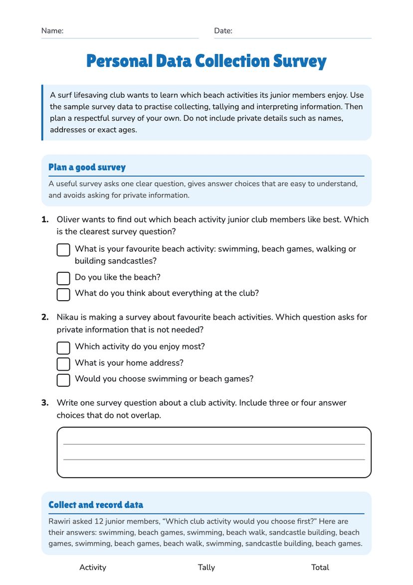
Instructions: Read each situation carefully. Identify the purpose, population, sample, variables, data source and context. Explain your thinking using complete sentences where requested.
a) What is the purpose of collecting the information?
b) Identify the population and the sample.
Part 2: Read and Interpret Statistical Displays
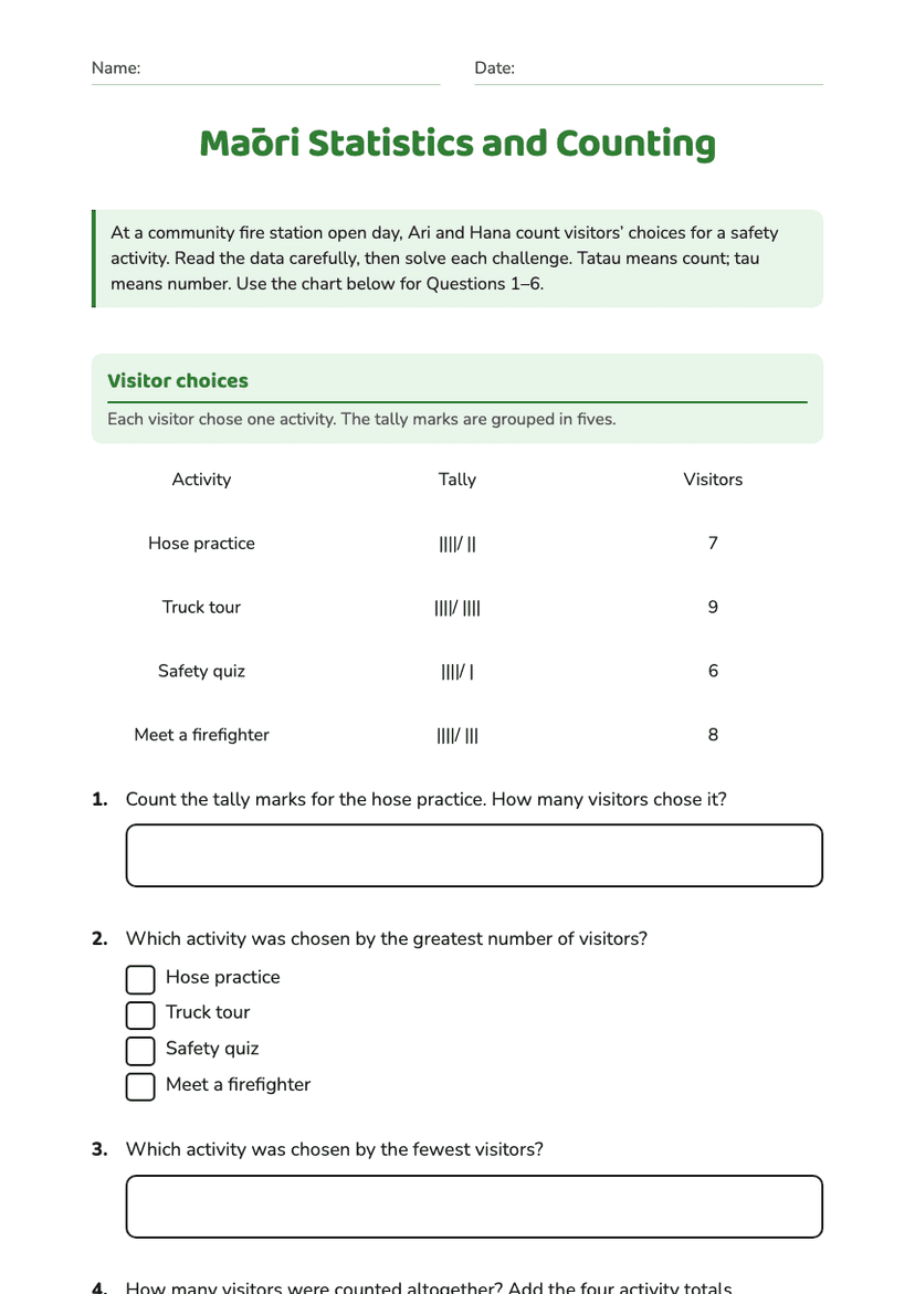
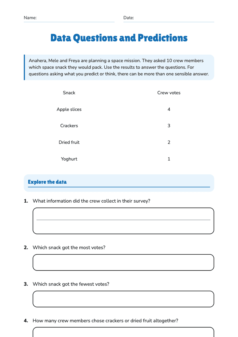
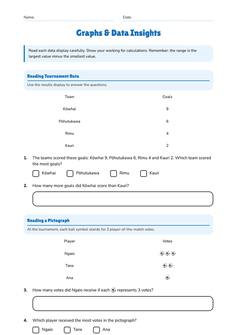
Instructions: Use the information in each display. Focus on what the data means in context, not only on finding numbers.
Swimming: 42 Walking: 30 Team sport: 24 Cycling: 18 Other: 6
a) Which activity was most popular?
b) Write one statement that compares swimming with cycling.
Hours per week: 0–<5: 4 students 5–<10: 11 students 10–<15: 17 students 15–<20: 12 students 20–<25: 6 students
a) Which interval contains the greatest number of students?
b) Is it reasonable to say that most students spend at least 15 hours per week on screens? Explain.
January: 18,000 February: 17,500 March: 19,000 April: 20,500 May: 21,000 June: 20,000
Describe the overall trend and identify the month with the highest number of passengers.
a) How many households used council collection?
b) Write one conclusion that could help the community group plan its services.
About This Worksheet
Free in Kuraplan
Sign up free, grab the PDF, and customize it for your class.
Print-Ready
Formatted for standard paper. Clean layout, easy to read.
AI-Generated
Created with Kuraplan's AI, designed for real classroom use.
For Teachers & Parents
Use in classrooms, for homework, tutoring, or homeschool.
Need a custom version of this worksheet?
Kuraplan's AI generates custom worksheets in seconds — differentiated for every learner, aligned to your curriculum.
Generate Custom Worksheets — Free