Data Graphing Practice Worksheet
A free, printable general worksheet ready for your classroom. Download instantly, print, and hand out to your students — no account needed.
Data Graphing Practice Worksheet
Quick Review: Choosing the
Right Graph 📊
Before
you begin, recall which graph suits which type of data. A mismatch makes data
hard to read!
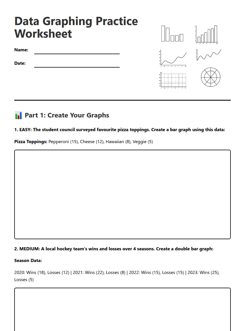
Line Graph: Shows change over time (continuous data).
Bar Graph: Compares distinct categories (discrete
data).
Double Bar Graph: Compares two sets of data across the same
categories.
Circle Graph (Pie Chart): Shows parts of a whole (percentages).
Pictograph: Uses symbols to represent data quantities.
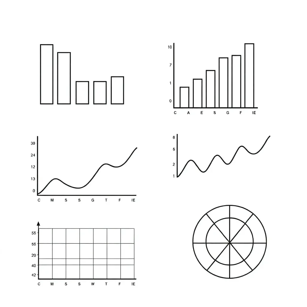
📊 Part 1: Create Your Graphs
Quick Review: Choosing the
Right Graph 📊
Before
you begin, recall which graph suits which type of data. A mismatch makes data
hard to read!
Line Graph: Shows change over time (continuous data).
Bar Graph: Compares distinct categories (discrete data).
Double Bar Graph: Compares two sets of data across the same categories.
Circle Graph (Pie Chart): Shows parts of a whole (percentages).
Pictograph: Uses symbols to represent data quantities.Pizza Toppings: Pepperoni (15), Cheese (12), Hawaiian (8), Veggie (5)
Season Data:
2020: Wins (18), Losses (12) | 2021: Wins (22), Losses (8) | 2022: Wins (15), Losses (15) | 2023: Wins (25), Losses (5)
Daily High Temperatures (°C): Mon (12°), Tue (15°), Wed (18°), Thu (16°), Fri (20°), Sat (22°), Sun (19°)
Survey Results (120 students total): Math (30), Science (36), English (24), Art (18), PE (12)
Circle is divided into 12 equal sections. Each section = 10 students.
Books Read: Class 8A (14 books), Class 8B (18 books), Class 8C (10 books), Class 8D (22 books)
🔍 Part 2: Fix the Misleading Graphs
Peer Feedback: On the bottom rectangle, another group member must review your graph and fix and mistakes
Problem:
Game A: 98 copies | Game B: 100 copies | Game C: 97 copies | Game D: 101 copies
Problem:
Problem: The months are not in chronological order: Mar, Jan, Apr, Feb, Jun, May
Rainfall (mm): Jan (145), Feb (120), Mar (100), Apr (85), May (65), Jun (45)
🎯 Part 3: Graph Selection Challenge
Transportation Data (240 students): Bus (96), Walk (72), Car (48), Bike (24)
Choose the most appropriate graph type and justify your choice below:
About This Worksheet
Free Download
No sign-up, no email, no paywall. Just download and print.
Print-Ready
Formatted for standard paper. Clean layout, easy to read.
AI-Generated
Created with Kuraplan's AI, designed for real classroom use.
For Teachers & Parents
Use in classrooms, for homework, tutoring, or homeschool.
Need a custom version of this worksheet?
Kuraplan's AI generates custom worksheets in seconds — differentiated for every learner, aligned to your curriculum.
Generate Custom Worksheets — Free