You know the moment: the class is halfway through a new concept, a few students are leaning in, and a few more are staring past the board like the lesson is happening somewhere else. That's usually the point where classroom visual aids stop being “nice to have” and start doing real instructional work. A strong visual turns an abstract explanation into something students can point to, compare, label, and remember.
That matters because visuals aren't just decoration. When information is paired with a relevant image, learners can retain about 65% of that information, and 3M research cited in a modern training summary says visuals can enhance the learning experience by up to 400%; a systematic review also found a moderate positive effect on reading comprehension with graphics included, with Hedges' g = 0.39 training summary on visual learning statistics. In other words, the right visual aid can make the difference between hearing a concept once and keeping it.

Why Your Classroom Walls Should Talk
A good classroom wall does more than look organized, it gives students something to think with. Pictorial materials have long been used more extensively than other visual aids in classrooms, and early comparative reporting showed they were used often to instruct 52% of pupils, compared with 27% for another category of visual aids ERIC-hosted report. That older pattern still fits what happens in real classrooms. Teachers need tools that can reach a whole room quickly, especially when the content is new, dense, or loaded with vocabulary.
The strongest classroom visual aids make abstract content concrete. A diagram can show relationships that a spoken explanation hides. A chart can keep steps visible while students work. A labeled image can reduce how much verbal explanation you need in the moment, which matters when students are trying to follow along and process at the same time.
What makes a visual aid useful
A useful visual aid has a clear job. It supports one learning target, stays readable from a distance, and helps students do something with the content, not just look at it. That might mean an anchor chart for a writing process, a number line for comparison, or a cause-and-effect graphic for science. It might also mean a graphic organizer that helps students sort ideas before they write, such as this guide to graphic organizers.
The point is not to cover every blank surface. It is to make the room readable for students. If a visual does not help them notice, remember, or apply information, it is probably just wall coverage.
Practical rule: if a visual takes longer to decode than the teacher's explanation, it is doing too much.
Classroom visual aids also sit between availability and adoption. The historical record shows they were used widely before they were fully standardized in courses of study, which is a useful reminder for school leaders. Teachers often adopt tools because they work in real time, not because policy caught up first ERIC-hosted report.
The Core Types of Classroom Visual Aids
Teachers usually get better results when they choose by purpose, not by format. A poster, a hands-on model, and a slide deck can all teach the same standard, but they don't do it the same way. The right choice depends on whether students need vocabulary support, step-by-step modeling, or active manipulation of ideas.
| Visual Aid Type | Best For | Example |
|---|---|---|
| Printables and posters | Reference, routines, vocabulary | Anchor charts, word walls, infographics |
| Manipulatives and hands-on tools | Concrete understanding, practice | Number lines, base-ten blocks, models, realia |
| Digital and interactive media | Whole-group teaching, guided practice | Slideshows, interactive whiteboard elements, educational videos |
Print and wall-based visuals
Print-based supports work well when students need something they can return to all day. Anchor charts, labels, and word walls keep key ideas visible during independent work. They're especially useful for routines, process steps, and language support.
The trade-off is obvious. Static visuals can become background noise if they're crowded or overused. A wall full of clever design still fails if students can't find the one idea they need.
Hands-on and physical visuals
Manipulatives give students something to move, sort, compare, and build. That matters in early math, science observation, and any lesson where a concrete object helps students understand an abstract idea. A fraction strip or a model cell often teaches more than a paragraph of explanation.
They do take time to manage, though. Materials need distribution, cleanup, and clear routines. When that setup is solid, the payoff is usually worth it.
Digital visuals
Slides, projected diagrams, and video clips are strongest when the teacher wants control over pacing and attention. They're easy to update and useful for showing motion, sequence, or layered information. They also make it simpler to revisit content across classes.
For teachers building visual supports, Kuraplan's graphic organizer guidance fits naturally into this planning process because organizers help match format to learning goal without overloading the page.
Visual Aids in Action Across Subjects and Grades
A first grader sounding out a word and a tenth grader analyzing a map need different visuals, but the logic is the same. The visual should match the developmental demand of the task. Younger students usually need more concrete representations, while older students can handle layered relationships, comparison, and inference.
Early and mid elementary
In early ELA, alphabet charts and picture-supported word walls help students anchor sounds to print. In math, base-ten blocks and number lines make quantity visible before students are ready to reason fluently in symbols. Those tools are simple, but they lower the language load and keep the lesson grounded.
Mid-elementary students often need visuals that stretch into organization. Historical timelines help them sequence events, and plant cell diagrams help them name parts they can't observe directly. These supports move students from “What am I looking at?” to “What matters here?”
Middle school and beyond
Middle school teachers often get the best results with visuals that show process. A writing flowchart can help students structure an essay before they draft. An interactive periodic table lets science content feel less like memorization and more like pattern recognition.
Vocabulary work is another place where visuals earn their keep. In one study, visual aids in English learning tasks led to a 14.69-point mean improvement and a 27.25% pre-test to post-test gain, with gains in motivation, attentiveness, confidence, and recall vocabulary instruction study. That's a strong reminder that the right image doesn't just decorate a term, it helps students retrieve it later.
A visual works best when it earns its place during thinking, not after the thinking is already done.
That pattern holds across subjects. In science, use diagrams to show systems. In social studies, use maps and timelines to show change over time. In ELA, use story maps or sequence charts to help students organize meaning instead of guessing their way through it.
Designing Visuals That Actually Teach
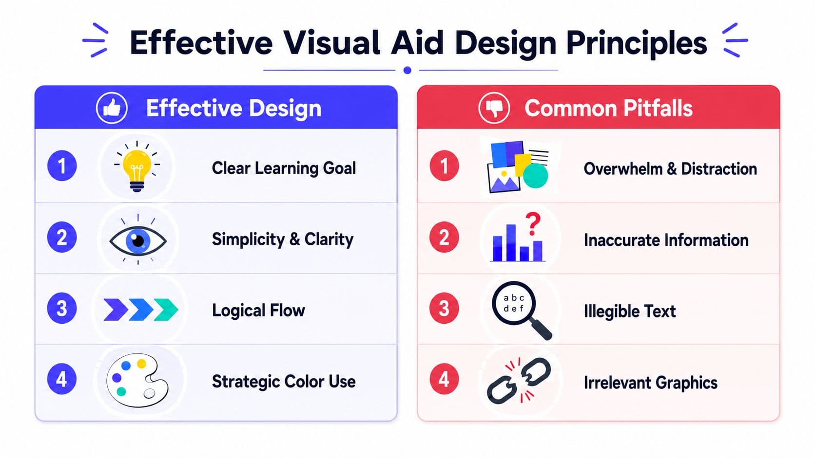
The strongest visuals are usually the least cluttered ones. A design that tries to show everything ends up teaching nothing clearly. Teachers don't need artist-level graphics, they need visuals that guide attention and reduce the amount of working memory students spend sorting through noise.
Keep one idea in focus
A training source on visual aids recommends limiting charts, slides, and diagrams to one or two key points each, and using brief introductions when an aid is lengthy or complex visual aid lesson guidance. That advice lines up with what teachers see every day. When a poster has three objectives, two font styles, five icons, and a busy background, students spend more time decoding the design than using the content.
Make text readable from the back of the room
For digital presentations, the University of Waterloo recommends 32–40 pt font for headings and 24–28 pt for main text, with standard fonts like Times New Roman, Arial, or Helvetica, plus one topic per slide and no distracting backgrounds University of Waterloo CTE. That's a practical standard, not a cosmetic preference. If students can't read it quickly, they can't use it.
Color should help students separate ideas, not entertain them. Use it to group categories, show sequence, or highlight one essential detail. Keep the background quiet so the message stays loud.
For teachers building visuals around an anchor chart or process wall, Kuraplan's anchor chart guidance can be a useful planning reference when the goal is to simplify a concept before it gets turned into a classroom display.
A quick design check
- Clear purpose: The visual supports one target, not three.
- Readable text: Students can read it from a normal classroom distance.
- Logical flow: Eyes move in a predictable direction.
- Limited clutter: No extra clip art competing with the lesson.
- Useful color: Color signals meaning, it doesn't just fill space.
Bringing Visuals to Life in Your Classroom
A visual aid only helps if the teacher teaches with it. Students need a reason to look, a model for how to interpret what they're seeing, and a chance to use the visual in discussion or practice. Without that, even a well-made chart can become wallpaper.
Model how to read the visual
Think-alouds work well here. Point to the diagram, name what you notice, and show how to move from observation to inference. If you're using a science diagram, trace the arrows. If it's a story map, explain how the setting changes the action.
This matters even more for multilingual learners. Visuals are not universally self-explanatory, and their effectiveness increases when they're paired with vocabulary support, home-language text, and culturally familiar references IRIS Center guidance. That's the bridge between “I see the picture” and “I understand the idea.”
Use visuals as part of routine
Anchor charts work best when students help build them, because co-creation gives them ownership of the language and the structure. A class-made chart for adding fractions, revising writing, or using evidence in discussion becomes a reference point students trust.
Visuals also make strong quick checks for understanding. Ask students to point, label, match, or explain what part of the visual supports their answer. That turns the aid into evidence of learning, not just a backdrop.
Useful habit: if students keep asking the same question, make the answer visible before you explain it again.
For inclusive classrooms, choose images that students can recognize and use. Avoid visuals that depend on niche background knowledge. If the example needs a long cultural explanation before the lesson can start, pick a different image.
Creating Custom Visuals Without the Hassle
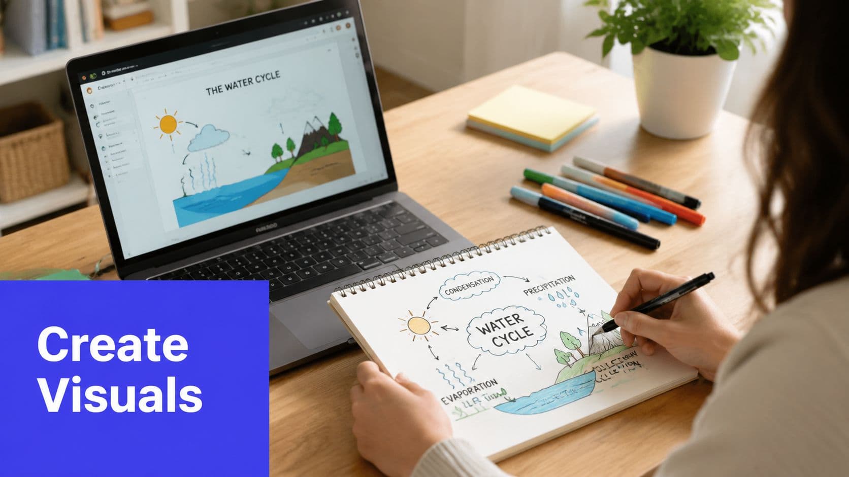
Teachers don't need a full design studio to make strong classroom visual aids. A workable process is enough. Start with the learning goal, sketch the idea roughly, and strip away anything that doesn't help students understand the content faster.
Start simple, then refine
Paper, markers, and chart paper still work. So do whiteboards, sticky notes, and student sketches. The advantage of handmade visuals is speed. You can react to what students need that morning instead of waiting for a polished final version.
Once the sketch works, move it into a cleaner format if you need reuse or printing. That can mean a slide, a shared document, or a printable handout. For teachers who want ready-made classroom materials, Kuraplan's printable posters can save prep time when the lesson needs a clean visual quickly.
Build with a repeatable workflow
- Name the target. Decide what the visual must help students do.
- Choose the format. Poster, diagram, slide, or hands-on model.
- Remove extras. If it doesn't serve the target, cut it.
- Test readability. Step back and check whether the key idea is obvious.
- Use it in instruction. Teach with it, don't just display it.
Digital tools can speed up the same workflow when you need a custom diagram, kid-friendly illustration, or visual-rich worksheet in less time. Kuraplan is one option for that kind of lesson support, especially when the visual has to connect directly to a standards-based objective.
Make Your Instruction Unforgettable
The best classroom visual aids don't make a room look busy, they make thinking easier. They help students see patterns, hold onto vocabulary, and stay with the lesson when the language gets dense or the idea gets abstract. The goal isn't the prettiest classroom on campus, it's the most comprehensible one.
Start with one visual that needs work. Redesign an anchor chart, simplify a slide, or build one diagram that students can use. Then watch what changes in their attention, their answers, and their confidence.
A CTA for Kuraplan.