EnglishFreePrintable

Visual Hierarchy Analysis

A free english worksheet ready for your classroom. Open in Kuraplan to grab the print-ready PDF, customize it for your students, or generate a fresh version in seconds.
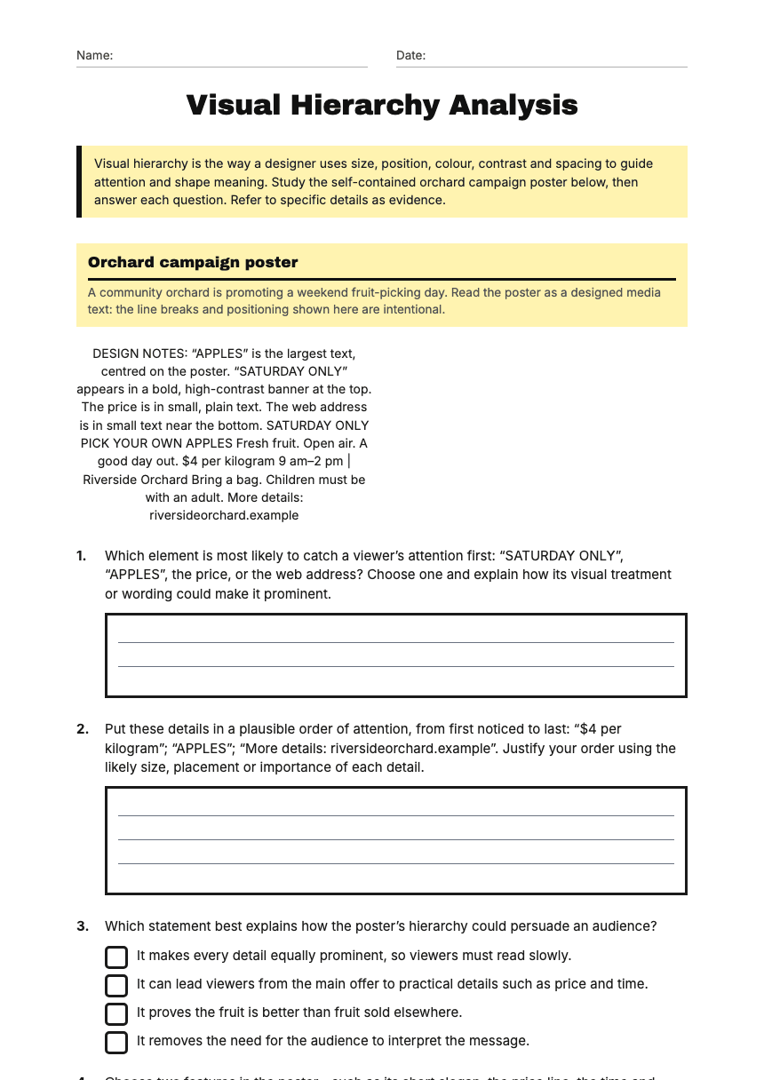
Visual Hierarchy Analysis worksheet preview
Name:Date:

Visual Hierarchy Analysis

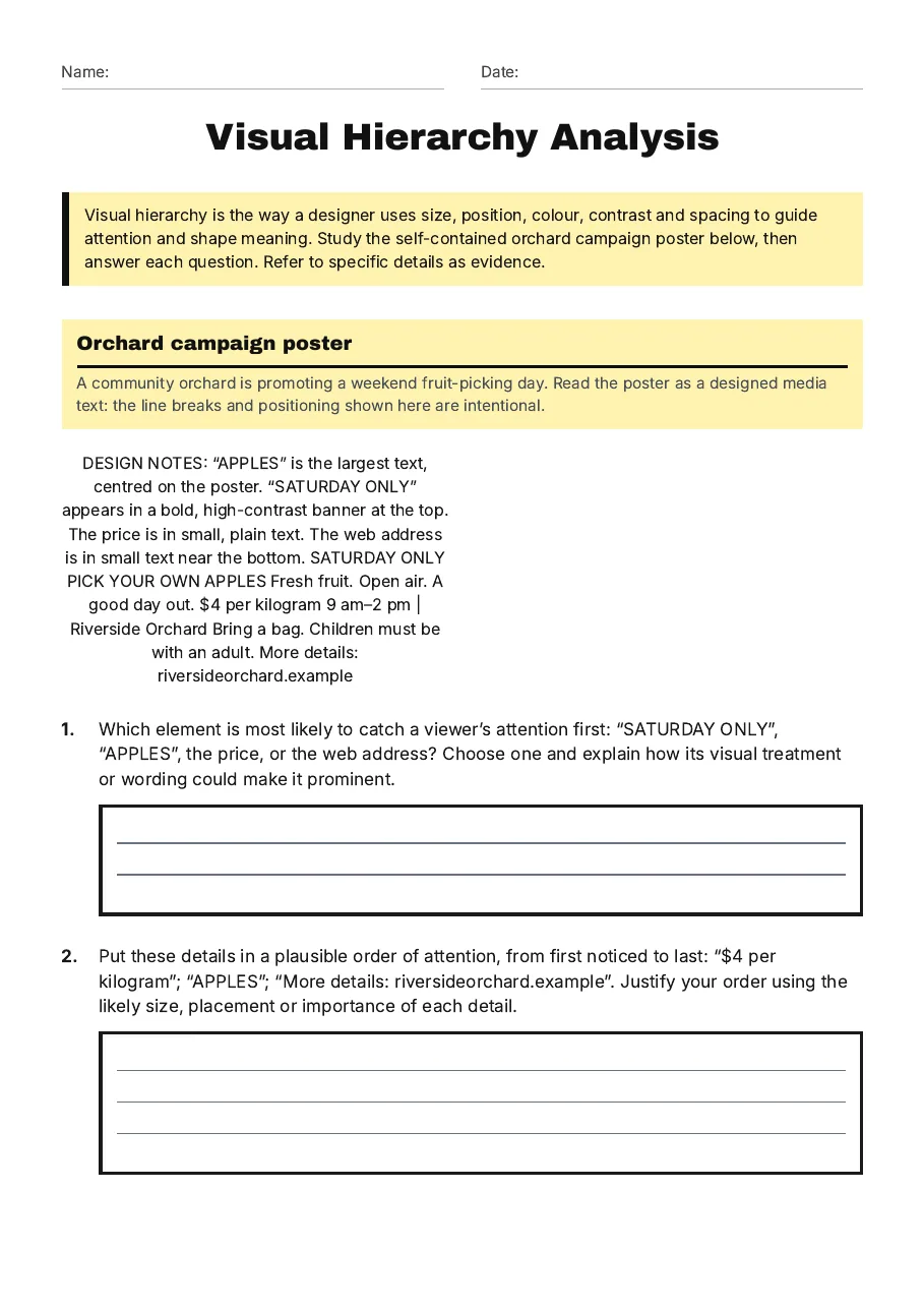
Visual hierarchy is the way a designer uses size, position, colour, contrast and spacing to guide attention and shape meaning. Study the self-contained orchard campaign poster below, then answer each question. Refer to specific details as evidence.

Orchard campaign poster

A community orchard is promoting a weekend fruit-picking day. Read the poster as a designed media text: the line breaks and positioning shown here are intentional.

DESIGN NOTES: “APPLES” is the largest text, centred on the poster. “SATURDAY ONLY” appears in a bold, high-contrast banner at the top. The price is in small, plain text. The web address is in small text near the bottom. SATURDAY ONLY PICK YOUR OWN APPLES Fresh fruit. Open air. A good day out. $4 per kilogram 9 am–2 pm | Riverside Orchard Bring a bag. Children must be with an adult. More details: riversideorchard.example

1.Which element is most likely to catch a viewer’s attention first: “SATURDAY ONLY”, “APPLES”, the price, or the web address? Choose one and explain how its visual treatment or wording could make it prominent.
2.Put these details in a plausible order of attention, from first noticed to last: “$4 per kilogram”; “APPLES”; “More details: riversideorchard.example”. Justify your order using the likely size, placement or importance of each detail.
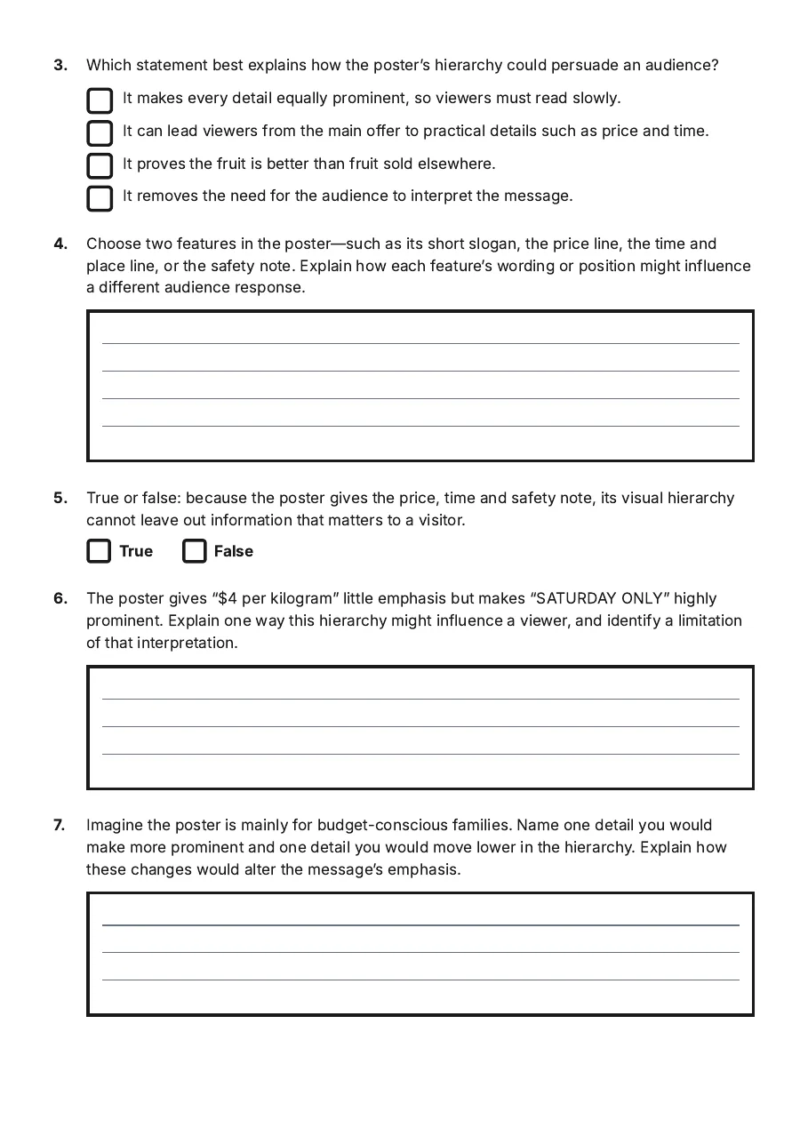
3.Which statement best explains how the poster’s hierarchy could persuade an audience?
  • It makes every detail equally prominent, so viewers must read slowly.
  • It can lead viewers from the main offer to practical details such as price and time.
  • It proves the fruit is better than fruit sold elsewhere.
  • It removes the need for the audience to interpret the message.
4.Choose two features in the poster—such as its short slogan, the price line, the time and place line, or the safety note. Explain how each feature’s wording or position might influence a different audience response.
5.True or false: because the poster gives the price, time and safety note, its visual hierarchy cannot leave out information that matters to a visitor.
TrueFalse
6.The poster gives “$4 per kilogram” little emphasis but makes “SATURDAY ONLY” highly prominent. Explain one way this hierarchy might influence a viewer, and identify a limitation of that interpretation.
7.Imagine the poster is mainly for budget-conscious families. Name one detail you would make more prominent and one detail you would move lower in the hierarchy. Explain how these changes would alter the message’s emphasis.
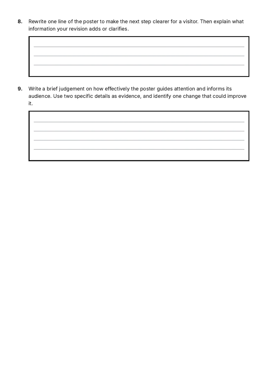
8.Rewrite one line of the poster to make the next step clearer for a visitor. Then explain what information your revision adds or clarifies.
9.Write a brief judgement on how effectively the poster guides attention and informs its audience. Use two specific details as evidence, and identify one change that could improve it.

3 printable pages

  • Visual Hierarchy Analysis, page 1 of 3: Orchard campaign poster

    Page 1

  • Visual Hierarchy Analysis, page 2 of 3: 3. Which statement best explains how the poster’s hierarchy could persuade an audience?

    Page 2

  • Visual Hierarchy Analysis, page 3 of 3: 8. Rewrite one line of the poster to make the next step clearer for a visitor. Then…

    Page 3

About This Worksheet

Free in Kuraplan

Sign up free, grab the PDF, and customize it for your class.

Print-Ready

Formatted for standard paper. Clean layout, easy to read.

AI-Generated

Created with Kuraplan's AI, designed for real classroom use.

For Teachers & Parents

Use in classrooms, for homework, tutoring, or homeschool.

Need a custom version of this worksheet?

Kuraplan's AI generates custom worksheets in seconds — differentiated for every learner, aligned to your curriculum.

Generate Custom Worksheets — Free
No credit card Curriculum-aligned Under 60 seconds