World Population Density — free printable diagram
Free geography resource for teachers · CC BY-NC 4.0
About this illustration
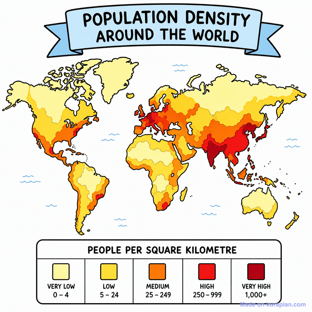
A flat illustration of a world map depicting global population density using a heat map gradient. The map is color-coded from yellow (very low density) to dark red (very high density), with a clear legend at the bottom indicating 'PEOPLE PER SQUARE KILOMETRE' for categories like 'VERY LOW 0-4' to 'VERY HIGH 1,000+'. This resource teaches world geography, population distribution, and data interpretation, suitable for introducing demographics or human settlement patterns. It is ideal for classroom slides, worksheet interpretation tasks, or as a discussion prompt for various grade levels, particularly in social studies or geography curricula.
How to use
- 1Right-click the image and choose “Save image as”, or use the download button.
- 2Use it in your classroom worksheets, slides or printables — free under CC BY-NC 4.0.
- 3Attribute as “Image by Kuraplan” or link back to kuraplan.com. Not for commercial resale.
Make worksheets with images like this
Kuraplan's editor has the full image library built in — drag-and-drop into a worksheet in seconds.
Related illustrations
More from World Maps (Thematic)
Browse by subject
10 subjects · 1,487 free illustrations