You've probably stood in front of a class with a poster, slide, or worksheet that looked polished but didn't help students learn. The colors were bright, the clip art was neat, and the page was full of information, yet students still asked, “What are we supposed to look at?” That's the test of visual learning materials, they should make the important idea easier to notice, easier to explain, and easier to remember.
A strong visual doesn't just decorate the room. It gives students a path into the concept, whether they're comparing, sequencing, labeling, manipulating, or describing. When a visual does that work well, it acts like a scaffold. When it doesn't, it becomes one more thing students have to decode.
Practical rule: if students have to spend most of their attention figuring out the layout, the visual is doing too much and teaching too little.
That's why the best classroom visuals start with the learning goal, not the design. A teacher might draft a lesson objective, worksheet, diagram, or kid-friendly illustration in Kuraplan, then review it for accuracy, age fit, and instructional clarity before using it with students. The quick check is simple, can students tell what matters, how the parts relate, and what they're expected to do?
When a Visual Helps Students Learn
A teacher pins a bright, detailed poster near the board. It has icons, borders, arrows, and a lot of text. Students glance at it, but their eyes move in too many directions, and the main idea gets lost. A visual can look polished and still miss the point.
The useful question is simple. Does this visual help students think? A visual helps when it makes a relationship obvious, shows a sequence, or cuts down the work of finding the important part. If students have to spend their attention sorting through the design first, the visual is getting in the way of instruction.
A simple classroom test
Before you use any visual, pause and check three things.
- What matters most here? Students should be able to point to the main idea quickly.
- How do the parts connect? The layout should show relationships, not bury them.
- What should students do with it? They should know whether to label, compare, explain, sort, or solve.
That check works for a science diagram, a math model, a reading anchor chart, or a slide for discussion. It also helps you decide when to strip away extra detail. A visual should not make students do extra decoding before the lesson starts.
Here is the next question to ask. Does the visual keep the learning goal intact while making the work easier to enter? A class can still work toward the same objective with a clearer image, fewer labels, or a different route into the idea. In that case, the visual is not the lesson itself. It is the route that helps students get to the lesson with less confusion.
Understanding Visual Learning Materials
Visual learning materials are instructional resources that use diagrams, images, spatial arrangement, objects, or motion to make an idea easier to understand. That includes far more than posters. It includes a labeled water-cycle diagram, a history timeline, a fraction model, a short demonstration video, a graphic organizer, and a worksheet with purposeful images.
The key is function. A visual is useful when it helps a learner notice something, compare something, or follow a process. A pretty illustration that doesn't do any of that is just decoration.
Match the representation to the task
The IRIS Center describes a clear progression in mathematics from concrete to representational to abstract. A student may first handle objects, then look at pictures of those objects, then use symbols and equations. That sequence matters because it gives students a bridge from touching an idea to thinking about it symbolically. IRIS Center guidance on concrete, representational, and abstract levels
That same logic applies across subjects. A plant's life cycle might appear as a sequence diagram in science, a timeline in social studies, or a cycle organizer in reading. The format changes because the thinking changes. The goal is always to choose the representation that makes the task clearer.
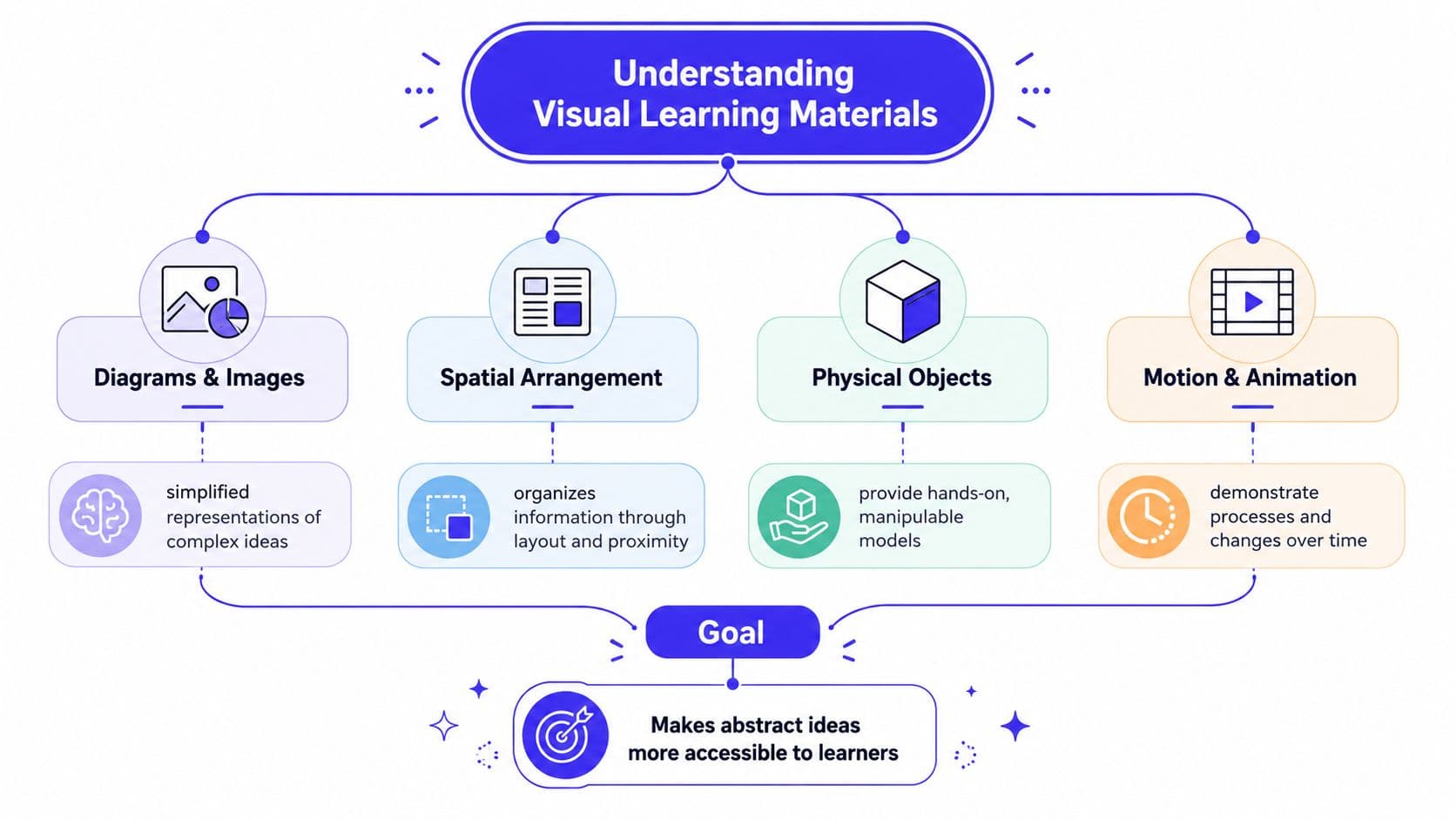
A useful habit is to classify visuals by what students do with them. Some visuals help students identify parts. Some help them sequence events. Some help them compare or manipulate ideas. Once you look at materials this way, you stop asking for “a visual” in general and start asking for the right visual for the job.
Choosing the Right Visual Format
The easiest way to choose a format is to ask what students need to notice, manipulate, remember, or explain. A diagram, infographic, worksheet, manipulative, video, and graphic organizer all look different, but they each do a different kind of teaching work.
| Material | Best suited for | Typical classroom use |
|---|---|---|
| Diagram | Parts and relationships | Labeling the water cycle, showing body systems |
| Infographic | A small set of connected ideas | Summarizing a topic before discussion |
| Illustrated worksheet | Guided practice | Sorting, matching, sequencing, or short responses |
| Manipulative | Physical testing of ideas | Fractions, place value, geometry, algebra tiles |
| Video | Process and change over time | Science demonstrations, procedures, experiments |
| Graphic organizer | Comparing, sequencing, categorizing, connecting | Cause and effect, timelines, Venn-style thinking |
A diagram works well when students need to see structure. A plant or animal system makes more sense when the parts are named and placed in relation to one another. It becomes less effective if the page is packed with extra detail that pulls attention away from the key relationships.
An infographic is better when you want to summarize a limited amount of information in a compact form. It can help students preview a unit or recall key vocabulary, but it loses impact if it tries to cover too much at once. A crowded infographic is just a poster with a design problem.
An illustrated worksheet pairs guidance with practice. Students might cut and sort steps, match labels, or annotate a picture. It works best when the task is small and focused. It is less useful when students need deep explanation, because a worksheet can't carry every kind of thinking.
Manipulatives make abstract relationships physically testable. A student can move pieces, regroup them, and try ideas out in front of them. That tactile step matters for concepts like equivalence, composition, and decomposition. If the task is mostly about watching a process, though, a manipulative may slow things down without adding clarity.
Videos are strongest when students need to see motion, transformation, or procedure. A short clip can show a science reaction or a math strategy in a way a still image cannot. The risk is passive viewing, so a video should come with a prompt, pause point, or quick response task.
Graphic organizers help students compare, sequence, categorize, or connect ideas. They're especially useful when the thinking itself is the lesson. If the organizer is too open-ended or too visually busy, students can spend more time filling boxes than understanding the concept.
For teachers building from a lesson objective, Kuraplan can generate curriculum-aligned worksheets and custom diagrams or kid-friendly illustrations that match the target. For physical models, a separate design reference such as AI-assisted texturing tips can be useful when the model itself needs clearer surface detail or more readable visual cues.
How Visual Learning Supports K–12 Learners
A teacher projects a diagram, and half the class relaxes because the relationship finally has a shape. Another student still looks uncertain, not because the idea is beyond reach, but because the visual is doing too much at once. That difference matters. Visual learning materials help most when they reduce the work students have to hold in mind, point attention to the right detail, and give language a place to attach.
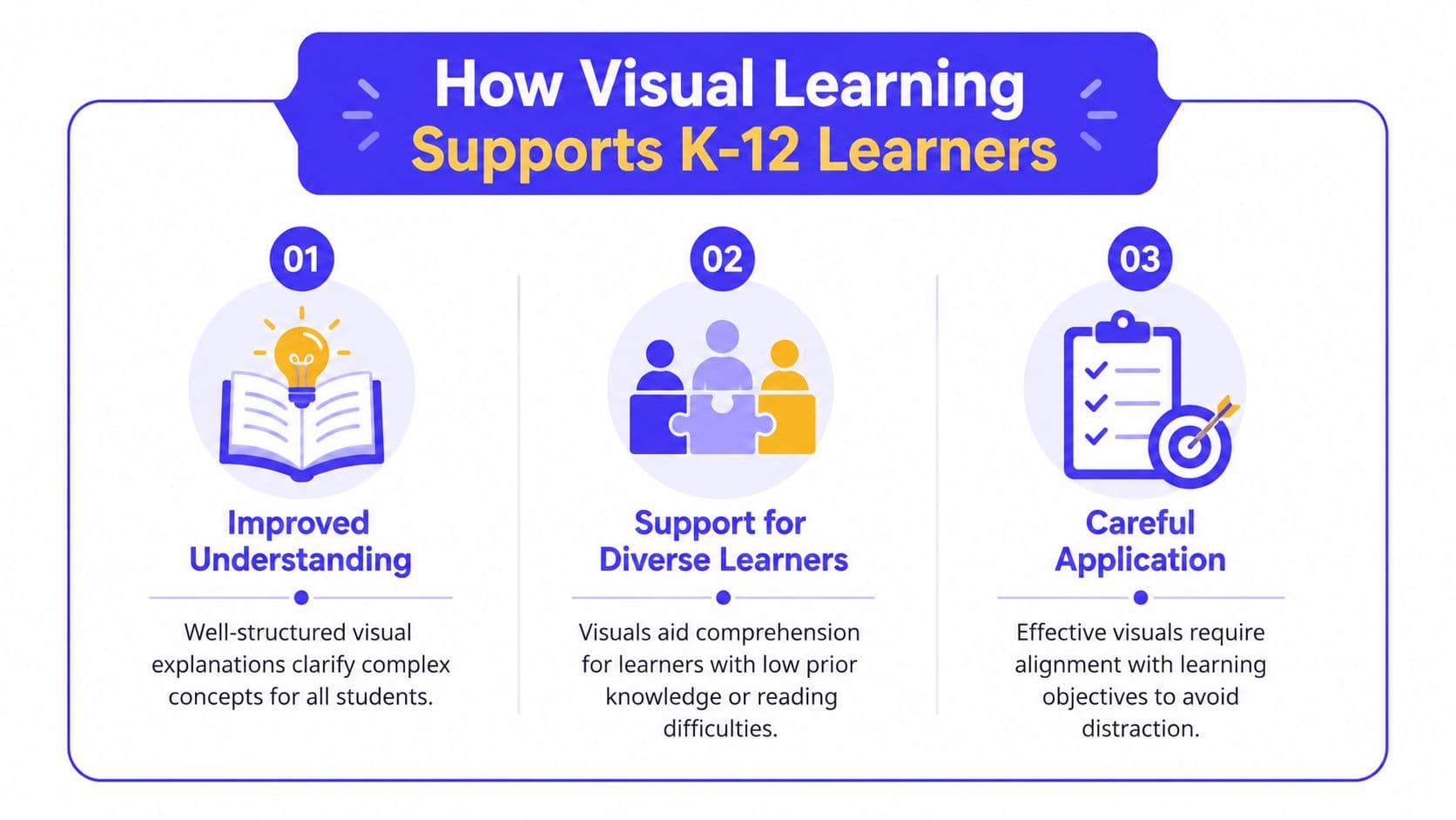
The strongest evidence in the brief points to a careful conclusion. Well-structured visual explanations can improve learning, including for learners with low spatial ability PN lesson on visual aids, and visual cues can improve performance when they direct attention to the right part of a task Edutopia on visual cues. That does not mean every visual helps, and it does not mean students should be sorted into fixed “visual learner” categories.
The smarter interpretation is simpler. A good visual lowers the amount of searching students must do, keeps the parts of a task organized, and gives them a structure to think with. That is why a labeled diagram helps when students need to explain a process, a sequence chart helps when they need to retell events in order, and a clean model helps when they need to connect a word with an idea. The visual is not the lesson by itself. It is the support that makes the lesson easier to hold.
Visuals also matter for language development. When a student sees a word beside a picture, a chart, or a step-by-step model, the meaning has two paths into memory instead of one. That helps English learners, but it also helps any child who is still building academic vocabulary. A science term on a board can feel abstract on its own. Put it next to a labeled image or a simple process map, and the word has a job to do.
That is where teachers often see a small but important shift. A student who could not explain a term from the textbook may point to a visual and use the term in a sentence. Another student may compare two objects more accurately because the visual keeps both ideas in view at the same time. The aim is not just to make the room look clearer. It is to make the thinking easier to start.
Quick check: if a visual helps students answer a question faster, explain a process more clearly, or find the right relationship without extra searching, it is probably earning its place.
The same idea helps with accessibility. Some students need the information laid out in a way that reduces strain. Others need the visual simplified so the important part stands out. A strong visual is like a well-marked path, it guides students without making them stop and guess where to step.
Avoid these common mistakes:
- Treating design as learning: A polished image can still be confusing.
- Assuming a visual learner label explains everything: Students use different supports depending on the task.
- Choosing digital over print by default: Sometimes a physical model or paper diagram is the clearer option.
- Adding visual clutter for interest: Extra decoration often competes with the lesson.
Designing Visuals That Reduce Mental Work
Good design starts with editing, not decorating. First, decide what students must understand or do. Then cut the visual down to one or two main ideas so the page doesn't become a search task. Oklahoma State University's teacher guidance is blunt about this, if there are several points, use more than one visual, keep visuals simple, and use few words with short phrases rather than full sentences Oklahoma State visual guidance.
A before and after mindset
A crowded slide might show a paragraph, clip art, multiple arrows, and six labels. A focused diagram might show one process, three labels, and one clear callout. The second version gives students a better chance to spend their attention on the concept instead of the layout.
One-or-two-idea rule: if a visual asks students to notice more than a couple of key points at once, it probably needs to be split into separate supports.
The design details matter more than people think. Place labels next to the thing they name. Align related elements consistently. Use readable standard fonts. Add arrows, circles, or callouts only when they improve interpretation. The goal is to signal importance, not create noise.
A simple review sequence helps before you distribute anything:
- Check the objective. Does the visual match what students are supposed to learn?
- Check the load. Is there anything decorative that doesn't teach?
- Check the labels. Can students match words to the right parts quickly?
- Check the complexity. Is the level right for the age, subject, and time you have?
- Check the task. Do students know what action the visual supports?
That routine works for posters, slides, directions, and handouts. It also helps when you're adapting the same content for different grade levels. Younger students may need fewer labels and stronger cues. Older students may need a cleaner layout with more space for interpretation.
For teachers who want a structured organizer to build from, the graphic organizers guide can be useful when planning sequence, compare-and-contrast, or category-based tasks.
Building an Inclusive Visual Learning Environment
Accessibility belongs in the first draft, not the cleanup stage. If a visual only works for students who can see it clearly and process it quickly, it leaves too many learners out. The brief points to supports that often need to travel with the visual, including braille, large print, tactile maps, adapted science kits, audio, and digital resources visual supports for learners with visual impairments.
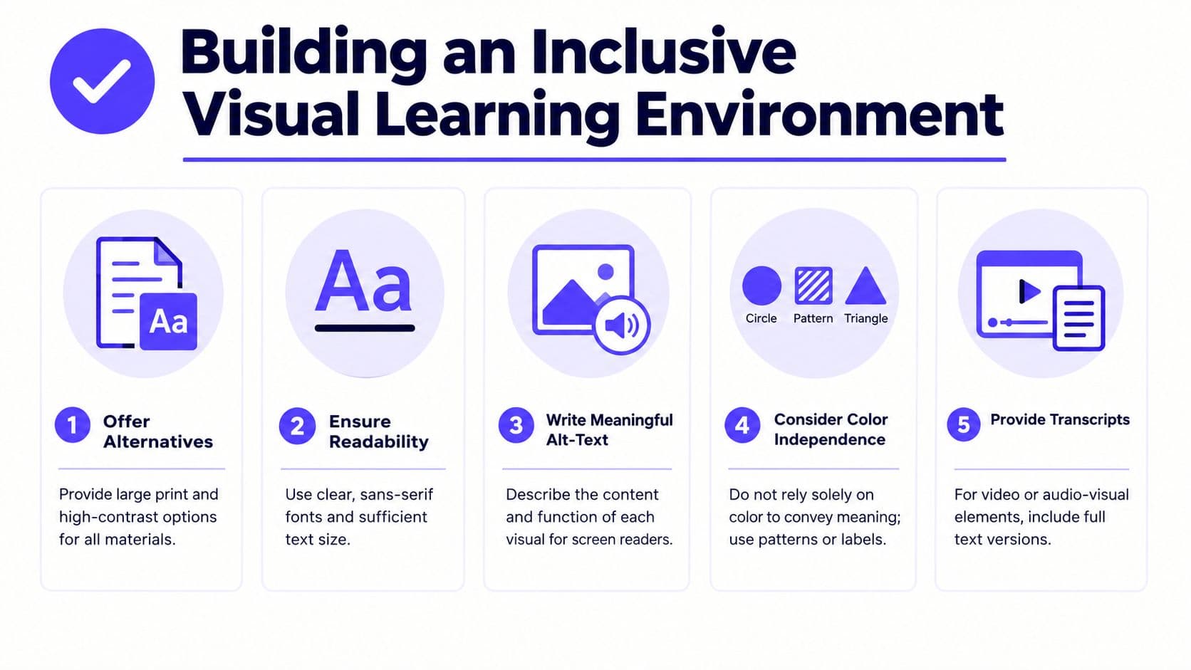
A good inclusive practice is to ask how the same concept can be reached through different routes. For one student, that might mean a large-print diagram. For another, it might mean a tactile version. For another, it might mean audio description plus a verbal explanation. The objective stays the same, but the access route changes.
Questions to ask before you hand out a visual
- Can every student read it? Use clear fonts, enough spacing, and high contrast.
- Does color carry the only meaning? If yes, add labels, patterns, or symbols.
- Can a screen reader make sense of it? Add meaningful alt text or image descriptions for digital materials.
- Is there a nonvisual version? Offer text, audio, tactile, or verbal support when needed.
- Does the language match the learner? Pair the visual with vocabulary cards, gestures, and structured talk.
Differentiation can also happen inside the visual itself. You can reduce the amount of information, simplify the language, add models for annotation, or give students different ways to show understanding. Some students will describe the image. Some will sort it. Some will use it to answer a question. Those are different access points, not different expectations.
Kuraplan can help generate age-appropriate images and differentiated worksheets for this kind of planning, but the teacher still has to review the output for clarity, accuracy, cultural responsiveness, and accessibility. The important point is that accessibility changes the route, not the standard.
Adapting Examples for Your Classroom
A workable adaptation frame keeps the planning tight: identify the learning target, choose the representation, provide an action students can perform, and add evidence of understanding. Once you have that frame, the same topic can become very different materials for different ages and subjects.
A primary science example might use a simple labeled diagram with arrows. The purpose is to name parts and show direction. The student action is to trace, point, or label. The evidence might be a completed diagram or a quick oral explanation.
A middle-school math lesson might use a graphic organizer for comparing fractions. The purpose is to make differences visible. The student action is to sort, compare, and justify. The evidence could be a written comparison or a completed organizer.
A secondary history timeline can help students place events in order and notice overlap. The student action is sequencing and connecting. The evidence might be a short explanation of cause and effect.
An illustrated worksheet works well for sequencing a process in science or ELA. The purpose is guided practice. The student action is cutting, matching, or numbering steps. The evidence is the finished sequence and a sentence about why the order matters.
A manipulative activity using physical objects gives students a way to test relationships with their hands. The purpose is to make an abstract idea concrete. The student action is moving, regrouping, or building. The evidence might be a teacher observation or a student explanation of what changed.
A short video prompt with a pause-and-predict question is useful when students need to notice change over time. The purpose is to focus attention on process. The student action is to predict, watch, and revise. The evidence is the prediction and the explanation after viewing.
A simple template teachers can copy:
- Objective
- Key idea
- Visual type
- Labels or callouts
- Accessibility option
- Check-for-understanding prompt
That template keeps the visual tied to instruction instead of turning it into a loose add-on. If you need a standards-aligned worksheet, visual, or differentiated question set quickly, Kuraplan can generate one from a lesson objective, but the teacher still needs to trim, adjust, and verify the final version.
Assessing the Learning Behind the Visual
A visual only matters if it changes how students understand the idea. Looking at it is not enough. Students have to do something with it. A diagram, chart, organizer, or short video becomes useful when it leads to matching, sequencing, labeling, explaining, predicting, or revising. Those actions show whether the visual helped students think.
The weaker evidence is easy to miss. “They seemed engaged” sounds positive, but it does not show whether the visual improved comprehension. A completed organizer, an annotated diagram, a short explanation, or an exit response gives you something concrete to review. In a classroom, that might look like a student pointing to a labeled arrow on a diagram and explaining why it belongs there, or fixing a sequence after a partner conversation.
Formative assessment examples for visual materials can help when you are designing quick checks that match a diagram, organizer, or worksheet. The point is to ask for evidence that fits the visual, not a generic response that only shows students were present.
A simple decision loop
- Define the target. What should students understand?
- Choose the visual. Which format matches the thinking?
- Use it during instruction. Do not save it for decoration.
- Collect evidence. Ask students to explain, label, predict, compare, or correct.
- Revise the material. Simplify, relabel, or switch formats if the evidence is weak.
That loop keeps the focus on learning rather than appearance. It also helps you adapt the same resource for different learners by changing the scaffold, not the goal. A student who struggles with a process diagram in science may need fewer labels and more direct callouts. A student who needs support in math may need a more concrete representation before moving to symbols. A student working on English language development may need a comparison organizer with vocabulary support and sentence frames.
The research in the brief points to one more important reminder. Visual explanations can be especially helpful for learners with low spatial ability visual explanation research, and they often need labeled diagrams more than abstract ones. A bare sketch can leave those students guessing, while a version with arrows, labels, and short callouts gives them a path through the idea. That is why the check-for-understanding step matters so much. The same image can help one student and confuse another if the labels, contrast, or amount of detail are not right.
Keep the framework simple: one clear purpose, one or two ideas, meaningful action, an accessible route, and a check for understanding. If a visual cannot meet that standard, revise it before it goes back in front of students.