Advanced Graph Interpretation Worksheet
A free maths worksheet ready for your classroom. Open in Kuraplan to grab the print-ready PDF, customize it for your students, or generate a fresh version in seconds.
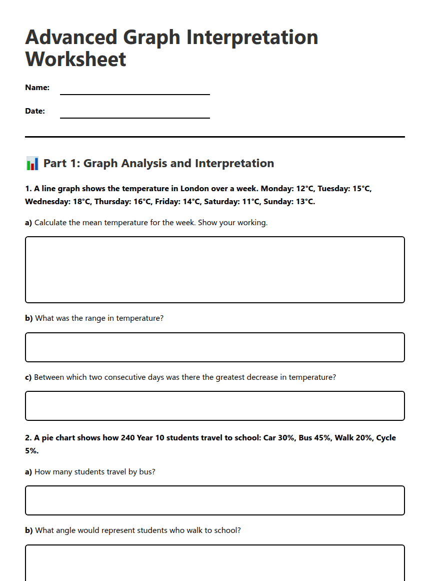
Advanced Graph Interpretation Worksheet
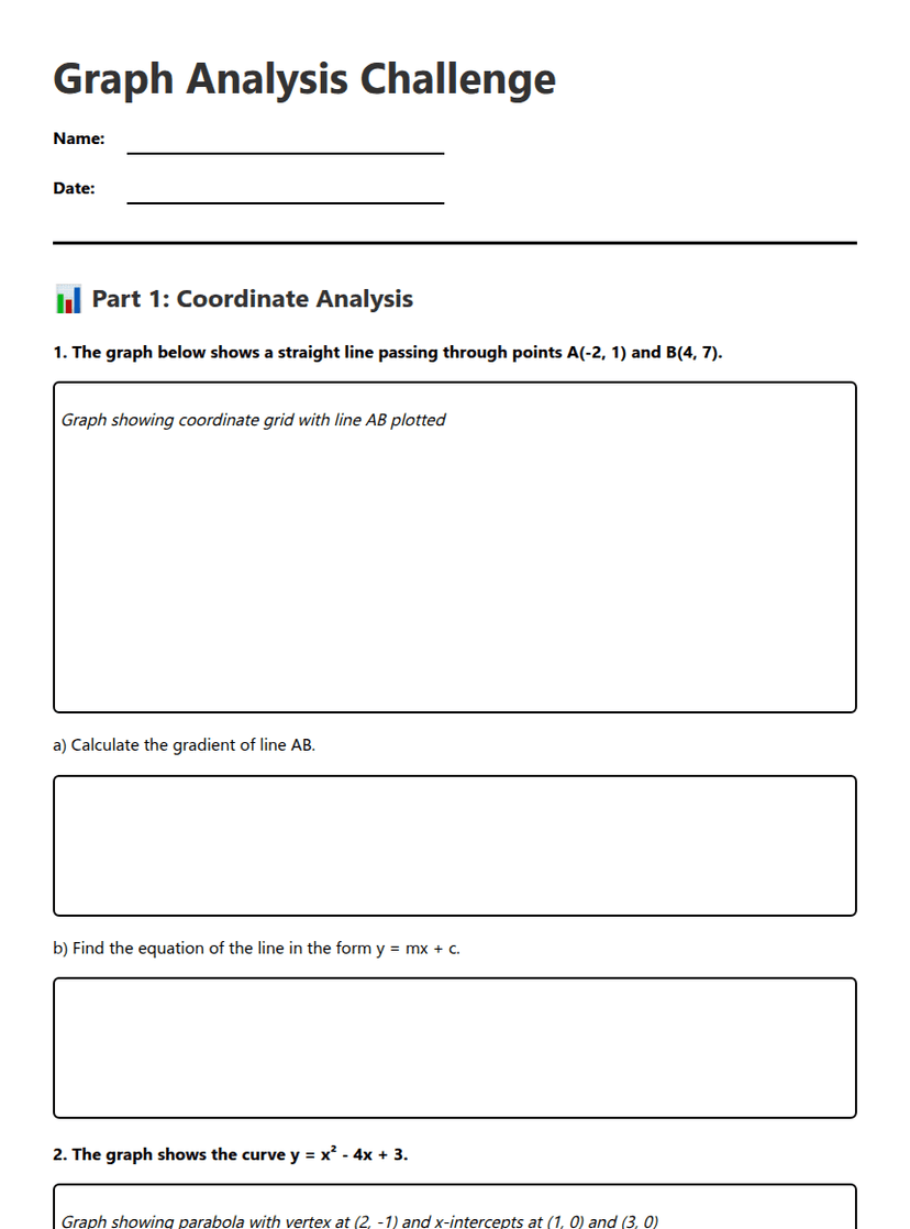
📊 Part 1: Graph Analysis and Interpretation
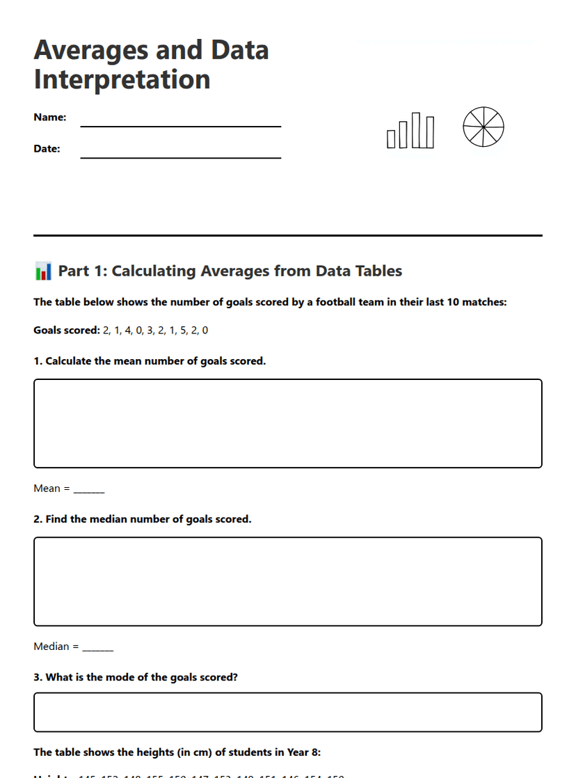
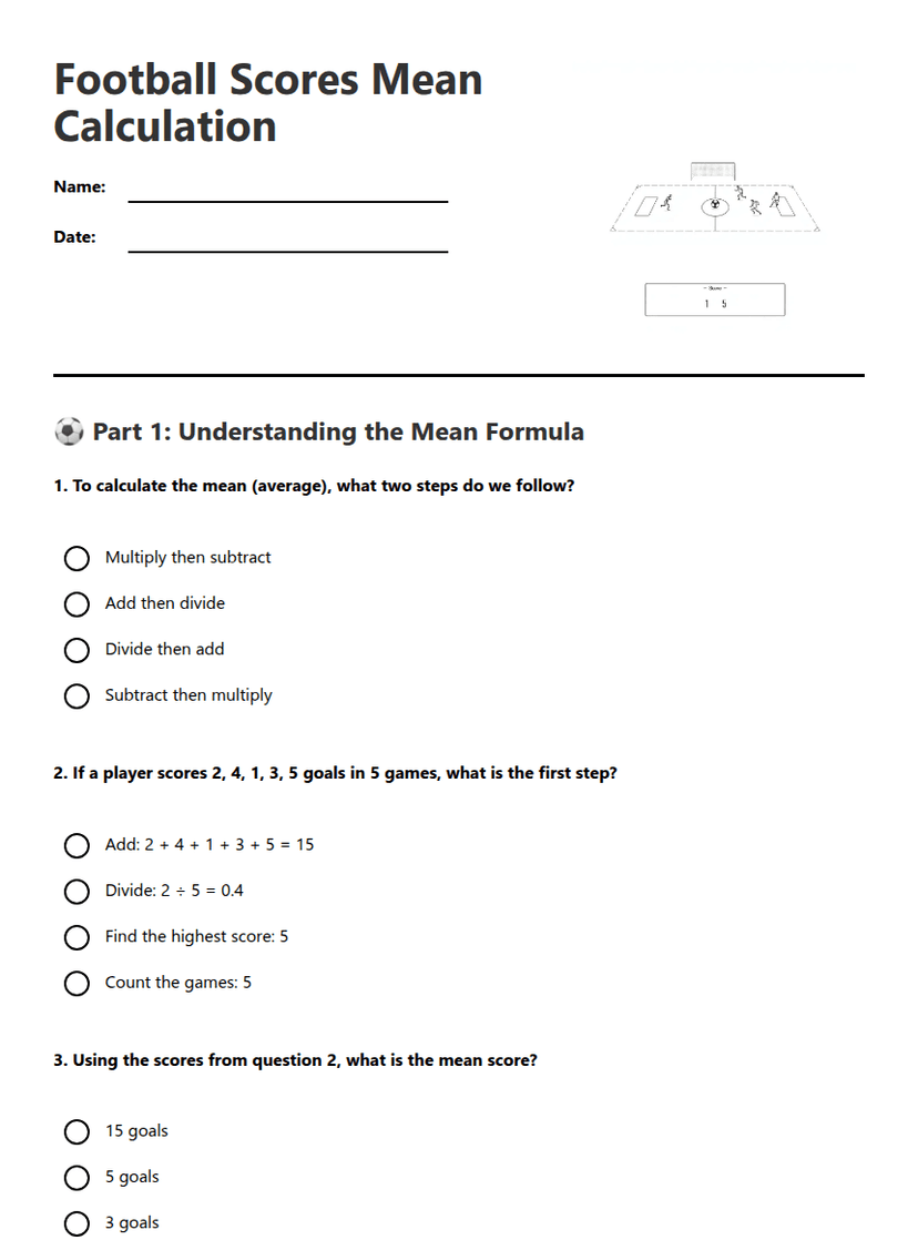
a) Calculate the mean temperature for the week. Show your working.
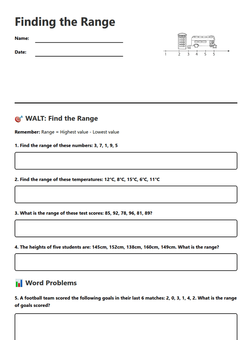
b) What was the range in temperature?
c) Between which two consecutive days was there the greatest decrease in temperature?
a) How many students travel by bus?
b) What angle would represent students who walk to school?
c) If 12 more students started cycling to school, what would be the new percentage of students who cycle? (Assume total number of students remains 240)
📈 Part 2: Trend Analysis and Comparison
Manchester: Jan: 80mm, Feb: 65mm, Mar: 70mm, Apr: 55mm, May: 45mm, Jun: 40mm
Brighton: Jan: 60mm, Feb: 50mm, Mar: 45mm, Apr: 35mm, May: 30mm, Jun: 25mm
a) Which city had more consistent rainfall? Justify your answer using range calculations.
b) Calculate the percentage decrease in rainfall from January to June for Manchester.
c) Describe the overall trend shown by both cities and suggest a possible reason.
a) Calculate the value of each investment after 3 years.
b) In which year will Investment A first exceed Investment B in value?
c) Explain why Investment A eventually becomes more valuable despite starting with less money.
🎯 Part 3: Graph Construction and Interpretation
Maths: 54 students, Science: 45 students, English: 36 students, History: 27 students, Art: 18 students
a) Draw a pie chart to represent this data. Calculate the angle for each sector first.
b) If this data were presented as a bar chart instead, what would be the advantages and disadvantages compared to the pie chart?
About This Worksheet
Free in Kuraplan
Sign up free, grab the PDF, and customize it for your class.
Print-Ready
Formatted for standard paper. Clean layout, easy to read.
AI-Generated
Created with Kuraplan's AI, designed for real classroom use.
For Teachers & Parents
Use in classrooms, for homework, tutoring, or homeschool.
Need a custom version of this worksheet?
Kuraplan's AI generates custom worksheets in seconds — differentiated for every learner, aligned to your curriculum.
Generate Custom Worksheets — Free