
Biology Data Visualization and Graphs
Understanding Graph Types in Scientific Research Year 11 Biology 60-minute lesson
Why Do Scientists Use Graphs?
Transform complex data into visual stories Identify patterns and trends in biological phenomena Communicate research findings effectively Make predictions based on data analysis Compare different experimental conditions
Five Essential Graph Types in Biology

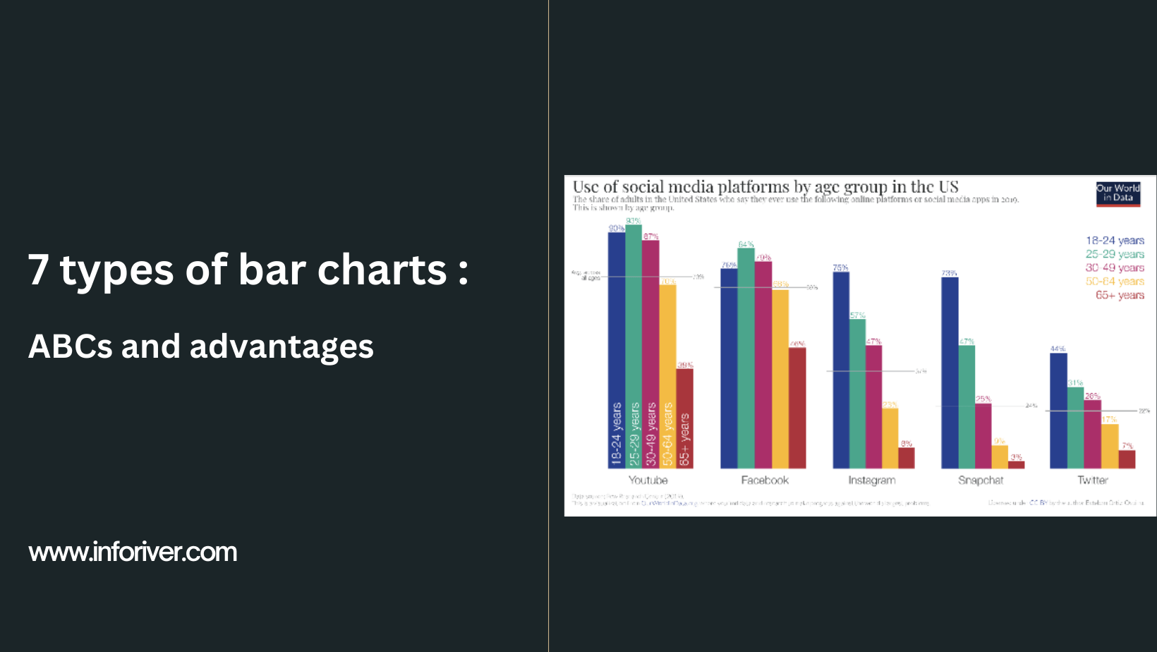
Bar Graphs: Comparing Categories
Compare different groups or categories Show discrete data with clear separation Perfect for experimental comparisons Examples: Plant growth under different fertilizers Key features: Separated bars, categorical x-axis
Line Graphs: Tracking Change Over Time
Show how variables change continuously Perfect for time-series biological data Reveal trends and patterns Examples: Population growth, enzyme activity vs temperature Key features: Connected data points, continuous variables

Graph Matching Challenge
Work in groups of 4-5 students Match biological data sets to appropriate graph types Justify your choices with scientific reasoning Present findings to the class Consider: What story does each graph type tell?

Scatter Plots vs Histograms
{"left":"Scatter Plots: Show relationships between two variables\nPerfect for correlation studies\nExample: Height vs arm span in humans","right":"Histograms: Show frequency distributions\nDisplay how often values occur\nExample: Distribution of bird beak lengths"}
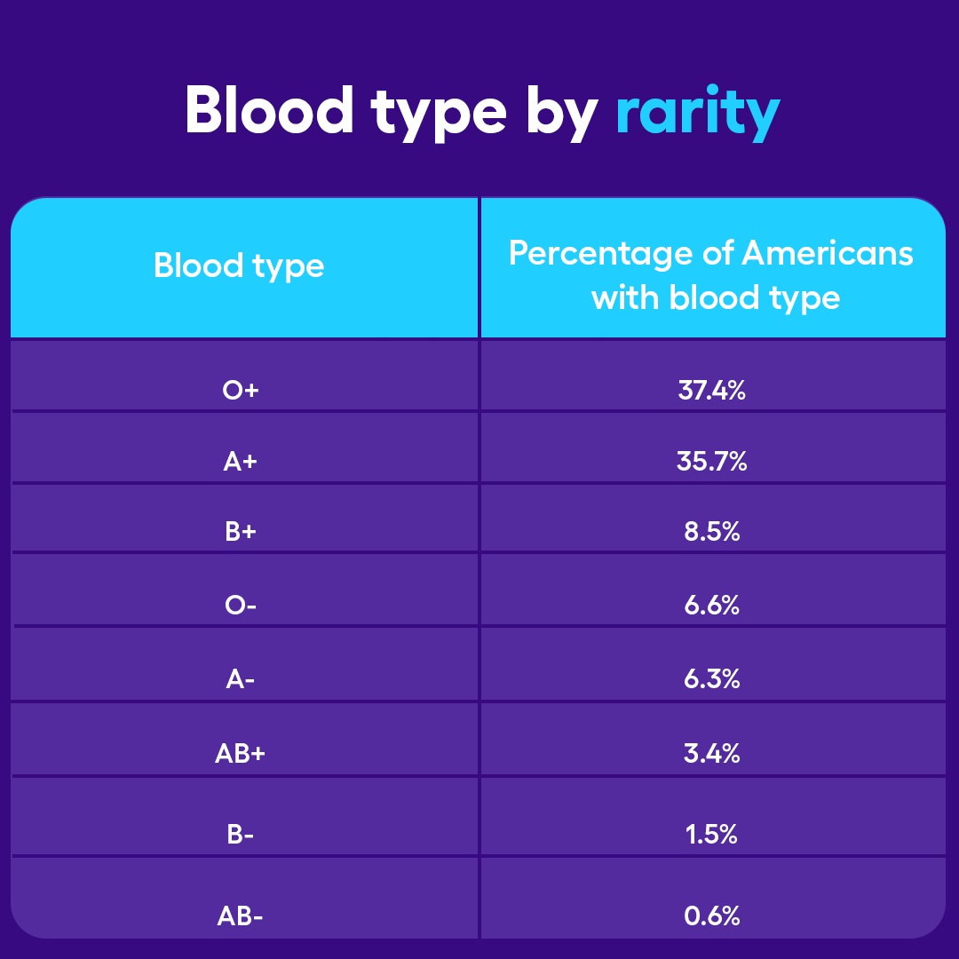
Quick Check: Which Graph Would You Choose?
A researcher wants to show the percentage of different blood types in a population Students measured the effect of light intensity on photosynthesis rate A study tracked the number of monarch butterflies migrating each year for 20 years Scientists recorded the body mass of 100 adult penguins