
Excel Data Storytelling for Beginners
Grade 7 Technology Ms. Kenya Akins John R. Griffin Middle School
Data Detective Challenge
Look at these two examples: Which tells the story better? Why do you think charts are more powerful than tables?
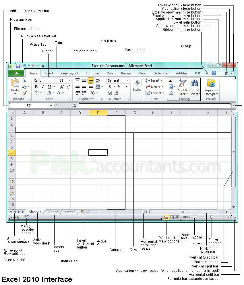
Excel Table Anatomy
Cells: Individual boxes where data lives Header Row: Column titles at the top Sort & Filter: Organize data instantly Navigation: Click, type, and move around
Chart Types: When to Use What
{"left":"Bar Charts: Compare different categories (like favorite snacks)\nLine Charts: Show changes over time (like temperature)","right":"Pie Charts: Show parts of a whole (like class vote percentages)"}

Guided Practice: Snack Vote Data
Step 1: Enter snack data into Excel table Step 2: Format with bold headers Step 3: Apply filters to columns Step 4: Create a bar chart together
Independent Lab: Create Your Data Story
Choose your own small dataset Ideas: favorite sports, pets, colors, hobbies Create a formatted table Generate 1-2 appropriate charts Be ready to explain your chart choice!

Chart Selection Guide

Data Storytelling Success!
'I can create charts that tell meaningful stories with data' Share your chart with a partner Explain why you chose your chart type Complete exit ticket: When would you use each chart?