Graphs and Data Visualization
A free maths worksheet ready for your classroom. Open in Kuraplan to grab the print-ready PDF, customize it for your students, or generate a fresh version in seconds.
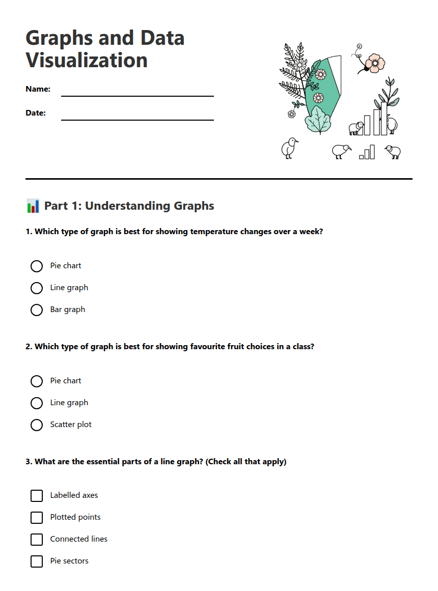
Graphs and Data Visualization

📊 Part 1: Understanding Graphs
📈 Part 2: Interpreting Data
Monday: 18°C, Tuesday: 20°C, Wednesday: 22°C, Thursday: 19°C, Friday: 16°C
a) What was the highest temperature? ________°C
b) On which day did the temperature drop the most? ___________
c) What pattern do you notice in the temperature changes?
a) How many students were surveyed in total? _______ students
b) What fraction of students chose apples? _______
c) Which fruit was least popular? ___________
✏️ Part 3: Creating Graphs
Remember to: label your axes, plot points accurately, connect points with lines
Calculate what fraction of the circle each fruit should take:
Apples: _____ out of _____ = _____
Bananas: _____ out of _____ = _____
Oranges: _____ out of _____ = _____
Grapes: _____ out of _____ = _____
About This Worksheet
Free in Kuraplan
Sign up free, grab the PDF, and customize it for your class.
Print-Ready
Formatted for standard paper. Clean layout, easy to read.
AI-Generated
Created with Kuraplan's AI, designed for real classroom use.
For Teachers & Parents
Use in classrooms, for homework, tutoring, or homeschool.
Need a custom version of this worksheet?
Kuraplan's AI generates custom worksheets in seconds — differentiated for every learner, aligned to your curriculum.
Generate Custom Worksheets — Free






