Some lessons fall apart in the exact same way. You explain clearly, you check for understanding, you ask a student to restate the idea, and the room still looks foggy. That usually isn't a sign that your content is weak. It often means the format isn't doing enough work.
In busy classrooms, visual aids for teaching aren't decoration. They're part of how students access the lesson in the first place. A sketch on the board can reveal a math pattern that five minutes of talking didn't. A timeline can make a historical sequence click. A simple diagram can turn a science explanation from abstract into manageable.
What matters most is not just using visuals more often. It's using them with purpose, teaching students how to read them, and knowing when a visual helps one learner but overwhelms another. That's where the essence of classroom craft resides.
That Moment When the Lesson Just Isn't Landing
You know the moment. You're halfway through explaining equivalent fractions, the examples are solid, and a few students are tracking. Then you scan the room and catch the same signs every teacher recognizes. Tight shoulders. Blank notebooks. Eyes drifting to the window.
I've seen it in every grade band. In elementary, it's often a concept that's too invisible, like place value or a character's motivation. In middle school, it's the jump from concrete to abstract. In high school, it's when students can repeat words from the textbook but still can't organize the idea in their minds.
The frustrating part is that you may already be teaching well. The problem is that spoken explanation alone asks students to hold too much in working memory at once. Some can do it. Many can't.
A quick visual often changes the room faster than another verbal rephrase. Draw the fraction model. Map the causes of the war on the board. Sketch the water cycle with arrows. Suddenly students have something to anchor their thinking to.
Why the shift matters
Research in a study on visual supports found that visual senses contribute to approximately 90% of all human learning, and that incorporating visual supports increased academic performance by five to ten percent in the observed students, highlighting their instructional value in the study summary here.
That lines up with what classrooms feel like in real time. Students who looked lost often aren't refusing to learn. They need the concept made visible.
When a lesson stalls, I stop adding words first. I ask what students need to see.
What that looks like on an ordinary school day
A visual doesn't have to be polished.
- For math: a number line, base-ten sketch, tape diagram, or color-coded steps
- For reading: a character map, plot arc, or text structure chart
- For science: labeled diagrams, process arrows, or compare-and-contrast tables
- For behavior and routines: picture cues, sequence cards, and posted exemplars
Those small shifts reduce confusion before it spreads. They also help students who know more than they can currently explain.
Why Visuals Are a Pedagogical Superpower
There's a reason visuals work so consistently across subjects. They shorten the distance between explanation and understanding. Instead of asking students to build a mental model from words alone, visuals give them the model.
Research has shown that incorporating visual aids can improve learning by up to 400%, that humans process visual information 60,000 times faster than text, and that recall after three days rises to 65% with visuals compared with 10% with auditory learning alone according to this education report.
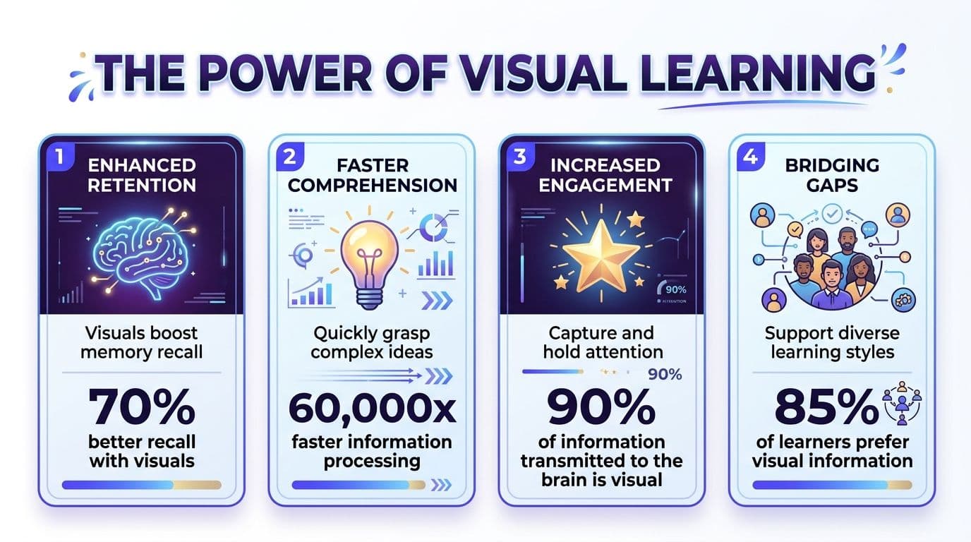
Those numbers explain a lot of what teachers already notice. Students don't just enjoy visuals more. They often understand faster because the visual has already organized the information.
Visuals reduce hidden cognitive work
When students hear a long explanation, they have to do several things at once:
- Decode language: They have to process vocabulary, syntax, and tone.
- Hold details: They keep earlier ideas in mind while new ones keep coming.
- Build structure: They mentally sort what is a step, example, cause, effect, or exception.
- Decide what matters: They figure out which parts deserve attention.
A good visual takes some of that load off. It shows sequence, hierarchy, comparison, and relationship without forcing students to construct all of it from scratch.
That's why visual aids for teaching help so much with content that is abstract, layered, or unfamiliar. The visual isn't extra. It's support for thinking.
They also make memory stick
Students forget a surprising amount of what they only hear once. That isn't laziness. That's how memory works when information has no concrete anchor.
Practical rule: If a concept has multiple parts, it needs a visual structure students can return to after the explanation ends.
A process chart does that for scientific cycles. A sentence frame chart does it for writing. A map does it for geography. A color-coded exemplar does it for problem solving.
Why this matters across grade levels
Visuals help young students because they make ideas concrete. They help older students because secondary content gets dense fast. The more abstract the lesson, the more a visual can clarify the core idea.
Here's the difference in classroom terms:
| Teaching approach | What students often experience |
|---|---|
| Verbal explanation only | They hear information but struggle to organize it |
| Text-heavy slides | They copy words without building meaning |
| Purposeful visual support | They see relationships, patterns, and sequence more clearly |
This is why I treat visuals as part of instructional design, not classroom decoration. A visual should answer one of these questions for students: What is this? How does it work? How are these ideas connected? What comes first?
If it does that, it's earning its place.
A Teacher's Toolkit of Visual Aids
"Visual aid" is a broad label, and that's part of why teachers either underuse it or overcomplicate it. It helps to sort your options into a few classroom-friendly categories. Once you do that, choosing the right support gets much easier.
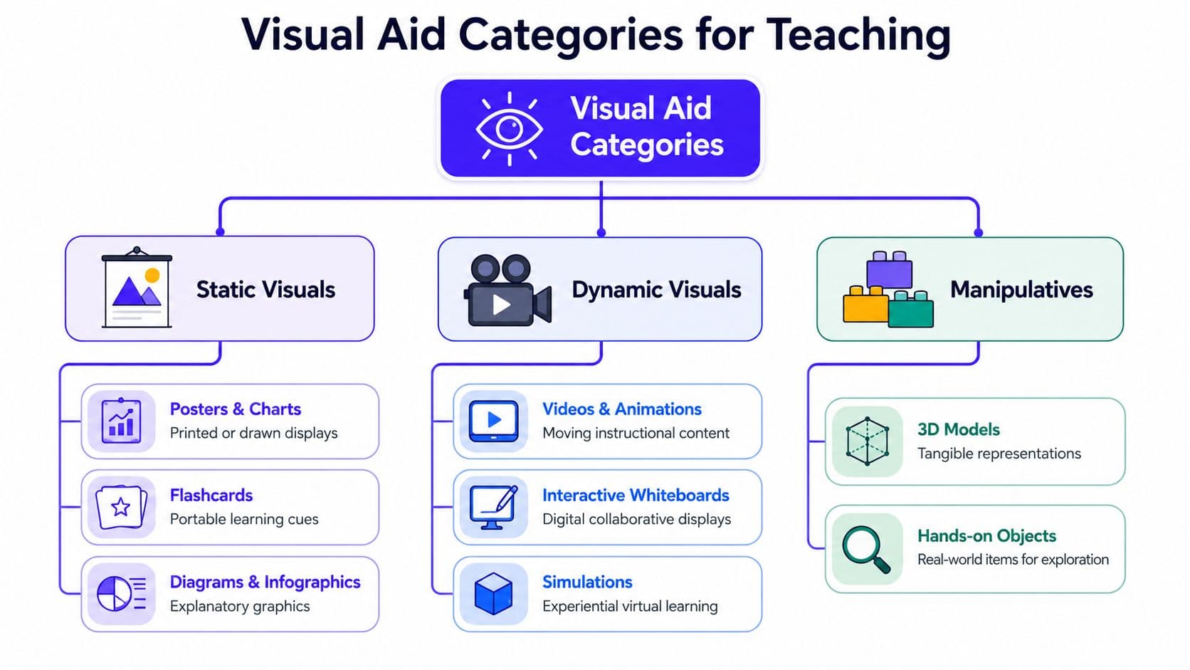
Static visuals you can leave up
These are the workhorses. They stay visible and keep helping after the mini-lesson ends.
- Anchor charts: Great for processes, routines, and recurring skills
- Diagrams: Useful when students need labels, parts, and relationships
- Graphic organizers: Best for sorting ideas before writing or discussion
- Timelines and maps: Ideal for sequence and context
- Exemplars: Strong for showing what finished work looks like
If you're building a library of reusable supports, a collection of graphic organizer ideas for classroom planning is often more useful than another generic worksheet folder.
Dynamic visuals that unfold over time
Some content needs motion, progression, or transformation. That's where digital or teacher-created sequences help.
Think of:
- Slides that reveal one step at a time
- Short videos
- Animations of systems or cycles
- Live annotation on an interactive whiteboard
- Document camera modeling
These work well when students need to see cause and effect, movement, or revision in action. A still image of a chemical reaction can help. A short, tightly chosen video can help more.
Physical and hands-on visuals
Not every useful visual lives on a screen or wall. Some need to be held, moved, or built.
A place value block, fraction strip, sentence puzzle, anatomy model, or real artifact can do what a poster can't. Students can manipulate the idea physically before they can describe it accurately.
The right manipulative keeps students focused on the concept. The wrong one turns into a distraction with bright colors.
A quick way to choose the right category
Use this simple match-up:
| If students need to... | Try... |
|---|---|
| Remember steps | Anchor chart or checklist |
| Compare ideas | T-chart, Venn diagram, or table |
| Visualize a process | Diagram, sequence cards, or short animation |
| Explore structure | 3D model or manipulatives |
| Review key concepts | Infographic, flashcards, or summary slide |
Teachers who create a lot of visuals for class books, handouts, or student-facing resources sometimes use tools that streamline content creation for books so they don't have to build every infographic from scratch.
The key is not collecting every visual aid under the sun. It is building a toolkit that helps you answer a recurring classroom question fast: what do students need to see right now?
Making Visuals Work in Your Classroom
The best visual aid depends on the age group, the subject, and the exact sticking point in the lesson. That's why broad advice like "use more images" isn't enough. Teachers need examples that feel like a Tuesday, not a conference slide.

Field data and post-hoc educator analysis confirm that visual aids simplify complex concepts, and classrooms that consistently use posters, videos, and graphics show measurable improvements in student engagement, confidence, and standardized test scores in this classroom analysis.
Early elementary examples that pull their weight
In primary grades, visuals need to be concrete, uncluttered, and directly tied to action.
A number line works because students can point, hop, and explain. A phonics anchor chart works when it pairs a sound with a mouth cue, a keyword, and one clear example. A classroom routine chart helps because it reduces the need for repeated verbal reminders.
What doesn't work as well? Overloaded posters with too many fonts, too many clip-art images, and no clear focal point. Young students often don't know where to look first.
A few dependable choices for K to 2:
- Math: ten frames, number paths, part-part-whole models
- Literacy: sound walls, story sequence cards, labeled picture vocabulary
- Science: life cycle diagrams, weather charts, observation sketches
- Behavior: visual schedules, transition cards, first-then boards
Middle school needs visuals with structure
By middle school, students can handle more complexity, but they still benefit from visible organization. Here, labels, color coding, and comparison charts become powerful.
In science, annotate a cell diagram together instead of handing students a fully completed one. In social studies, build a cause-and-effect chain for a revolution. In ELA, map character relationships and conflicts rather than asking students to hold all of that in memory during discussion.
Here's a format that works well:
- Show the base visual: a blank map, diagram, chart, or organizer
- Add information in stages: one label, arrow, or category at a time
- Ask students to explain the additions: not just copy them
- Fade the support: remove part of the model in independent practice
That gradual release matters because a visual should scaffold thinking, not replace it.
For teachers who want a demonstration to spark ideas, this short classroom video is worth a look.
Secondary classrooms need visuals that organize complexity
High school students don't outgrow visual support. They need more advanced versions of it.
A timeline can help students track a novel across shifting time periods. A rhetorical analysis chart can separate claim, evidence, and reasoning. In algebra, color-coded worked examples can reveal where a process changes. In history, a source comparison matrix can make document analysis more manageable.
If students keep mixing up concepts, don't just reteach verbally. Change the representation.
A few secondary examples that work well:
| Subject | Visual support | Why it helps |
|---|---|---|
| English | Character map or theme tracker | Makes relationships and patterns visible |
| History | Timeline or source matrix | Clarifies sequence and evidence |
| Science | Labeled process diagram | Shows parts and interactions |
| Math | Worked example with annotation | Makes thinking steps visible |
What actually makes the difference
It isn't the prettiest slide deck. It isn't the fanciest app. It's the match between the visual and the learning problem in front of you.
If students need sequence, show sequence. If they need comparison, show comparison. If they need to classify, sort, or label, give them a structure that lets them do that visibly.
That's when visual aids for teaching stop feeling like extras and start functioning like real instructional tools.
Designing and Selecting Effective Visuals
A visual can help a student understand faster, or it can create one more thing to decode. The difference usually comes down to design. Teachers don't need to be graphic designers, but they do need a few sharp filters for deciding what belongs on the page, board, or screen.
Start with clarity, not decoration
The best classroom visuals are easy to read from the back of the room and easy to process from the front desk. They have one job.
Ask these questions before you use any visual:
- What is the one idea this visual needs to clarify?
- Where should students look first?
- What can I remove without losing meaning?
- Will students use this during thinking, or only glance at it once?
If you can't answer those quickly, the visual probably needs trimming.
A lot of teacher-made materials become cluttered because we try to make them complete. Complete isn't always useful. In real classrooms, useful usually means focused.
Cognitive diversity changes the design decision
This is the part that often gets skipped in general advice about visual aids for teaching. More visual support is not always better.
A critical but often ignored issue is that poorly designed visual aids can cause overload. Recent reports indicate that 45% of special education teachers find that visual clutter can increase anxiety in students with autism in this report discussed here.
That should change how we build materials.
For some students, a busy slide packed with icons, colors, sidebars, and arrows doesn't feel engaging. It feels noisy. Students with attention regulation challenges or sensory processing differences may spend their energy sorting the page instead of learning from it.
What to reduce when overload is likely
Try these adjustments:
- Cut competing colors: Use color to signal categories, not to decorate every element.
- Limit visual elements: If every box has an icon, the icons stop helping.
- Chunk information: Break one packed visual into two or three smaller ones.
- Increase white space: Empty space supports focus.
- Reveal in stages: Don't show every label and arrow at once if students don't need them yet.
A clean visual often teaches more than a detailed one because students can actually find the idea.
Teachers using AI image tools also need to be selective before bringing generated visuals into class. If you're experimenting with prompts, a practical AI prompt writing guide can help you ask for simpler, instruction-ready visuals instead of flashy but unusable ones.
Teach students to read visuals, not just receive them
A second issue gets even less attention. Students are often shown visuals but rarely taught how to interpret them critically.
That matters with diagrams, charts, maps, photographs, historical images, and even anchor charts. Students should learn to ask what the image emphasizes, what it leaves out, and what details support an interpretation.
One easy routine is to pair any important visual with prompts like these:
- What do you notice first?
- What details stand out?
- What seems missing?
- What makes you say that?
- How does this visual shape your understanding?
Anchor charts can evolve from passive reference tools into discussion tools. Teachers looking for fresh classroom examples often borrow ideas from anchor chart routines and formats and then adapt them to their own students.
A simple filter before you print or project
Use this quick check:
| Question | If the answer is no |
|---|---|
| Is the purpose obvious? | Rewrite or retitle it |
| Is the layout calm and readable? | Remove extras |
| Can students explain what they see? | Add guided questions |
| Does it support your learners, not just your plan? | Differentiate or simplify |
Good visuals don't just present information. They guide attention, reduce confusion, and invite interpretation. That's a much higher bar than "looks nice," and it leads to better teaching.
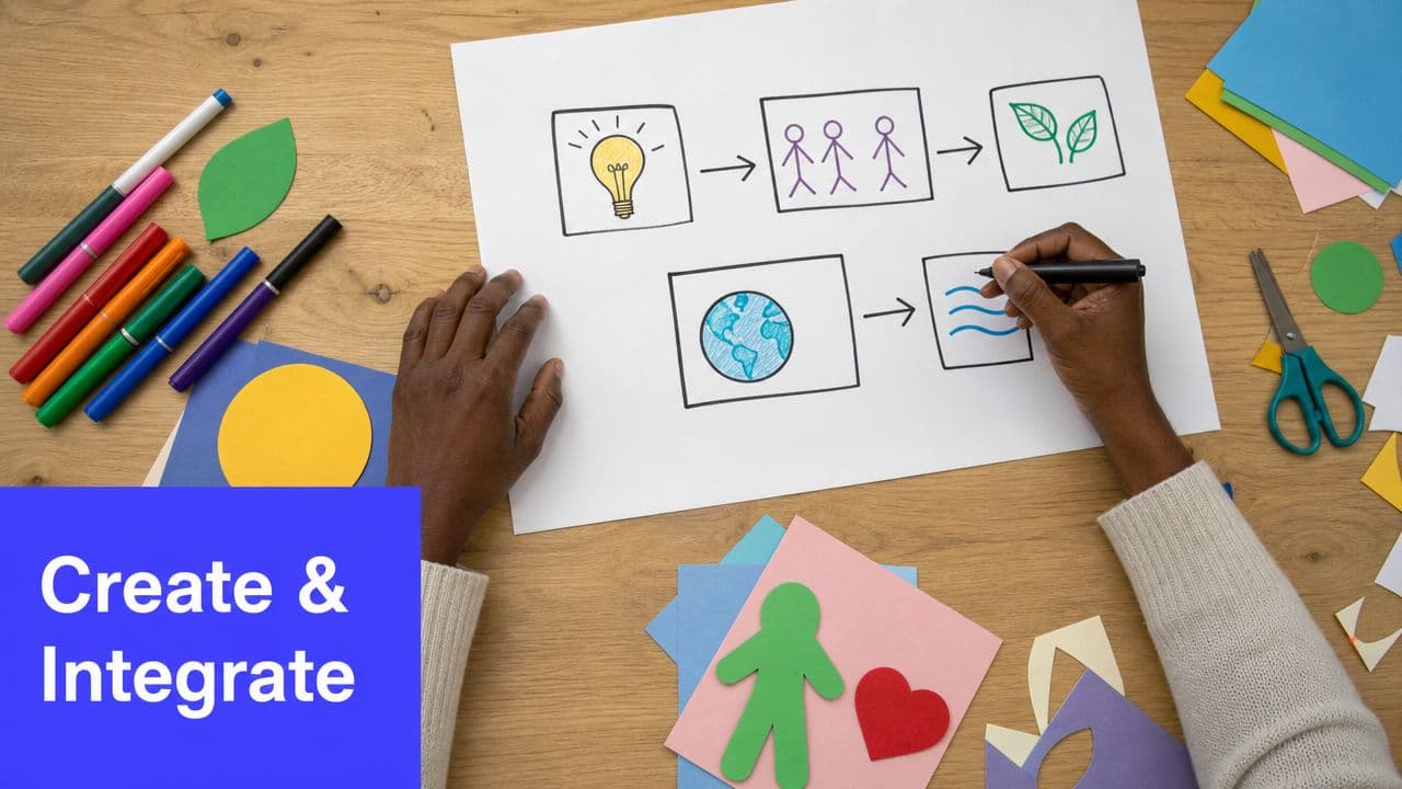
From Idea to Impact Creating and Integrating Your Visuals
Teachers don't need a huge production process to create effective visuals. You need a repeatable workflow. The easiest one starts with instruction, not design.
A major gap in professional development is the lack of guidance on teaching visual literacy. Data shows that 70% of educators struggle to integrate this standard because most resources focus on creating visuals, not on teaching students how to critically decode them in this discussion of classroom visual literacy.
A practical workflow that saves time
I use a five-part filter when planning visuals:
Name the confusion point
Where are students likely to get stuck? If the sticking point is sequence, make a sequence visual. If it's comparison, choose a compare-and-contrast format.Choose the lowest-lift format that works
Sometimes that's a hand-drawn anchor chart. Sometimes it's a simple slide with one diagram. Don't build a complex infographic when a T-chart will do.Decide how students will interact with it
Will they label it, annotate it, sort with it, discuss it, or refer back to it during independent work?Plan one visual literacy question
Ask students not just what the visual says, but how they know.Reuse and refine
Save anything that worked. Tweak what didn't.
Low-tech still works beautifully
Some of the most effective visuals in school are made with chart paper, sticky notes, index cards, and markers.
A hand-drawn model during a think-aloud can beat a polished slide because students see the idea take shape in real time. A student-built anchor chart can work better than a preprinted poster because the class helped create the meaning.
When digital tools make sense
Digital creation is helpful when you need consistency, subject-specific diagrams, printable resources, or quick edits across multiple classes.
If you're already using AI-supported planning tools, image generation for classroom visuals can save time by producing lesson-aligned diagrams, kid-friendly illustrations, and ready-to-use instructional images without the usual image search rabbit hole. Kuraplan is one example teachers use when they want visuals tied closely to lesson content rather than generic stock graphics.
Build the visual last if needed, but plan the student thinking first.
Integration matters more than creation
A visual has much more impact when you introduce it intentionally.
Try this sequence:
- Launch: Tell students what to look for
- Model: Show how to read or use the visual
- Interact: Have students label, sort, annotate, or discuss
- Apply: Use it during practice, not only during the mini-lesson
- Fade: Remove parts of the support when students are ready
That last step matters. Visual supports are strongest when they move students toward independence, not permanent dependence.
Start Small Win Big
You don't need a full visual overhaul next week. Start with one lesson that usually feels harder to teach than it should. Add one visual that solves one real problem.
That might be a cleaner anchor chart. It might be a diagram students annotate instead of copy. It might be a short routine for asking what a visual shows, what it hides, and why it was designed that way. Those small shifts change the quality of student thinking.
The bigger shift is this. Visual aids for teaching work best when students aren't just looking at them. Students need to use them, question them, and sometimes push back on them. That's where visual support becomes visual literacy.
If you're exploring how newer video tools might fit classroom explanation or modeling, this Veo3 AI teachers guide offers ideas worth reviewing with a teacher's usual caution and common sense.
Start with clarity. Keep it simple. Watch what helps your students think more independently. Then build from there.
If you want one place to plan lessons and generate classroom-ready visuals without bouncing between tabs, Kuraplan is built for that workflow. It helps K to 12 teachers create standards-aligned lessons, worksheets, diagrams, and instructional images quickly so more time goes to teaching and less to formatting.