MathsFreePrintable
Graphs and Data Visualization
A free maths worksheet ready for your classroom. Open in Kuraplan to grab the print-ready PDF, customize it for your students, or generate a fresh version in seconds.
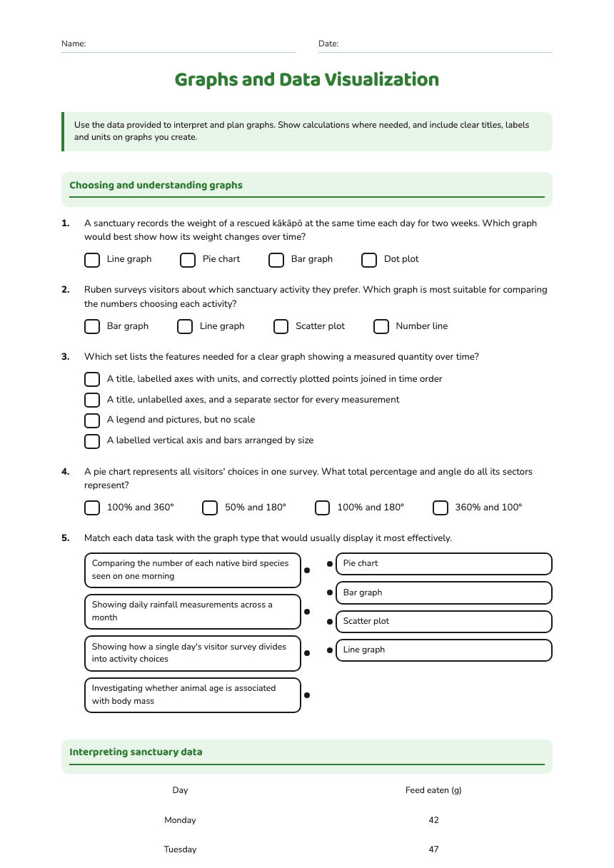
Name:Date:
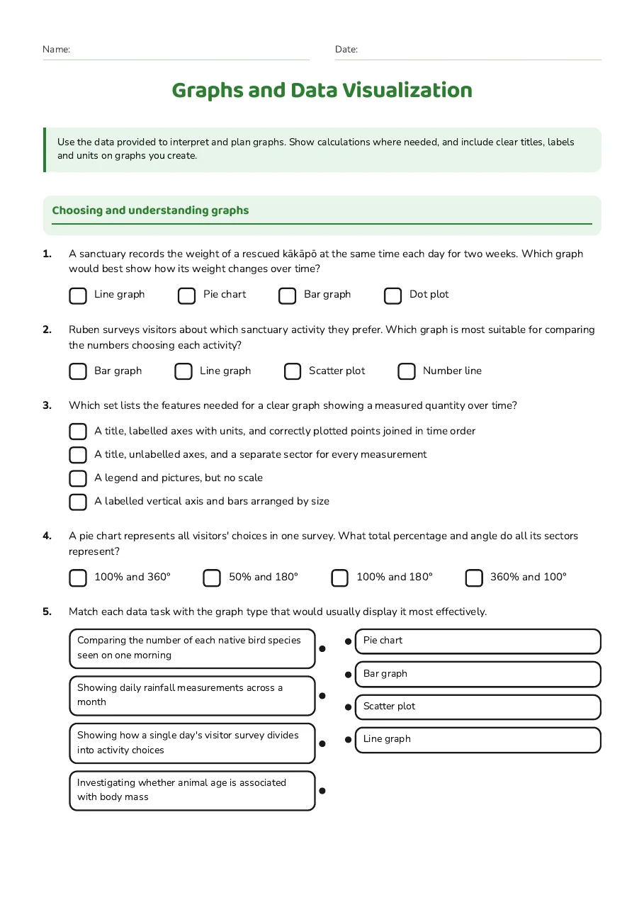
Graphs and Data Visualization
Use the data provided to interpret and plan graphs. Show calculations where needed, and include clear titles, labels and units on graphs you create.
Choosing and understanding graphs
1.A sanctuary records the weight of a rescued kākāpō at the same time each day for two weeks. Which graph would best show how its weight changes over time?
- Line graph
- Pie chart
- Bar graph
- Dot plot
2.Ruben surveys visitors about which sanctuary activity they prefer. Which graph is most suitable for comparing the numbers choosing each activity?
- Bar graph
- Line graph
- Scatter plot
- Number line
3.Which set lists the features needed for a clear graph showing a measured quantity over time?
- A title, labelled axes with units, and correctly plotted points joined in time order
- A title, unlabelled axes, and a separate sector for every measurement
- A legend and pictures, but no scale
- A labelled vertical axis and bars arranged by size
4.A pie chart represents all visitors' choices in one survey. What total percentage and angle do all its sectors represent?
- 100% and 360°
- 50% and 180°
- 100% and 180°
- 360% and 100°
5.Match each data task with the graph type that would usually display it most effectively.
- Comparing the number of each native bird species seen on one morning
- Showing daily rainfall measurements across a month
- Showing how a single day's visitor survey divides into activity choices
- Investigating whether animal age is associated with body mass
- Pie chart
- Bar graph
- Scatter plot
- Line graph
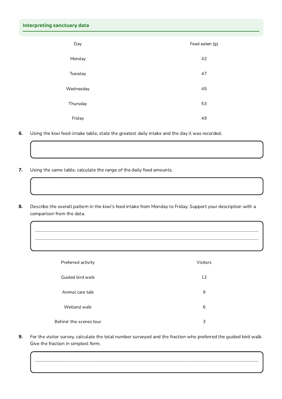
Interpreting sanctuary data
Day
Feed eaten (g)
Monday
42
Tuesday
47
Wednesday
45
Thursday
53
Friday
49
6.Using the kiwi feed-intake table, state the greatest daily intake and the day it was recorded.
7.Using the same table, calculate the range of the daily feed amounts.
8.Describe the overall pattern in the kiwi's feed intake from Monday to Friday. Support your description with a comparison from the data.
Preferred activity
Visitors
Guided bird walk
12
Animal care talk
9
Wetland walk
6
Behind-the-scenes tour
3
9.For the visitor survey, calculate the total number surveyed and the fraction who preferred the guided bird walk. Give the fraction in simplest form.
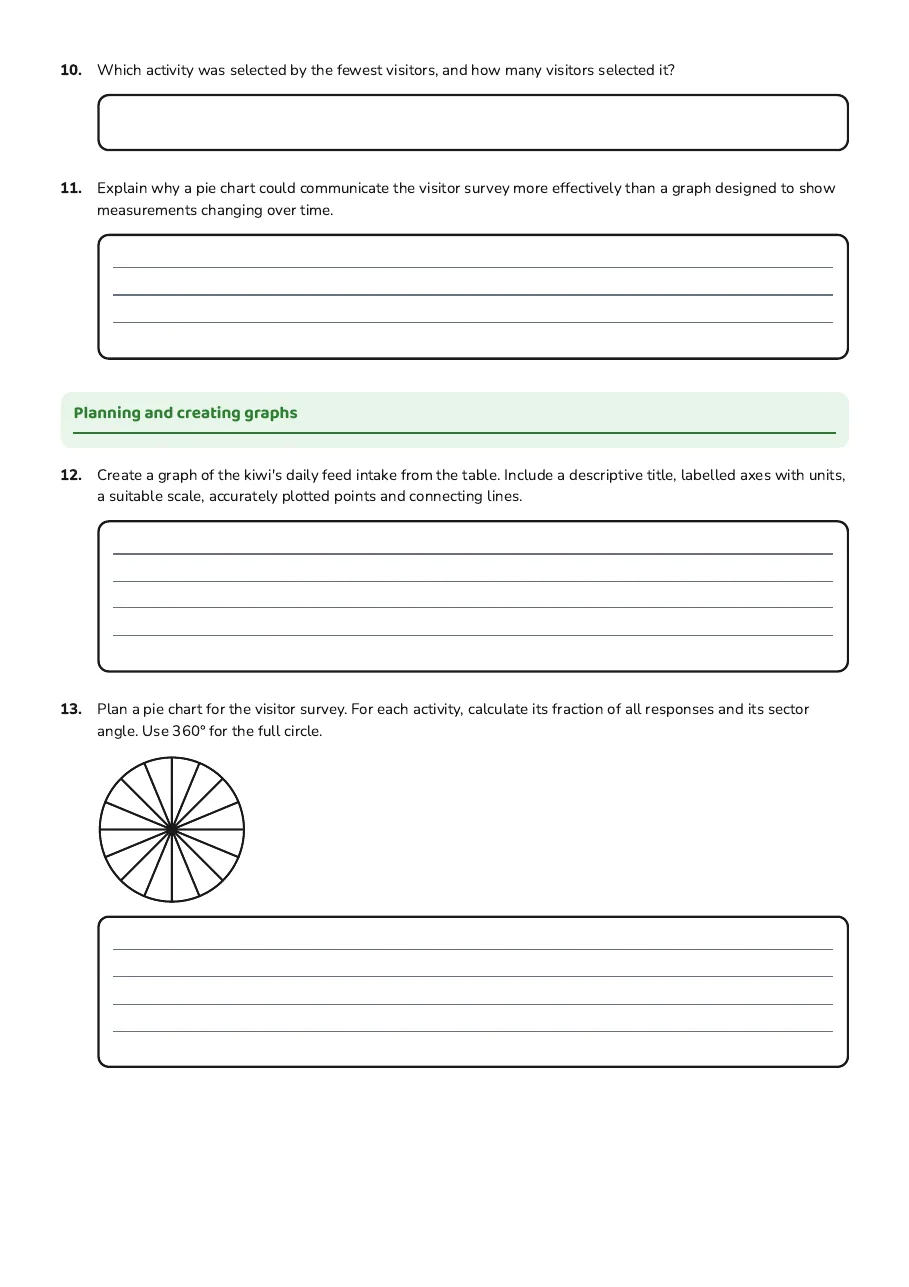
10.Which activity was selected by the fewest visitors, and how many visitors selected it?
11.Explain why a pie chart could communicate the visitor survey more effectively than a graph designed to show measurements changing over time.
Planning and creating graphs
12.Create a graph of the kiwi's daily feed intake from the table. Include a descriptive title, labelled axes with units, a suitable scale, accurately plotted points and connecting lines.
13.Plan a pie chart for the visitor survey. For each activity, calculate its fraction of all responses and its sector angle. Use 360° for the full circle.
14.Over three weeks, Anahera records the number of visitors who choose each of four sanctuary activities. Recommend a graph that would allow her to compare both activity preferences and changes between weeks. Explain how it could show the data.
4 printable pages
Page 1
Page 2
Page 3

Page 4
About This Worksheet
Free in Kuraplan
Sign up free, grab the PDF, and customize it for your class.
Print-Ready
Formatted for standard paper. Clean layout, easy to read.
AI-Generated
Created with Kuraplan's AI, designed for real classroom use.
For Teachers & Parents
Use in classrooms, for homework, tutoring, or homeschool.
Need a custom version of this worksheet?
Kuraplan's AI generates custom worksheets in seconds — differentiated for every learner, aligned to your curriculum.
Generate Custom Worksheets — Free No credit card Curriculum-aligned Under 60 seconds