A free english worksheet ready for your classroom. Open in Kuraplan to grab the print-ready PDF, customize it for your students, or generate a fresh version in seconds.
Read the feature and examine the visual. Use details that are actually provided; distinguish evidence from opinion and note what cannot be concluded. The feature and visual are classroom practice materials, not real-world data.
A longer season at Harbour Ice Rink?
Dylan is helping the student media team check a claim before publishing it. The team has received this draft feature and a chart. Decide what the evidence supports—and what still needs checking.
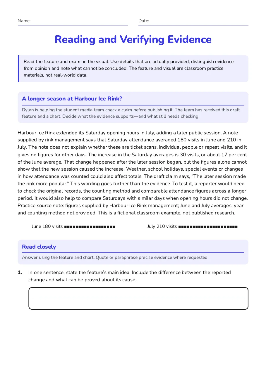
Harbour Ice Rink extended its Saturday opening hours in July, adding a later public session. A note supplied by rink management says that Saturday attendance averaged 180 visits in June and 210 in July. The note does not explain whether these are ticket scans, individual people or repeat visits, and it gives no figures for other days.
The increase in the Saturday averages is 30 visits, or about 17 per cent of the June average. That change happened after the later session began, but the figures alone cannot show that the new session caused the increase. Weather, school holidays, special events or changes in how attendance was counted could also affect totals.
The draft claim says, “The later session made the rink more popular.” This wording goes further than the evidence. To test it, a reporter would need to check the original records, the counting method and comparable attendance figures across a longer period. It would also help to compare Saturdays with similar days when opening hours did not change.
Practice source note: figures supplied by Harbour Ice Rink management; June and July averages; year and counting method not provided. This is a fictional classroom example, not published research.
June
180 visits
■■■■■■■■■■■■■■■■■■
July
210 visits
■■■■■■■■■■■■■■■■■■■■■
Read closely
Answer using the feature and chart. Quote or paraphrase precise evidence where requested.
1.In one sentence, state the feature’s main idea. Include the difference between the reported change and what can be proved about its cause.
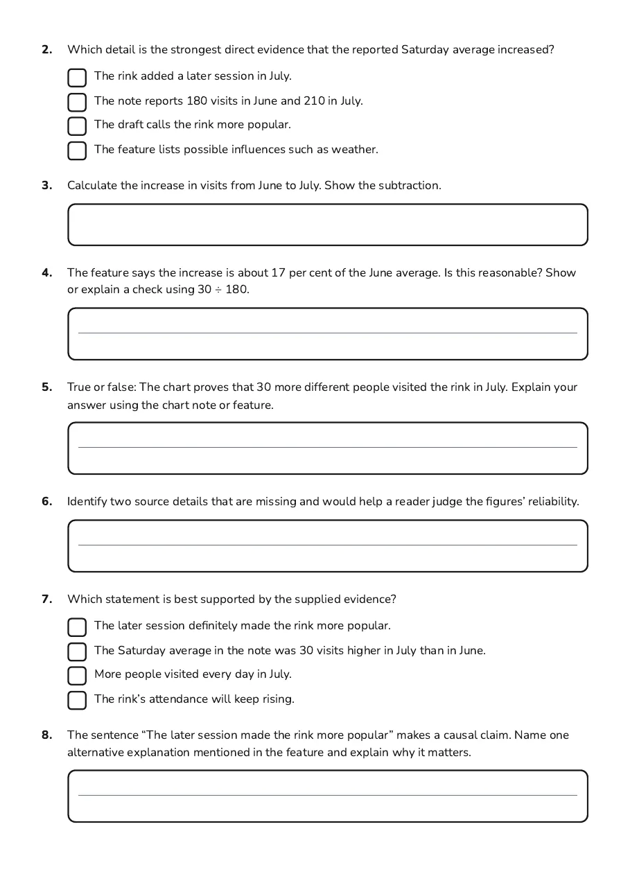
2.Which detail is the strongest direct evidence that the reported Saturday average increased?
The rink added a later session in July.
The note reports 180 visits in June and 210 in July.
The draft calls the rink more popular.
The feature lists possible influences such as weather.
3.Calculate the increase in visits from June to July. Show the subtraction.
4.The feature says the increase is about 17 per cent of the June average. Is this reasonable? Show or explain a check using 30 ÷ 180.
5.True or false: The chart proves that 30 more different people visited the rink in July. Explain your answer using the chart note or feature.
6.Identify two source details that are missing and would help a reader judge the figures’ reliability.
7.Which statement is best supported by the supplied evidence?
The later session definitely made the rink more popular.
The Saturday average in the note was 30 visits higher in July than in June.
More people visited every day in July.
The rink’s attendance will keep rising.
8.The sentence “The later session made the rink more popular” makes a causal claim. Name one alternative explanation mentioned in the feature and explain why it matters.
9.The phrase “figures alone cannot show” signals a cautious limitation. In your own words, explain what the writer is careful not to claim.
10.Write a two-sentence, evidence-based summary. Include the June and July averages and one limitation. Do not add an unsupported cause.
11.Write one useful question Dylan should ask the rink manager before the team publishes the claim. Explain briefly how the answer would help verify the evidence.