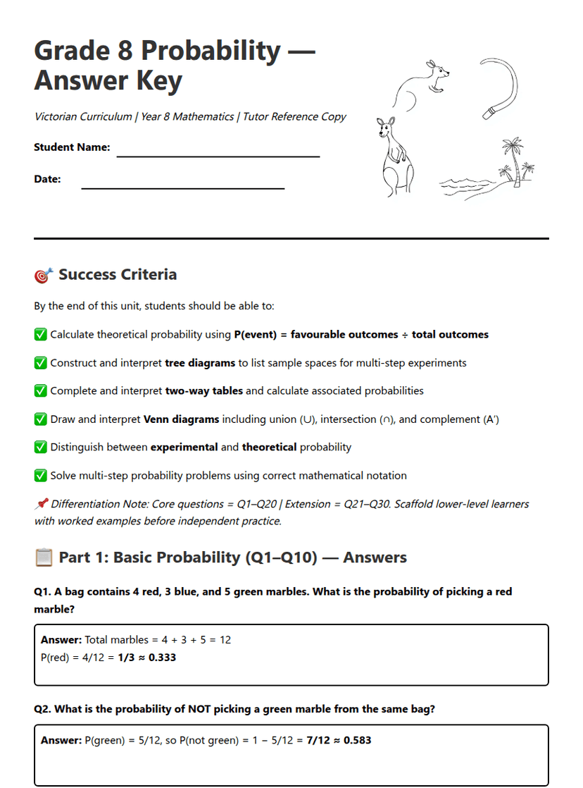
Data Detective Day
A free maths worksheet ready for your classroom. Open in Kuraplan to grab the print-ready PDF, customize it for your students, or generate a fresh version in seconds.
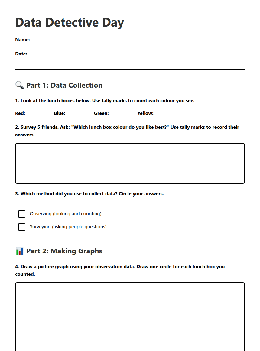
Data Detective Day
🔍 Part 1: Data Collection
- Red: _______
- Blue: _______
- Green: _______
- Yellow: _______
- Orange: _______
- Purple: _______
- Black: _______
📊 Part 2: Making a Column Graph
1. Look at the vertical numbers on the side. They show how many friends chose each colour.
2. Write the lunch box colours at the bottom of the graph.
3. Draw a vertical bar for each colour to show how many friends chose that colour. Make sure the height of the bar matches the number of friends!
Instructions: Draw a vertical column for each colour based on how many friends chose that colour!
📊 Part 3: Picture Graph
Picture Graph Area
Instructions: Draw a picture for each colour based on how many friends chose that colour!
🕵️ Part 4: Data Detective Questions
The most popular colour was: _________________
The most chosen colour was: _________________ because: ____________________________________________________
Comparison: ____________________________________________________
The least chosen colour was: _________________ because: ____________________________________________________
I think the __________________ graph shows the favourite colours better because: ____________________________________________________
It is helpful to use different types of graphs because: ____________________________________________________
We should make a lunch box that is _______________ because most friends like this colour.
About This Worksheet
Free in Kuraplan
Sign up free, grab the PDF, and customize it for your class.
Print-Ready
Formatted for standard paper. Clean layout, easy to read.
AI-Generated
Created with Kuraplan's AI, designed for real classroom use.
For Teachers & Parents
Use in classrooms, for homework, tutoring, or homeschool.
Need a custom version of this worksheet?
Kuraplan's AI generates custom worksheets in seconds — differentiated for every learner, aligned to your curriculum.
Generate Custom Worksheets — FreeMore Maths Worksheets

Year 7 Statistics Pretest
Free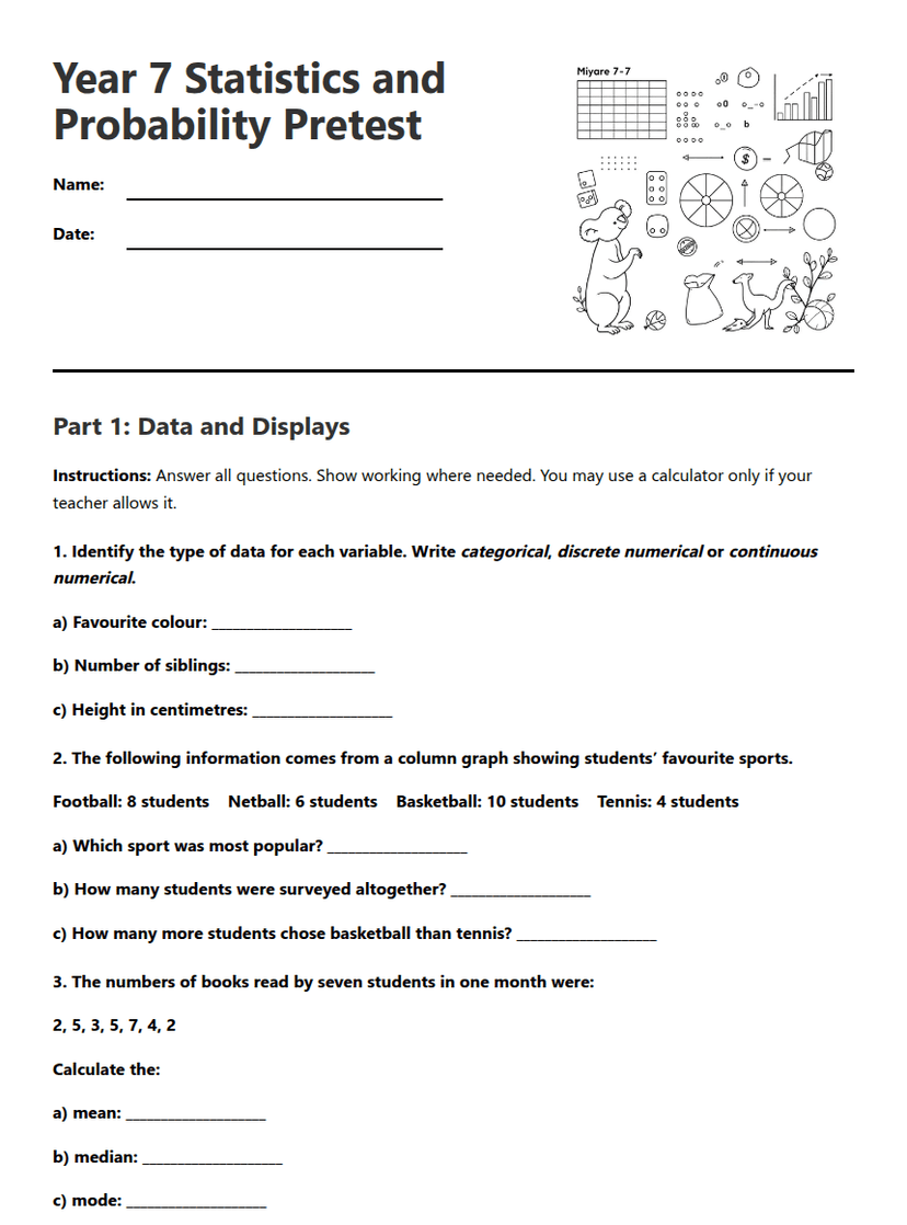
Year 7 Statistics and Probability Pretest
Free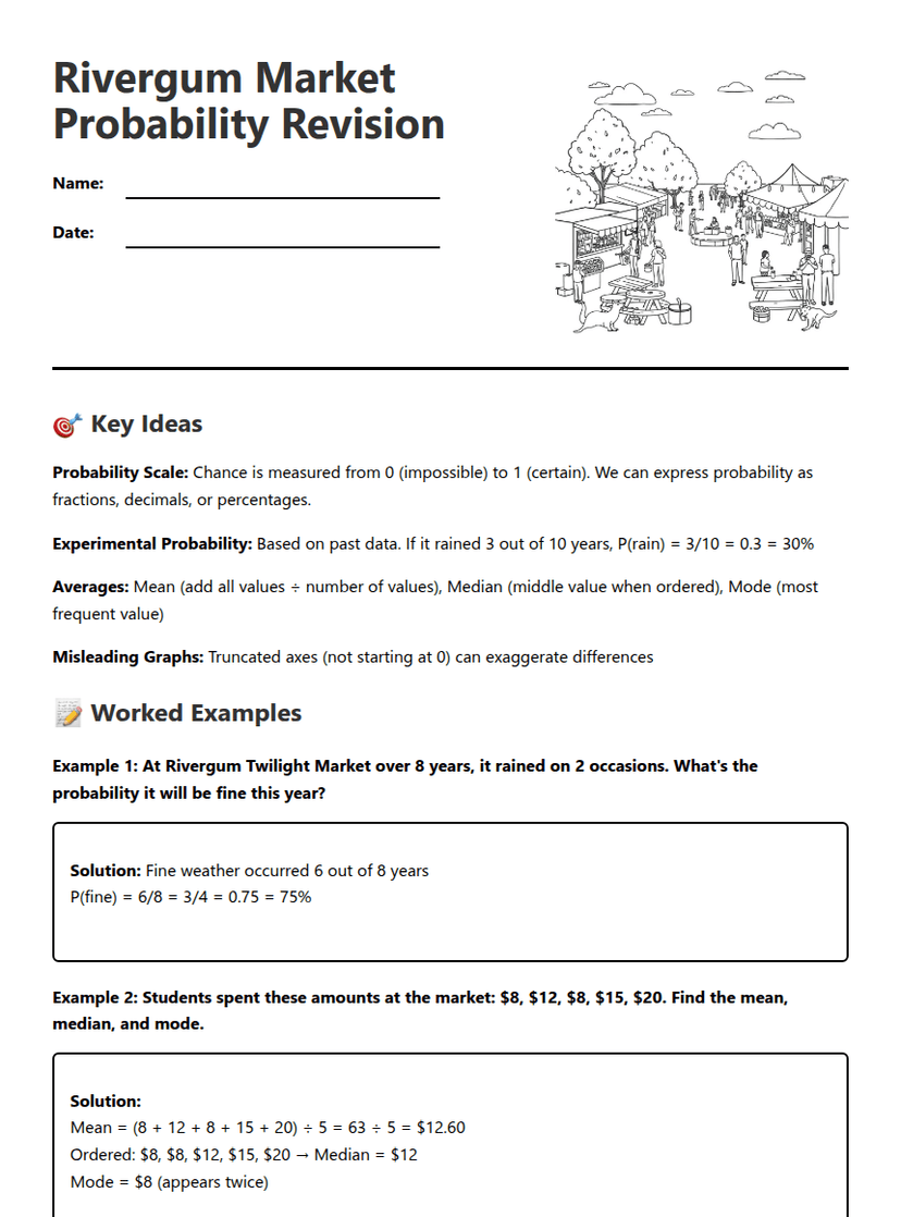
Rivergum Market Probability Revision
Free
Z-Scores in Real Life
Free
Stem-and-Leaf Plots Worksheet
Free
Carnival Game Probability Challenge
Free
Drawing Histograms Worksheet
Free