Drawing Histograms Worksheet
A free maths worksheet ready for your classroom. Open in Kuraplan to grab the print-ready PDF, customize it for your students, or generate a fresh version in seconds.
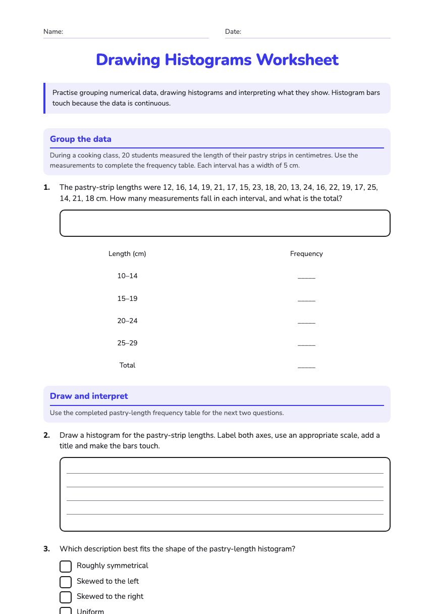
Drawing Histograms Worksheet
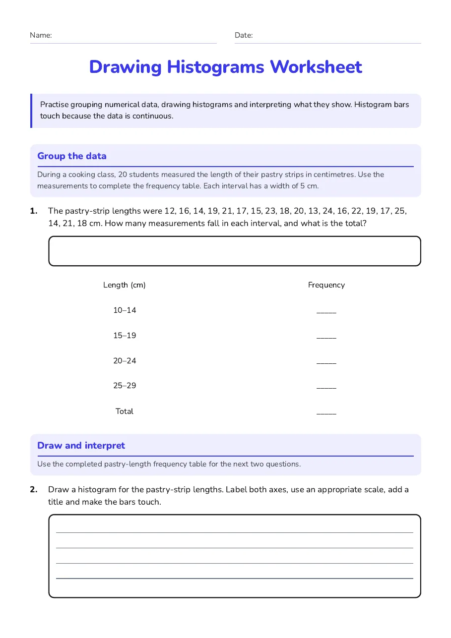
Group the data
During a cooking class, 20 students measured the length of their pastry strips in centimetres. Use the measurements to complete the frequency table. Each interval has a width of 5 cm.
Length (cm)
Frequency
10–14
_____
15–19
_____
20–24
_____
25–29
_____
Total
_____
Draw and interpret
Use the completed pastry-length frequency table for the next two questions.
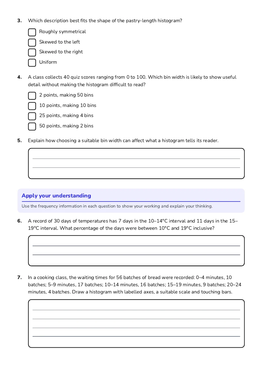
- Roughly symmetrical
- Skewed to the left
- Skewed to the right
- Uniform
- 2 points, making 50 bins
- 10 points, making 10 bins
- 25 points, making 4 bins
- 50 points, making 2 bins
Apply your understanding
Use the frequency information in each question to show your working and explain your thinking.
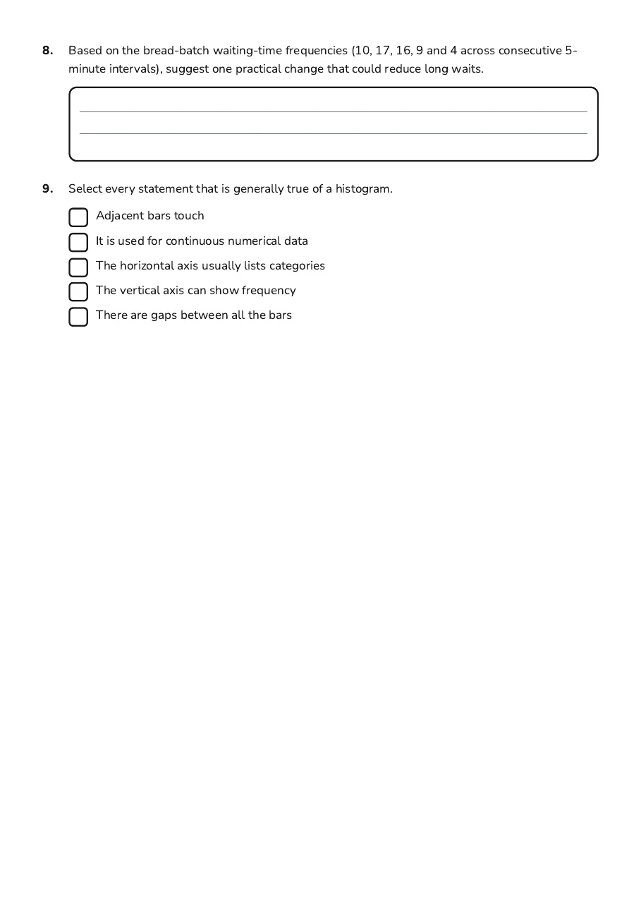
- Adjacent bars touch
- It is used for continuous numerical data
- The horizontal axis usually lists categories
- The vertical axis can show frequency
- There are gaps between all the bars
3 printable pages
Page 1
Page 2
Page 3
About This Worksheet
Free in Kuraplan
Sign up free, grab the PDF, and customize it for your class.
Print-Ready
Formatted for standard paper. Clean layout, easy to read.
AI-Generated
Created with Kuraplan's AI, designed for real classroom use.
For Teachers & Parents
Use in classrooms, for homework, tutoring, or homeschool.
Need a custom version of this worksheet?
Kuraplan's AI generates custom worksheets in seconds — differentiated for every learner, aligned to your curriculum.
Generate Custom Worksheets — Free