MathsFreePrintable

Data Representation Exploration

A free maths worksheet ready for your classroom. Open in Kuraplan to grab the print-ready PDF, customize it for your students, or generate a fresh version in seconds.
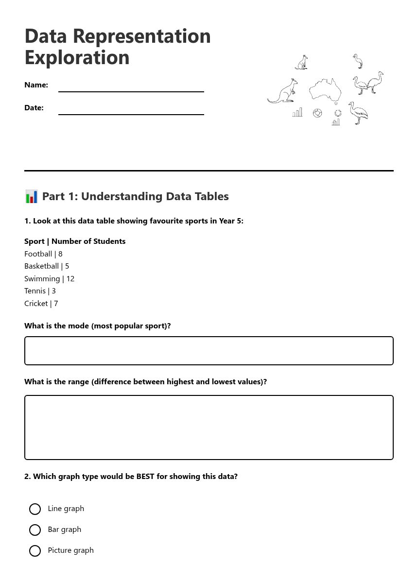
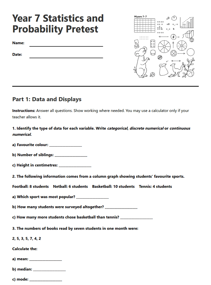
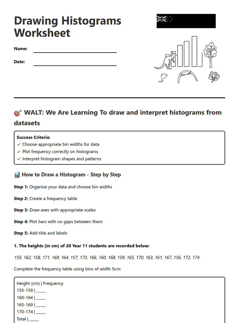
Data Representation Exploration worksheet preview
Data Representation Exploration

Data Representation Exploration

Data charts and graphs illustration

📊 Part 1: Understanding Data Tables

1. Look at this data table showing favourite sports in Year 5:

Sport | Number of Students
Football | 8
Basketball | 5
Swimming | 12
Tennis | 3
Cricket | 7

What is the mode (most popular sport)?
What is the range (difference between highest and lowest values)?
2. Which graph type would be BEST for showing this data?

Line graph

Bar graph

Picture graph

Both bar graph and picture graph

📈 Part 2: Line Graph Interpretation

3. A line graph shows the temperature in Melbourne over one week. The temperatures were: Monday 18°C, Tuesday 22°C, Wednesday 25°C, Thursday 23°C, Friday 20°C, Saturday 19°C, Sunday 21°C.
What was the highest temperature recorded?
On which day did the temperature drop the most from the previous day?
4. Line graphs are most useful for showing:

Favourite colours in the class

Changes over time

Types of pets students own

Number of books in different genres

🎯 Part 3: Data Collection Planning

5. You want to find out "How many hours do Year 5 students spend reading each week?" Plan your data collection:
What question would you ask each student?
How would you record the answers? (Tick all good methods)

Tally chart

Just remember in your head

Write each answer on paper

Use a data collection sheet

6. Create a simple data table template for collecting "Favourite School Subject" data:

🔍 Part 4: Graph Analysis

7. Match each data type with the BEST graph type to represent it:
1. Daily rainfall over a month
2. Favourite pizza toppings
3. Plant growth over 6 weeks
4. Number of students in each year level
A. Bar graph
B. Line graph
C. Line graph
D. Picture graph or bar graph
8. A graph shows "Number of Books Read by Students" but the scale starts at 50 instead of 0. This could be misleading because:

💭 Part 5: Critical Thinking

9. Fill in the blanks about data representation:

The _______ is the most frequently occurring value in a data set. The _______ shows how spread out the data is by finding the difference between the highest and lowest values. When creating graphs, it's important to include clear _______ and accurate _______.

10. You collected data about "Distance students travel to school" and got these results: 2km, 5km, 1km, 8km, 3km, 2km, 4km, 2km, 6km, 2km
What is the mode?
What is the range?
11. Explain why it's important to organise data into tables before creating graphs:

🏠 Part 6: Real-World Application

12. Design a data collection plan for your home. Choose ONE topic to investigate over one week:
Choose your topic:

Daily temperature readings

Number of steps walked each day

Hours of screen time per day

Amount of water consumed daily

How will you collect this data accurately?
What type of graph will you create with your data and why?

About This Worksheet

Free in Kuraplan

Sign up free, grab the PDF, and customize it for your class.

Print-Ready

Formatted for standard paper. Clean layout, easy to read.

AI-Generated

Created with Kuraplan's AI, designed for real classroom use.

For Teachers & Parents

Use in classrooms, for homework, tutoring, or homeschool.

Need a custom version of this worksheet?

Kuraplan's AI generates custom worksheets in seconds — differentiated for every learner, aligned to your curriculum.

Generate Custom Worksheets — Free
No credit card Curriculum-aligned Under 60 seconds