MathsFreePrintable
Data Visualization Analysis Worksheet
A free maths worksheet ready for your classroom. Open in Kuraplan to grab the print-ready PDF, customize it for your students, or generate a fresh version in seconds.
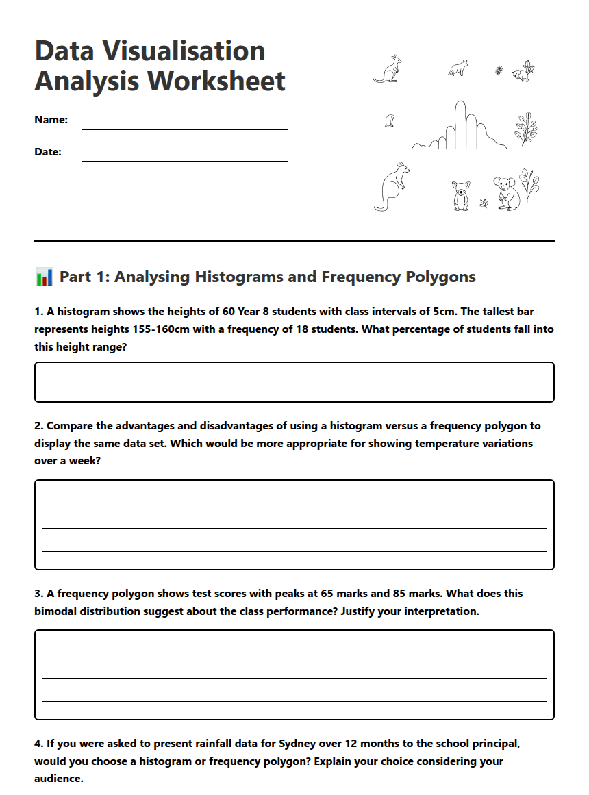
Data Visualisation Analysis Worksheet
📊 Part 1: Analysing Histograms and Frequency Polygons
1. A histogram shows the heights of 60 Year 8 students with class intervals of 5cm. The tallest bar represents heights 155-160cm with a frequency of 18 students. What percentage of students fall into this height range?
2. Compare the advantages and disadvantages of using a histogram versus a frequency polygon to display the same data set. Which would be more appropriate for showing temperature variations over a week?
3. A frequency polygon shows test scores with peaks at 65 marks and 85 marks. What does this bimodal distribution suggest about the class performance? Justify your interpretation.
4. If you were asked to present rainfall data for Sydney over 12 months to the school principal, would you choose a histogram or frequency polygon? Explain your choice considering your audience.
🔍 Part 2: Critical Analysis and Evaluation
5. A histogram shows mobile phone battery life with the following data: 0-2 hours (5 phones), 2-4 hours (12 phones), 4-6 hours (25 phones), 6-8 hours (18 phones), 8-10 hours (8 phones). Calculate the modal class and explain why this information would be valuable to a phone manufacturer.
6. Two students create different visualisations of the same data about weekly pocket money. Student A uses class intervals of $5 ($0-5, $5-10, etc.) while Student B uses intervals of $10 ($0-10, $10-20, etc.). How might this affect the interpretation of the data? Which approach is better and why?
7. A frequency polygon showing daily temperatures in Melbourne appears to have gaps or missing data points. What could cause this, and how might it affect conclusions drawn from the graph?
8. Evaluate this statement: "Histograms are always more accurate than frequency polygons for displaying continuous data." Provide evidence to support or refute this claim.
🎨 Part 3: Design and Synthesis
9. You've collected data on the time students spend on homework each night. Design a data collection method and explain whether you would present your findings as a histogram or frequency polygon. Justify your choice considering your target audience (parents, teachers, or students).
10. Create a scenario where overlaying two frequency polygons on the same graph would provide valuable insights. Describe the data sets and explain what conclusions could be drawn from the comparison.
11. A sports coach wants to analyse player performance data to make team selections. The data includes sprint times, with most players clustering around 12-13 seconds, but a few outliers at 9-10 seconds and 16-17 seconds. How would you advise the coach to visualise this data, and what insights might they gain?
12. Design a study to compare the effectiveness of histograms versus frequency polygons for helping Year 7 students understand data patterns. What would you measure, and how would you ensure your results are reliable?
About This Worksheet
Free in Kuraplan
Sign up free, grab the PDF, and customize it for your class.
Print-Ready
Formatted for standard paper. Clean layout, easy to read.
AI-Generated
Created with Kuraplan's AI, designed for real classroom use.
For Teachers & Parents
Use in classrooms, for homework, tutoring, or homeschool.
Need a custom version of this worksheet?
Kuraplan's AI generates custom worksheets in seconds — differentiated for every learner, aligned to your curriculum.
Generate Custom Worksheets — Free No credit card Curriculum-aligned Under 60 seconds
More Maths Worksheets

Year 7
Year 7 Statistics Pretest
Free
Year 7
Year 7 Statistics and Probability Pretest
Free
Year 12
Rivergum Market Probability Revision
Free
Year 12
Z-Scores in Real Life
Free
Year 7
Stem-and-Leaf Plots Worksheet
Free
Year 7
Carnival Game Probability Challenge
Free
Drawing Histograms Worksheet
Free