MathsFreePrintable

Graph Discussion Defense Cards

A free maths worksheet ready for your classroom. Open in Kuraplan to grab the print-ready PDF, customize it for your students, or generate a fresh version in seconds.
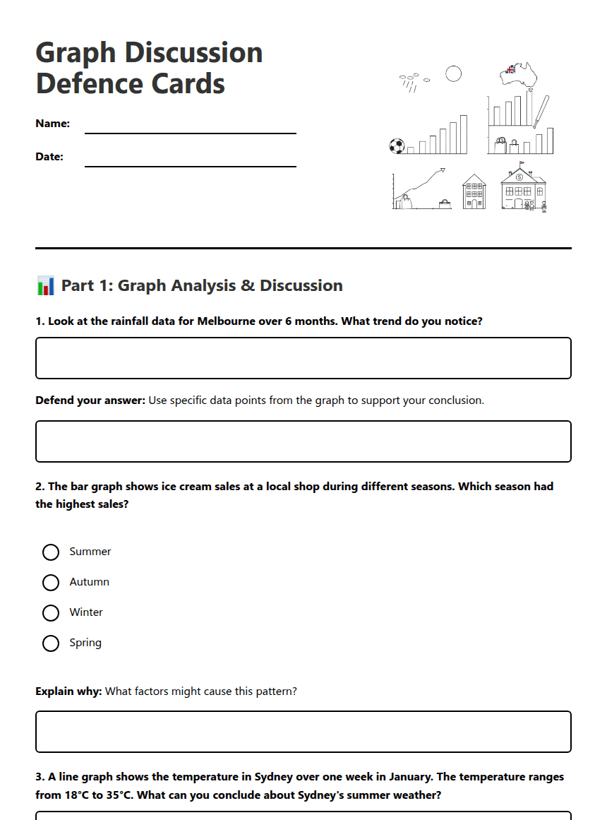
Graph Discussion Defense Cards worksheet preview

Graph Discussion Defence Cards

Students analyzing graphs and charts

📊 Part 1: Graph Analysis & Discussion

1. Look at the rainfall data for Melbourne over 6 months. What trend do you notice?

Defend your answer: Use specific data points from the graph to support your conclusion.

2. The bar graph shows ice cream sales at a local shop during different seasons. Which season had the highest sales?

Summer

Autumn

Winter

Spring

Explain why: What factors might cause this pattern?

3. A line graph shows the temperature in Sydney over one week in January. The temperature ranges from 18°C to 35°C. What can you conclude about Sydney's summer weather?

Discussion point: How might this temperature range affect people's daily activities?

4. The bar graph displays the number of students absent from school each day of the week. Tuesday shows the highest absences. What might explain this pattern?

Students were sick from weekend activities

There was a school excursion

Bad weather occurred

It was a public holiday

🔍 Part 2: Interpret & Defend

5. A line graph shows the population growth of kangaroos in a national park over 5 years. The line goes up steadily, then drops sharply in year 4. What could cause this sudden drop?

Defend your reasoning: What evidence from real life supports your explanation?

6. The bar graph shows AFL match attendance for different stadiums in Australia. The MCG has the highest bar. Is this surprising?

Yes, it's surprising

No, it's expected

Explain your choice: What factors influence stadium attendance?

7. A line graph tracks bicycle sales at a shop throughout the year. Sales peak in October and are lowest in June. Defend whether this pattern makes sense for Australian conditions.
8. Looking at a bar graph of favourite pizza toppings among Year 6 students, pepperoni wins by a large margin. Your friend says this data isn't reliable. What questions would you ask about how the data was collected?

💭 Part 3: Critical Thinking

9. A line graph shows that reading scores in a school improved dramatically after installing new computers. Your task: Argue whether the computers definitely caused the improvement.
10. Two students are debating a bar graph about favourite school subjects. One says "Maths is clearly the most popular subject." The other disagrees. What information would you need to settle this debate?
11. A graph shows that beach visitor numbers drop significantly on days when the UV index is very high. Create an argument for why this correlation makes sense, using at least three supporting points.

About This Worksheet

Free in Kuraplan

Sign up free, grab the PDF, and customize it for your class.

Print-Ready

Formatted for standard paper. Clean layout, easy to read.

AI-Generated

Created with Kuraplan's AI, designed for real classroom use.

For Teachers & Parents

Use in classrooms, for homework, tutoring, or homeschool.

Need a custom version of this worksheet?

Kuraplan's AI generates custom worksheets in seconds — differentiated for every learner, aligned to your curriculum.

Generate Custom Worksheets — Free
No credit card Curriculum-aligned Under 60 seconds