MathsFreePrintable

Analyzing Data Trends

A free maths worksheet ready for your classroom. Open in Kuraplan to grab the print-ready PDF, customize it for your students, or generate a fresh version in seconds.
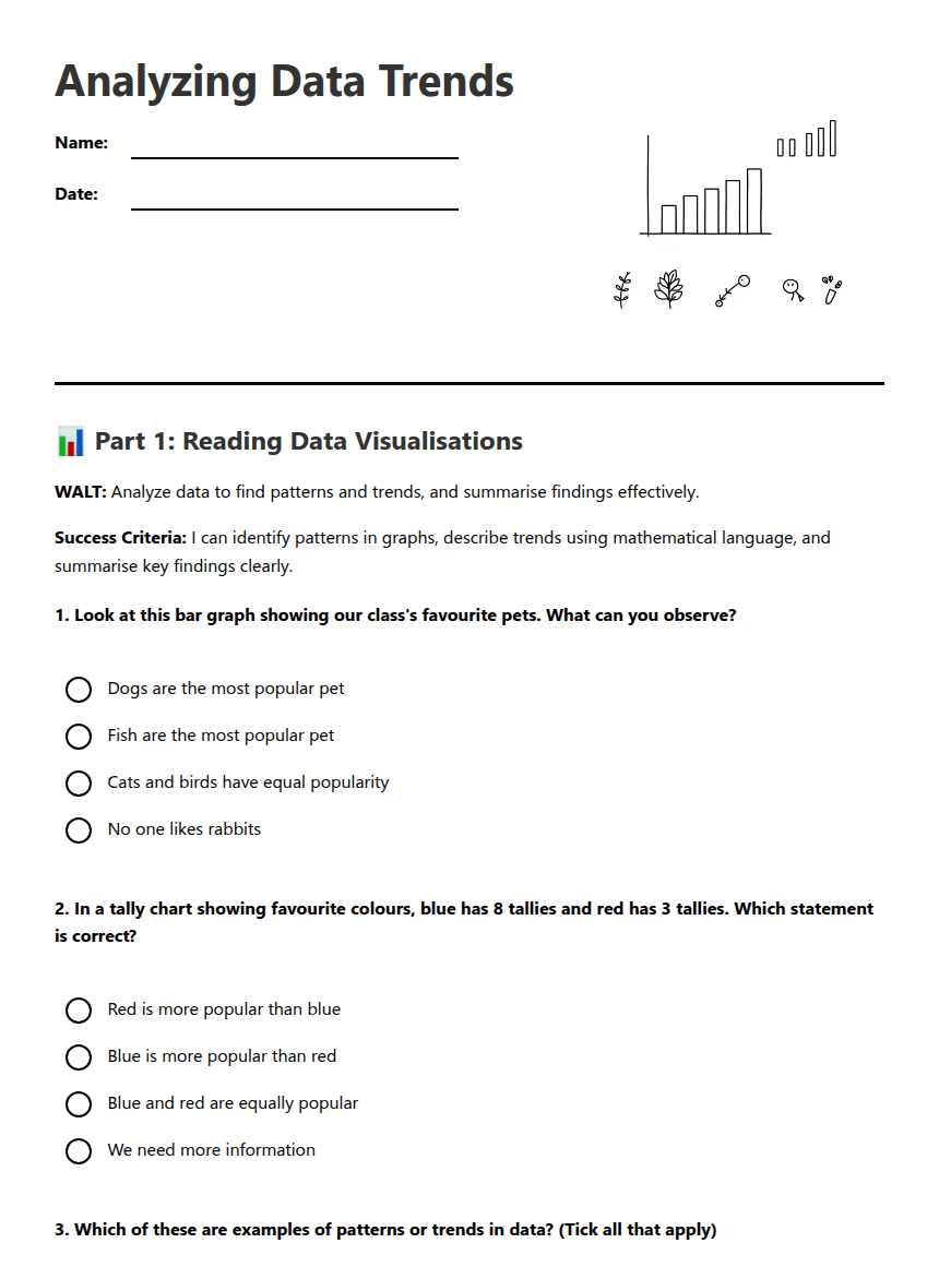
Analyzing Data Trends worksheet preview
Analyzing Data Trends

Students analyzing bar graphs and charts

📊 Part 1: Reading Data Visualisations

WALT: Analyze data to find patterns and trends, and summarise findings effectively.

Success Criteria: I can identify patterns in graphs, describe trends using mathematical language, and summarise key findings clearly.

1. Look at this bar graph showing our class's favourite pets. What can you observe?

Dogs are the most popular pet

Fish are the most popular pet

Cats and birds have equal popularity

No one likes rabbits

2. In a tally chart showing favourite colours, blue has 8 tallies and red has 3 tallies. Which statement is correct?

Red is more popular than blue

Blue is more popular than red

Blue and red are equally popular

We need more information

3. Which of these are examples of patterns or trends in data? (Tick all that apply)

Most students chose pizza as their favourite food

Boys and girls like different sports

The data shows random results

Summer is the most popular season

4. What does the word 'variable' mean in statistics?

Something that changes or varies

A type of graph

The most popular choice

A mathematical equation

✏️ Part 2: Describing Trends and Patterns

5. Complete these sentence starters about data trends:

The most popular choice in our survey was ___________________.

The least popular choice was ___________________.

This data shows a trend that ___________________.

One surprising finding was ___________________.

6. Look at your group's data from yesterday's survey. Write three observations about patterns you can see:
7. Explain how analyzing data helps us understand our classmates better:
8. If you created a bar graph showing favourite school subjects, what would you need to include to make it clear and easy to read?

🎯 Part 3: Planning Your Data Summary

9. Use this graphic organiser to plan your group's data summary for presentation:

Our variable (what we measured): ___________________

Our group of interest (who we surveyed): ___________________

Key findings:

1. _________________________________

2. _________________________________

3. _________________________________

10. Write one question you could ask about someone else's data presentation to check if their findings make sense:

About This Worksheet

Free in Kuraplan

Sign up free, grab the PDF, and customize it for your class.

Print-Ready

Formatted for standard paper. Clean layout, easy to read.

AI-Generated

Created with Kuraplan's AI, designed for real classroom use.

For Teachers & Parents

Use in classrooms, for homework, tutoring, or homeschool.

Need a custom version of this worksheet?

Kuraplan's AI generates custom worksheets in seconds — differentiated for every learner, aligned to your curriculum.

Generate Custom Worksheets — Free


No credit card Curriculum-aligned Under 60 seconds





