MathsFreePrintable

Christmas Data Visualizations

A free maths worksheet ready for your classroom. Open in Kuraplan to grab the print-ready PDF, customize it for your students, or generate a fresh version in seconds.
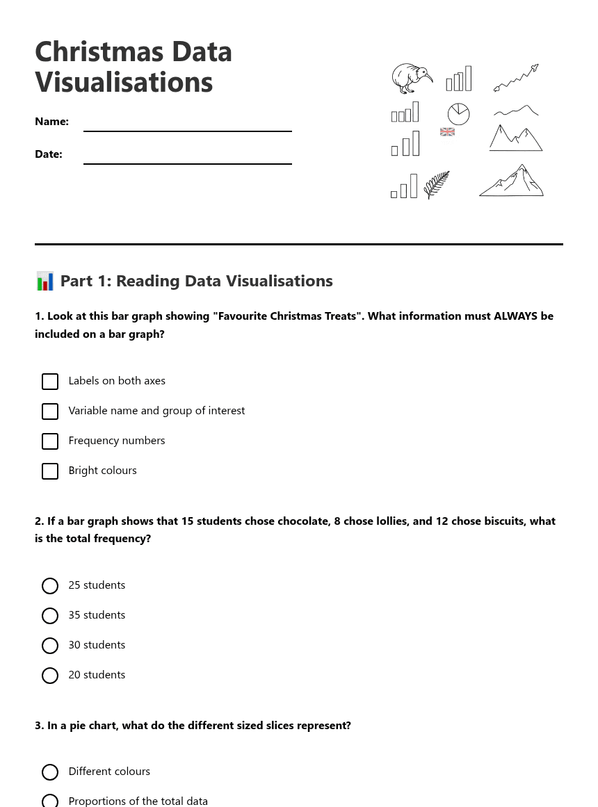
Christmas Data Visualizations worksheet preview

Christmas Data Visualisations

Christmas data charts and graphs

📊 Part 1: Reading Data Visualisations

1. Look at this bar graph showing "Favourite Christmas Treats". What information must ALWAYS be included on a bar graph?

Labels on both axes

Variable name and group of interest

Frequency numbers

Bright colours

2. If a bar graph shows that 15 students chose chocolate, 8 chose lollies, and 12 chose biscuits, what is the total frequency?

25 students

35 students

30 students

20 students

3. In a pie chart, what do the different sized slices represent?

Different colours

Proportions of the total data

The number of students surveyed

Different Christmas treats

4. Which statement uses proper statistical vocabulary?

"Most kids like chocolate"

"The variable 'Christmas treats' shows chocolate has the highest frequency"

"Chocolate is the best"

"Everyone chose chocolate"

✏️ Part 2: Creating and Describing Visualisations

5. You collected data about "Types of Christmas Decorations" from your class. List the steps you would follow to create a clear bar graph:
6. Draw a simple bar graph using this data about "Favourite Christmas Activities":

Swimming: 12 students    Beach trips: 8 students    BBQ: 15 students    Family visits: 10 students

7. Look at your bar graph above. Complete these sentences using statistical vocabulary:

The variable is _________________________ and the group of interest is _________________________.

The activity with the highest frequency is _________________________ with _______ students.

I notice that _________________________________________________________________.

8. Why is it important to label graphs clearly? Give two reasons:

🎯 Part 3: Reflection and Analysis

9. Compare bar graphs and pie charts. When would you use each type of visualisation?
10. You want to show your Christmas data to your family. What would make your data visualisation easy for them to understand?

About This Worksheet

Free in Kuraplan

Sign up free, grab the PDF, and customize it for your class.

Print-Ready

Formatted for standard paper. Clean layout, easy to read.

AI-Generated

Created with Kuraplan's AI, designed for real classroom use.

For Teachers & Parents

Use in classrooms, for homework, tutoring, or homeschool.

Need a custom version of this worksheet?

Kuraplan's AI generates custom worksheets in seconds — differentiated for every learner, aligned to your curriculum.

Generate Custom Worksheets — Free


No credit card Curriculum-aligned Under 60 seconds