MathsFreePrintable

Data Trends Analysis

A free maths worksheet ready for your classroom. Open in Kuraplan to grab the print-ready PDF, customize it for your students, or generate a fresh version in seconds.
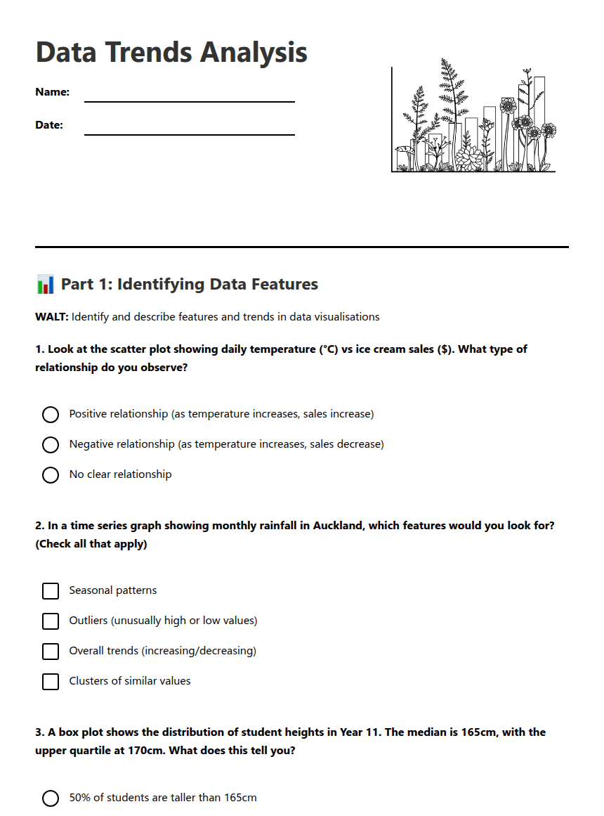
Data Trends Analysis worksheet preview
Data Trends Analysis

Data analysis illustration

📊 Part 1: Identifying Data Features

WALT: Identify and describe features and trends in data visualisations

1. Look at the scatter plot showing daily temperature (°C) vs ice cream sales ($). What type of relationship do you observe?

Positive relationship (as temperature increases, sales increase)

Negative relationship (as temperature increases, sales decrease)

No clear relationship

2. In a time series graph showing monthly rainfall in Auckland, which features would you look for? (Check all that apply)

Seasonal patterns

Outliers (unusually high or low values)

Overall trends (increasing/decreasing)

Clusters of similar values

3. A box plot shows the distribution of student heights in Year 11. The median is 165cm, with the upper quartile at 170cm. What does this tell you?

50% of students are taller than 165cm

Most students are exactly 165cm tall

170cm is the average height

4. When describing the spread of data, which terms are most appropriate?

Range

Interquartile range

Variability

Correlation

📈 Part 2: Analysing Trends and Making Inferences

5. Describe what you observe in a scatter plot showing study hours vs exam scores. Use appropriate statistical vocabulary.
6. If you drew a line of best fit through the data points, what would it help you predict?
7. A time series shows COVID-19 vaccination rates in New Zealand from 2021-2022. You notice a sharp increase in September 2021. What informal inference could you make about this pattern?
8. Extension Activity: Explain how you would investigate whether an outlier in your data set is a genuine data point or an error. What factors would you consider?

🎯 Part 3: Success Criteria Check

Rate yourself on these success criteria (1 = needs work, 5 = confident):

9. I can read and interpret different types of data visualisations

Rating: 1 _____ 2 _____ 3 _____ 4 _____ 5

10. I can describe trends, clusters, and outliers using statistical vocabulary

Rating: 1 _____ 2 _____ 3 _____ 4 _____ 5

11. I can make informal inferences from data trends and support them with evidence

Rating: 1 _____ 2 _____ 3 _____ 4 _____ 5

12. Reflection: Choose one data visualisation from today's lesson. Write a brief summary of its main trend and one inference you can make from it.

About This Worksheet

Free in Kuraplan

Sign up free, grab the PDF, and customize it for your class.

Print-Ready

Formatted for standard paper. Clean layout, easy to read.

AI-Generated

Created with Kuraplan's AI, designed for real classroom use.

For Teachers & Parents

Use in classrooms, for homework, tutoring, or homeschool.

Need a custom version of this worksheet?

Kuraplan's AI generates custom worksheets in seconds — differentiated for every learner, aligned to your curriculum.

Generate Custom Worksheets — Free


No credit card Curriculum-aligned Under 60 seconds





