MathsFreePrintable

Data Visualisation Skills Worksheet

A free maths worksheet ready for your classroom. Open in Kuraplan to grab the print-ready PDF, customize it for your students, or generate a fresh version in seconds.
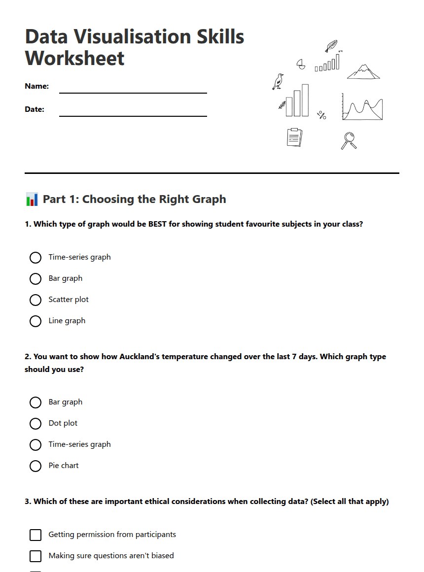
Data Visualisation Skills Worksheet worksheet preview

Data Visualisation Skills Worksheet

Data visualization charts and graphs

📊 Part 1: Choosing the Right Graph

1. Which type of graph would be BEST for showing student favourite subjects in your class?

Time-series graph

Bar graph

Scatter plot

Line graph

2. You want to show how Auckland's temperature changed over the last 7 days. Which graph type should you use?

Bar graph

Dot plot

Time-series graph

Pie chart

3. Which of these are important ethical considerations when collecting data? (Select all that apply)

Getting permission from participants

Making sure questions aren't biased

Only collecting data that supports your opinion

Keeping personal information private

4. A dot plot is most useful for showing:

Changes over time

The distribution and frequency of numerical data

Percentages of a whole

Relationships between two variables

📈 Part 2: Interpreting Data Visualisations

5. Look at this data about books read by Year 8 students in one month:
Books Read: 0, 1, 1, 2, 2, 2, 3, 3, 4, 5, 6
What is the mode of this data set?

Mode = _______

6. Describe one trend you might expect to see in a time-series graph showing ice cream sales throughout the year in New Zealand:
7. A bar graph shows that 15 students chose pizza, 8 chose burgers, and 12 chose fish and chips as their favourite lunch. What can you conclude about the most popular choice?
8. Explain why it would be unethical to ask this survey question: "Don't you think homework is terrible and should be banned?"

🎯 Part 3: Graph Construction Planning

9. You collect data on how many minutes students in your class spent exercising each day last week. Plan your graph:

a) What type of graph would you choose? ________________

b) What would you label the x-axis? ________________

c) What would you label the y-axis? ________________

10. Create a simple dot plot using this data about pets owned by students:
Number of pets: 0, 0, 1, 1, 1, 2, 2, 3, 4
11. List two features you should always include when creating a data visualisation using digital tools:

1. _________________________________

2. _________________________________

12. Reflection: Why is it important to choose the correct type of graph for your data?

About This Worksheet

Free in Kuraplan

Sign up free, grab the PDF, and customize it for your class.

Print-Ready

Formatted for standard paper. Clean layout, easy to read.

AI-Generated

Created with Kuraplan's AI, designed for real classroom use.

For Teachers & Parents

Use in classrooms, for homework, tutoring, or homeschool.

Need a custom version of this worksheet?

Kuraplan's AI generates custom worksheets in seconds — differentiated for every learner, aligned to your curriculum.

Generate Custom Worksheets — Free


No credit card Curriculum-aligned Under 60 seconds





