MathsFreePrintable

Interpreting Graphs and Charts

A free maths worksheet ready for your classroom. Open in Kuraplan to grab the print-ready PDF, customize it for your students, or generate a fresh version in seconds.
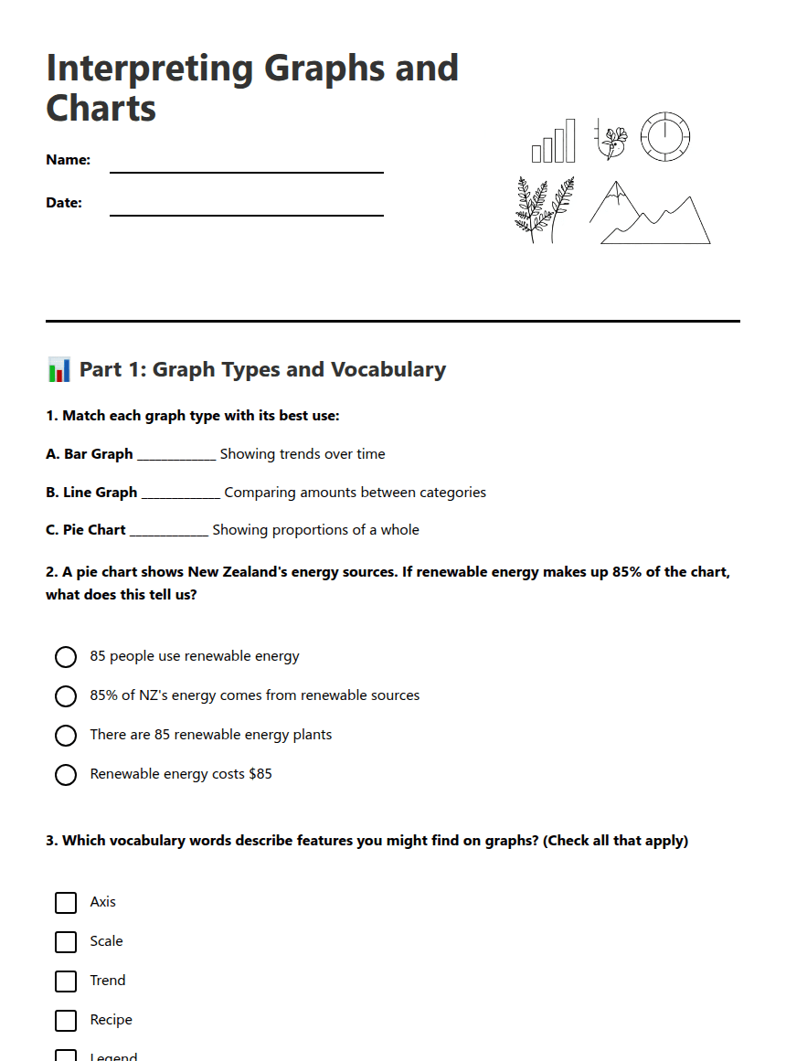
Interpreting Graphs and Charts worksheet preview

Interpreting Graphs and Charts

Various graphs and charts illustration

📊 Part 1: Graph Types and Vocabulary

1. Match each graph type with its best use:

A. Bar Graph _____________ Showing trends over time

B. Line Graph _____________ Comparing amounts between categories

C. Pie Chart _____________ Showing proportions of a whole

2. A pie chart shows New Zealand's energy sources. If renewable energy makes up 85% of the chart, what does this tell us?

85 people use renewable energy

85% of NZ's energy comes from renewable sources

There are 85 renewable energy plants

Renewable energy costs $85

3. Which vocabulary words describe features you might find on graphs? (Check all that apply)

Axis

Scale

Trend

Recipe

Legend

📈 Part 2: Data Interpretation

4. A line graph shows Auckland's average temperature from January to December. The line starts at 23°C in January, drops to 15°C in July, then rises back to 22°C in December. What trend does this show?
5. A bar graph compares rainfall in four NZ cities: Wellington (1200mm), Christchurch (600mm), Auckland (1100mm), Dunedin (800mm). Which city has the highest rainfall and which has the lowest?

Highest: _________________ Lowest: _________________

6. Look at this pie chart description: "Favourite sports of Year 11 students - Rugby 40%, Netball 25%, Football 20%, Basketball 10%, Other 5%"

a) Which sport is most popular? _________________

b) What percentage of students chose either Rugby or Football? _______%

c) If 200 students were surveyed, how many chose Netball? _______ students

🤔 Part 3: Critical Thinking

7. A graph titled "Ice Cream Sales Increase Crime!" shows that both ice cream sales and crime rates are higher in summer months. Explain why this graph might be misleading:
8. Extension Challenge: You need to present data about student mobile phone usage (hours per day) over a school week. Which graph type would be most effective and why?
9. Create your own real-world example where a pie chart would be the best choice for displaying data:

About This Worksheet

Free in Kuraplan

Sign up free, grab the PDF, and customize it for your class.

Print-Ready

Formatted for standard paper. Clean layout, easy to read.

AI-Generated

Created with Kuraplan's AI, designed for real classroom use.

For Teachers & Parents

Use in classrooms, for homework, tutoring, or homeschool.

Need a custom version of this worksheet?

Kuraplan's AI generates custom worksheets in seconds — differentiated for every learner, aligned to your curriculum.

Generate Custom Worksheets — Free


No credit card Curriculum-aligned Under 60 seconds





