MathsFreePrintable

Travel Budget Graphs

A free maths worksheet ready for your classroom. Open in Kuraplan to grab the print-ready PDF, customize it for your students, or generate a fresh version in seconds.
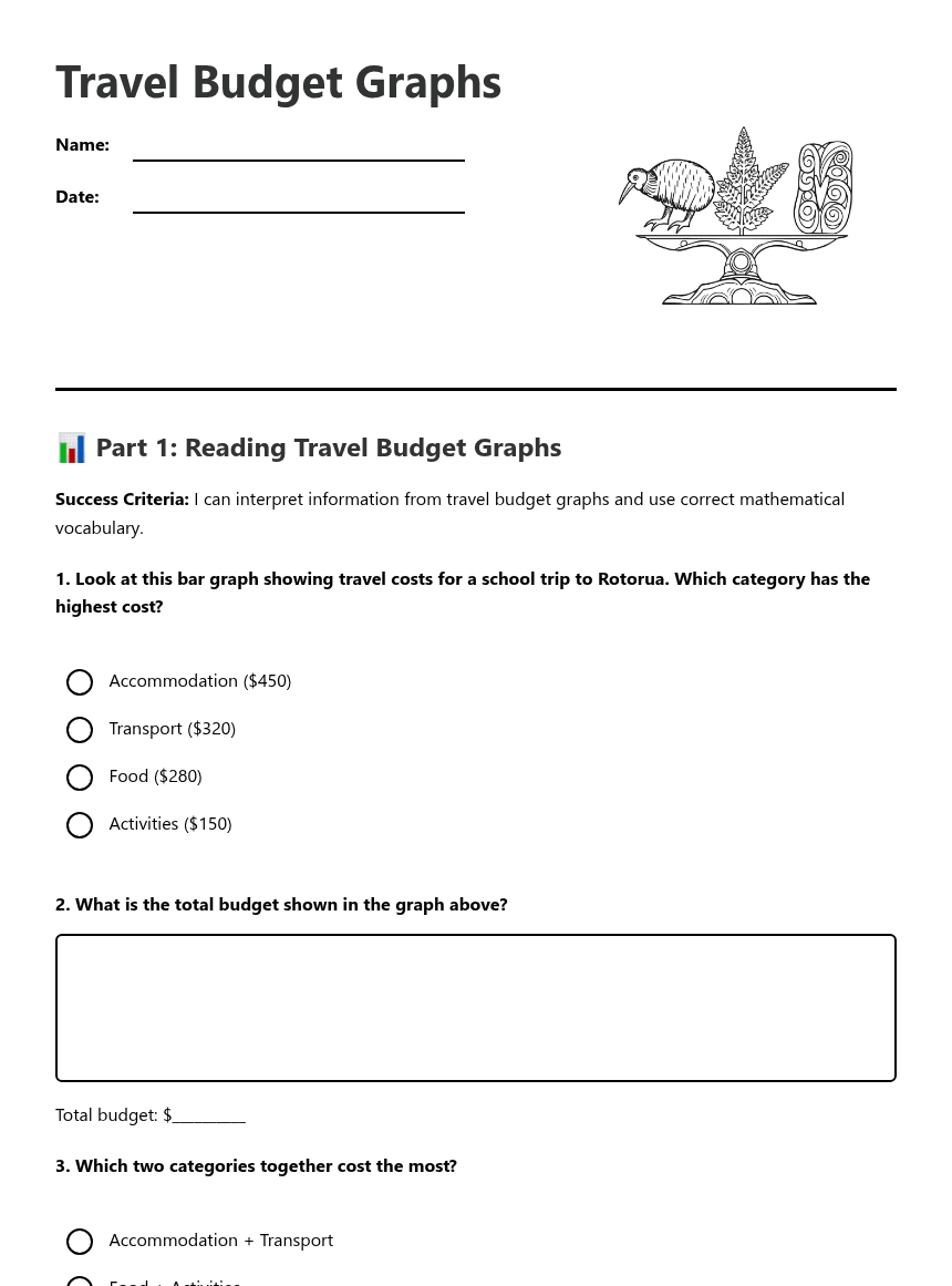
Travel Budget Graphs worksheet preview

Travel Budget Graphs

Travel budget graph illustration

📊 Part 1: Reading Travel Budget Graphs

Success Criteria: I can interpret information from travel budget graphs and use correct mathematical vocabulary.

1. Look at this bar graph showing travel costs for a school trip to Rotorua. Which category has the highest cost?

Accommodation ($450)

Transport ($320)

Food ($280)

Activities ($150)

2. What is the total budget shown in the graph above?

Total budget: $__________

3. Which two categories together cost the most?

Accommodation + Transport

Food + Activities

Transport + Food

Accommodation + Activities

4. A line graph shows daily spending over 5 days of travel. If Day 1 = $80, Day 2 = $65, Day 3 = $90, Day 4 = $55, and Day 5 = $75, which day had the lowest spending?

Day with lowest spending: Day ______

✏️ Part 2: Creating and Analysing Graphs

Success Criteria: I can create accurate graphs from budget data and explain what they show using mathematical vocabulary including te reo Māori terms.

5. Create a bar graph using this data for a Wellington trip:
Transport: $180, Accommodation: $320, Food: $240, Activities: $160
6. Using your graph from Question 5, explain which category takes up the largest portion of the budget and why this might be important for trip planning.
7. If you needed to reduce the total budget by $100, which category would you reduce and why? Use your graph to support your answer.
8. Extension Activity: Create a line graph showing how your daily spending might change over a 4-day trip, starting with $85 on Day 1. Explain the pattern you chose.

🤔 Part 3: Graph Comparison and Decision Making

Success Criteria: I can compare different graphs and use them to make informed decisions about travel budgets.

9. Two students created different graphs for the same trip data. Student A used a bar graph, Student B used a line graph. Which type of graph is better for showing different cost categories and why?
10. Look at your graphs from this worksheet. Write one mathematical statement using the vocabulary: tauākī pāngarau (mathematical expressions), utu (cost), and hautaka (budget).
11. Reflection: How do graphs help you understand and plan travel budgets better than just looking at numbers in a list?

About This Worksheet

Free in Kuraplan

Sign up free, grab the PDF, and customize it for your class.

Print-Ready

Formatted for standard paper. Clean layout, easy to read.

AI-Generated

Created with Kuraplan's AI, designed for real classroom use.

For Teachers & Parents

Use in classrooms, for homework, tutoring, or homeschool.

Need a custom version of this worksheet?

Kuraplan's AI generates custom worksheets in seconds — differentiated for every learner, aligned to your curriculum.

Generate Custom Worksheets — Free


No credit card Curriculum-aligned Under 60 seconds





