Visualising Data Worksheet
A free maths worksheet ready for your classroom. Open in Kuraplan to grab the print-ready PDF, customize it for your students, or generate a fresh version in seconds.
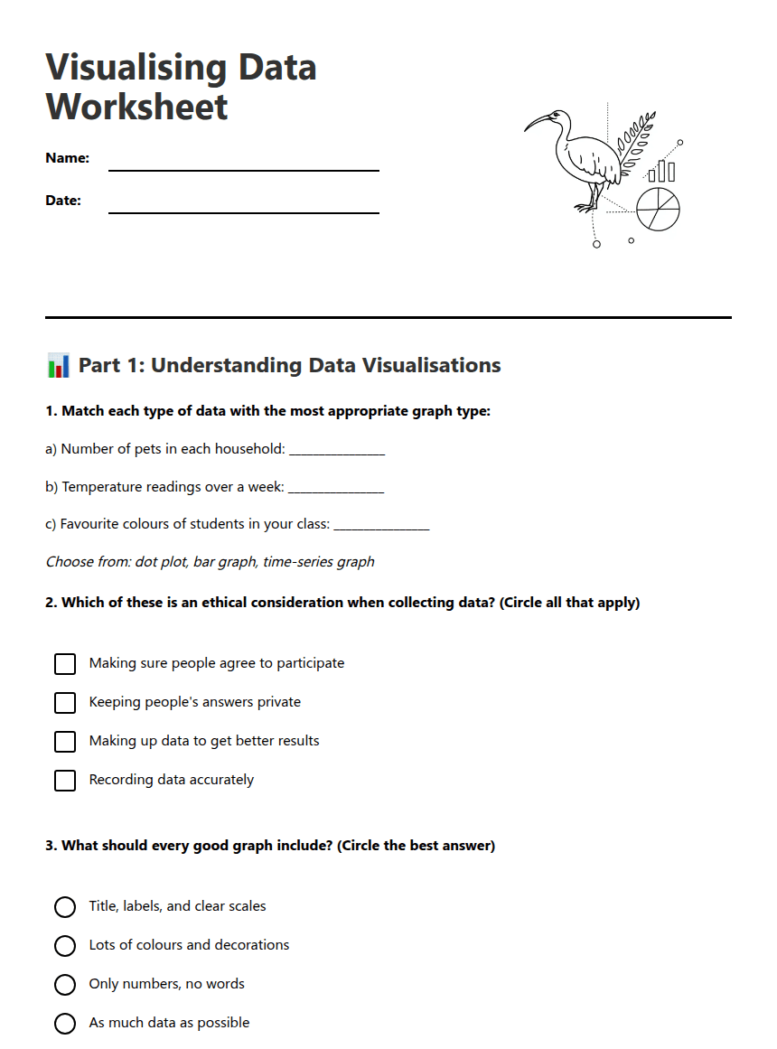
Visualising Data Worksheet

📊 Part 1: Understanding Data Visualisations
a) Number of pets in each household: ________________
b) Temperature readings over a week: ________________
c) Favourite colours of students in your class: ________________
Choose from: dot plot, bar graph, time-series graph
📋 Part 2: Planning Your Data Collection
Question I will investigate: _________________________________________________
Variable I will measure: _________________________________________________
Type of data (numerical/categorical): _________________________________________________
Units of measurement: _________________________________________________
Who will I collect data from: _________________________________________________
📈 Part 3: Creating and Interpreting Graphs
I notice that... _________________________________________________
This graph shows... _________________________________________________
The highest value is... _________________________________________________
An interesting pattern is... _________________________________________________
About This Worksheet
Free in Kuraplan
Sign up free, grab the PDF, and customize it for your class.
Print-Ready
Formatted for standard paper. Clean layout, easy to read.
AI-Generated
Created with Kuraplan's AI, designed for real classroom use.
For Teachers & Parents
Use in classrooms, for homework, tutoring, or homeschool.
Need a custom version of this worksheet?
Kuraplan's AI generates custom worksheets in seconds — differentiated for every learner, aligned to your curriculum.
Generate Custom Worksheets — Free






