MathsFreePrintable

Community Statistics Presentations

A free maths worksheet ready for your classroom. Open in Kuraplan to grab the print-ready PDF, customize it for your students, or generate a fresh version in seconds.
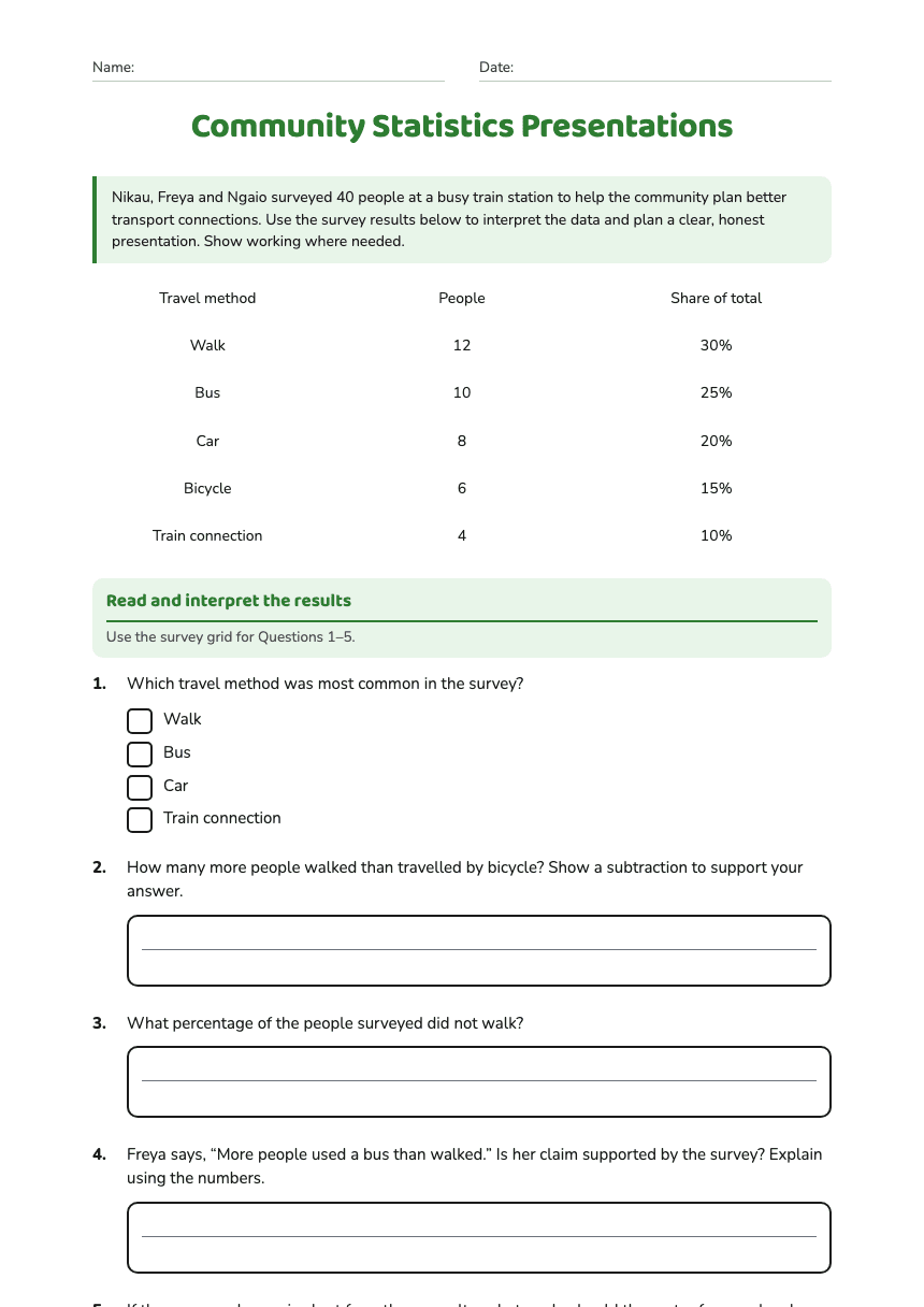
Community Statistics Presentations worksheet preview
Name:Date:

Community Statistics Presentations

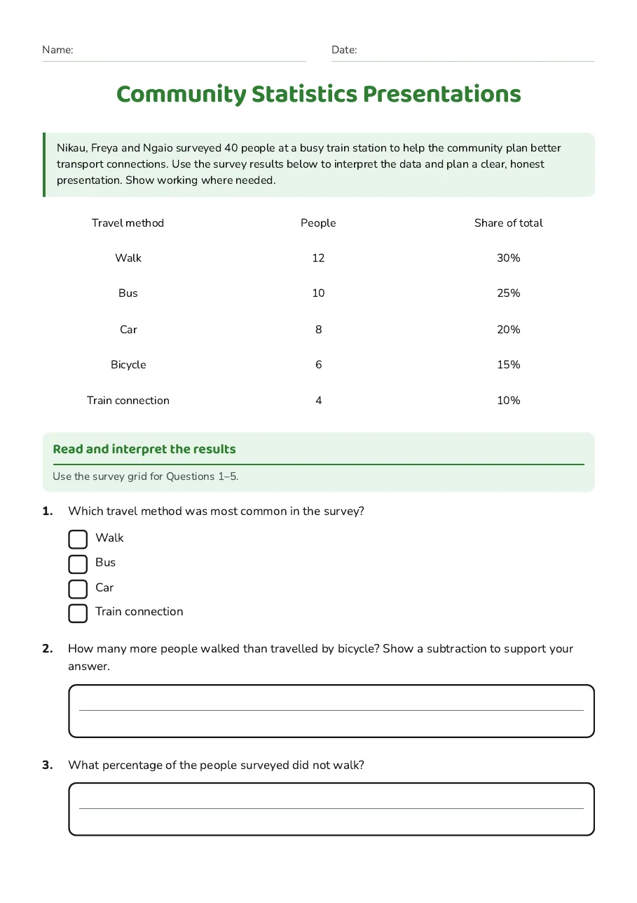
Nikau, Freya and Ngaio surveyed 40 people at a busy train station to help the community plan better transport connections. Use the survey results below to interpret the data and plan a clear, honest presentation. Show working where needed.

Travel method

People

Share of total

Walk

12

30%

Bus

10

25%

Car

8

20%

Bicycle

6

15%

Train connection

4

10%

Read and interpret the results

Use the survey grid for Questions 1–5.

1.Which travel method was most common in the survey?
  • Walk
  • Bus
  • Car
  • Train connection
2.How many more people walked than travelled by bicycle? Show a subtraction to support your answer.
3.What percentage of the people surveyed did not walk?
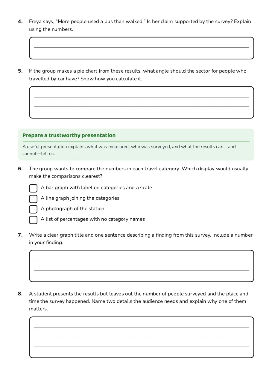
4.Freya says, “More people used a bus than walked.” Is her claim supported by the survey? Explain using the numbers.
5.If the group makes a pie chart from these results, what angle should the sector for people who travelled by car have? Show how you calculate it.

Prepare a trustworthy presentation

A useful presentation explains what was measured, who was surveyed, and what the results can—and cannot—tell us.

6.The group wants to compare the numbers in each travel category. Which display would usually make the comparisons clearest?
  • A bar graph with labelled categories and a scale
  • A line graph joining the categories
  • A photograph of the station
  • A list of percentages with no category names
7.Write a clear graph title and one sentence describing a finding from this survey. Include a number in your finding.
8.A student presents the results but leaves out the number of people surveyed and the place and time the survey happened. Name two details the audience needs and explain why one of them matters.
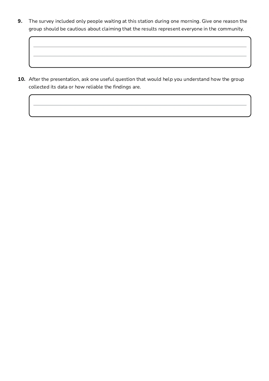
9.The survey included only people waiting at this station during one morning. Give one reason the group should be cautious about claiming that the results represent everyone in the community.
10.After the presentation, ask one useful question that would help you understand how the group collected its data or how reliable the findings are.

3 printable pages

  • Community Statistics Presentations, page 1 of 3: Read and interpret the results

    Page 1

  • Community Statistics Presentations, page 2 of 3: Prepare a trustworthy presentation

    Page 2

  • Community Statistics Presentations, page 3 of 3: 9. The survey included only people waiting at this station during one morning. Give one…

    Page 3

About This Worksheet

Free in Kuraplan

Sign up free, grab the PDF, and customize it for your class.

Print-Ready

Formatted for standard paper. Clean layout, easy to read.

AI-Generated

Created with Kuraplan's AI, designed for real classroom use.

For Teachers & Parents

Use in classrooms, for homework, tutoring, or homeschool.

Need a custom version of this worksheet?

Kuraplan's AI generates custom worksheets in seconds — differentiated for every learner, aligned to your curriculum.

Generate Custom Worksheets — Free
No credit card Curriculum-aligned Under 60 seconds