A student hands you a beautifully drawn box plot. The box is straight, the whiskers reach the endpoints, and the number line looks tidy. Then you ask, “What does this tell us about the data?” and the explanation stops at, “The box is in the middle.”
That moment is familiar because drawing a box-and-whisker plot can look like understanding. A strong worksheet has to go further. It should help students connect an ordered dataset to center, spread, skew, and unusual values, so the finished graph becomes evidence they can discuss rather than a shape they can copy.
Why Box and Whisker Plots Belong in Your Math Classroom
A box plot gives students a compact way to tell a statistical story. The minimum, first quartile, median, third quartile, and maximum provide landmarks for discussing where values sit and how much they vary. Students can compare two groups without calculating every individual difference, but only if the worksheet asks them to interpret those landmarks.
That's why I treat a create a box and whisker plot worksheet as more than a construction page. The strongest version combines calculation, drawing, and short explanations. A student might identify the median, compare the widths of two boxes, and explain why a longer whisker suggests an uneven distribution. The page then becomes a small piece of formative assessment, similar to the classroom checks described in these formative assessment examples.
Start with the reason before the procedure
Students engage more readily when the data has a question behind it. Ask whether two groups have similar results, whether one set is more consistent, or whether one unusual value deserves investigation. The graph becomes a tool for answering that question.
The modern box-and-whisker plot was developed by statistician John W. Tukey in the early 1970s as part of Exploratory Data Analysis. His landmark 1977 book helped formalize the now-standard 1.5 × IQR rule for identifying outliers, as summarized in this overview of interpreting box plots.
You don't need to turn a middle school lesson into a history lecture. A brief note about Tukey can help students see that the plot was designed to explore data, not merely decorate a worksheet. Tell them that every line and endpoint carries information, then make them use that information in writing.
Practical rule: Never let the final question be “Did you draw the box plot correctly?” Add “What does your box plot tell you?” every time.
Selecting and Generating Effective Datasets
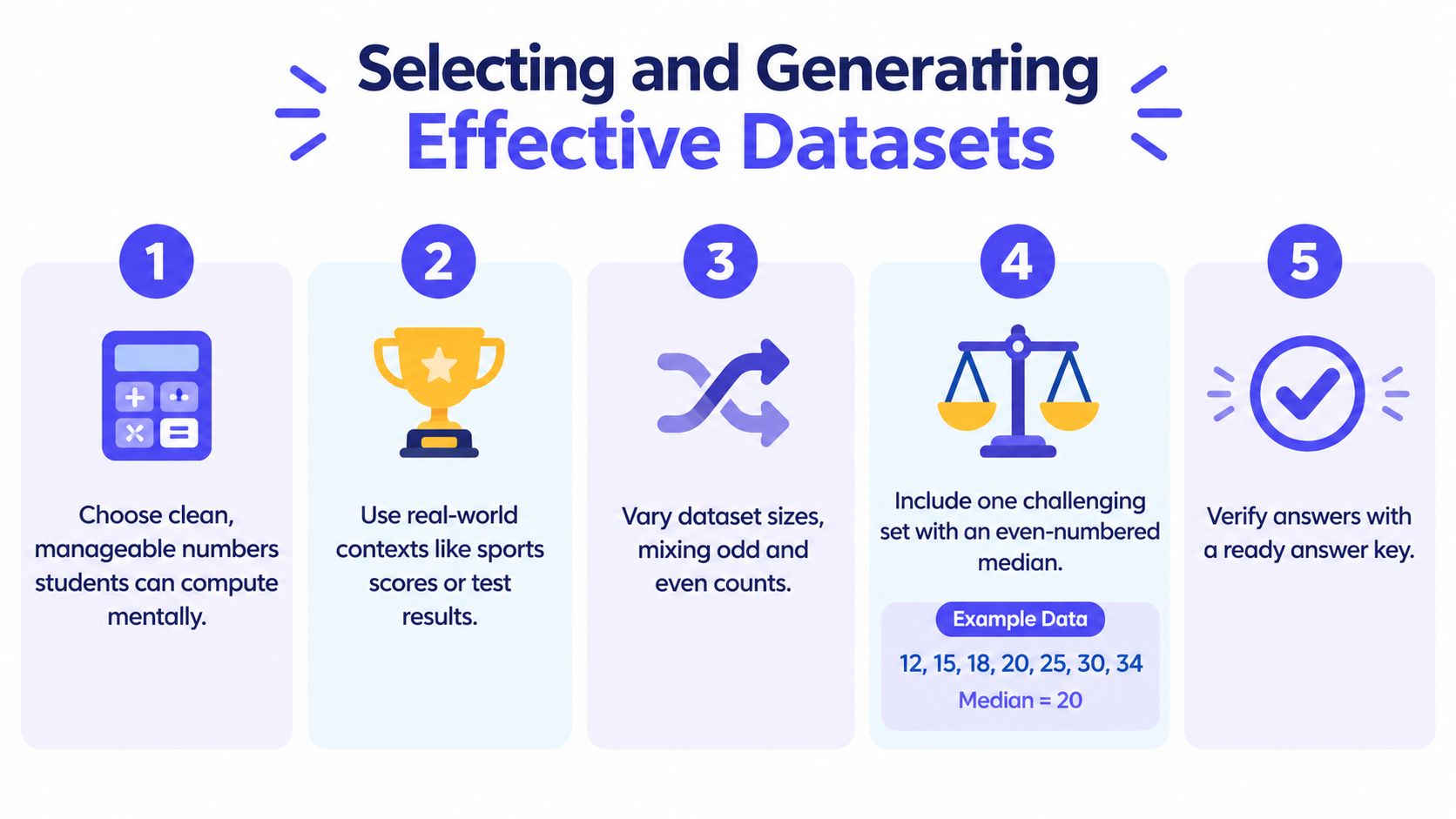
The dataset controls the quality of the lesson. If the values create unnecessary arithmetic obstacles, students spend their energy fighting calculations instead of noticing distribution. If the context feels disconnected from their lives, even a clean dataset can produce weak discussion.
Educational resources commonly present box-and-whisker plots as a skill based on ordered data and the five-number summary, with worksheet materials often aimed at upper elementary and middle school learners around grade 6 or 7. One published practice structure includes 11 skills-based questions, 4 applied word problems, and 3 exam-style items, moving from procedure to interpretation. These patterns appear in box plot worksheet resources, but you can adapt the same progression to your own class.
Choose numbers that serve the objective
For an introductory page, use values students can order confidently and calculate without getting buried in long arithmetic. Clean intervals and familiar units help them notice the median and quartiles. The values don't need to be artificial, but they should be manageable enough that a wrong answer points to a statistical misunderstanding rather than a copying error.
Good contexts include:
- Sports results: Use scores, lap times, or distances when students need to compare groups.
- School data: Consider quiz results, reading times, or daily attendance patterns, provided the context is appropriate and anonymous.
- Local observations: Weather measurements or travel times can make spread feel practical.
- Invented scenarios: A fictional dataset works well when it isolates a specific skill, such as finding quartiles in an even-numbered set.
Vary the structure across the worksheet. Include an odd-numbered set for a direct median, then a set where students must average the two central values. Add a dataset with a possible outlier only after students understand the ordinary construction process.
Before printing, check that every value is present, the units are consistent, and the answer key uses the same quartile convention you expect students to use. A quick teacher check prevents an avoidable argument over whether a strange result came from student error or the dataset itself.
Scaffolding the Five-Number Summary and Plotting Steps
A blank page creates more difficulty than many teachers expect. Students may know the vocabulary but still lose track of which values belong in the summary, where the median goes, or how far the whiskers should extend. The worksheet layout should carry part of that organizational load.
Build the page in working zones
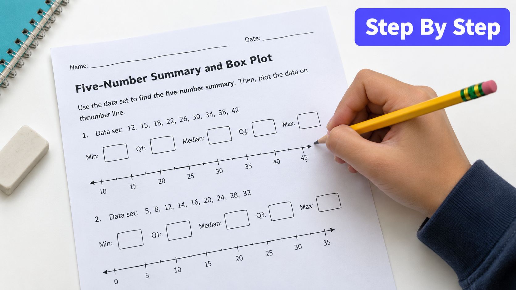
A reliable worksheet usually gives students a clear place for each stage:
- Order the data. Provide a line or table where students rewrite the values from least to greatest.
- Find the landmarks. Use a five-row table labeled minimum, Q1, median, Q3, and maximum.
- Show the split. Include space for students to mark the median and separate the lower and upper halves.
- Draw the graph. Place a pre-scaled number line below the calculations, with enough room for the box and whiskers.
- Explain the result. Add a short response area for a comparison or interpretation question.
A rigorous worksheet should require the complete five-number summary. Students should order the data, locate the median, split the ordered set into two halves, calculate the quartiles, and then draw the box and whiskers on a scaled number line, as outlined in OpenStax's box plot guidance.
Prevent spatial mistakes before they happen
An unscaled axis is a common source of misleading graphs. Students may place values at equal visual distances even when the numerical intervals aren't equal, or they may squeeze a large range into a tiny space. Give them tick marks and label enough values to establish the scale, but don't pre-draw the box.
I also like to include a small “check before you draw” box:
- Is the minimum smaller than Q1?
- Is Q1 smaller than the median?
- Is the median smaller than Q3?
- Is Q3 smaller than the maximum?
- Does the number line include every required value?
For students who need more support, provide the ordered data in the first problem and ask them to perform the remaining steps. Later, remove that support. Teachers who want broader practice with data reasoning can also browse statistical testing resources for ideas that extend beyond one graph type.
Don't crowd the page with decorative elements. The student needs room to write, mark the halves, and draw accurately. A clean worksheet often teaches better than a visually busy one because the page makes the thinking sequence visible.
Moving Beyond Drawing with Interpretive Questions
A student can reproduce a plot and still misunderstand nearly every part of it. The most persistent error is treating the box as two equal visual pieces, then assuming the line inside represents the mean. Students also confuse the minimum and maximum with the ends of the box, or treat Q1 and Q3 as ordinary data points rather than positional summaries.
Research on student errors highlights these misunderstandings and recommends giving interpretation more attention than rote construction. A box-and-whisker worksheet example reflects the larger instructional gap: many resources emphasize mechanical plotting while giving less space to explaining what the graph communicates.
Ask questions that expose the misconception
After students draw a plot, use prompts that require evidence from the graph. Avoid questions that can be answered with a single label.
Try prompts such as:
- “Which group has the larger median? How can you tell?” Students must refer to the position of the median line.
- “Which group has the greater middle spread?” This directs attention to the width of the box and the IQR.
- “Is the distribution balanced or skewed? Use the box and whiskers to support your answer.” Students need to discuss unequal distances rather than guess from appearance.
- “Why is the line inside the box not the mean?” This directly challenges a common vocabulary confusion.
- “A point appears beyond the whisker. What should we investigate before removing it?” This frames an outlier as a question, not automatically as an error.
- “Which statement is not supported by the plot?” This tests whether students understand what a box plot does not show.
Use error analysis as a teaching tool
Give students a deliberately flawed plot and ask them to circle the first mistake. One version can show a box split into equal visual halves even though the median is not centered numerically. Another can use an uneven number line, with values placed at equal spaces despite unequal intervals.
Have students correct the graph and write one sentence explaining the change. That sentence often reveals more than another routine calculation. A student who writes, “The median has to be in the center of the box,” needs a different conversation from a student who writes, “I placed Q3 at the wrong tick mark.”
A neat plot is evidence of careful drawing. A justified interpretation is evidence of statistical understanding.
For comparison work, place two datasets on the same scale and ask students to rank their medians, boxes, and whiskers separately. Don't allow “Group A is better” without a defined measure. Require students to say whether they mean a higher typical value, lower variation, fewer unusual values, or something else.
Designing Answer Keys and Classroom Accommodations
An answer key should show the reasoning path, not just display a finished graph. Include the ordered data, the five summary values, the scale used, and a short note about the interpretation. When students disagree with the key, you can locate the disagreement instead of merely marking the final plot wrong.
Digital tools make this especially important. Microsoft documents box-and-whisker charts in Excel through the Insert > Statistic Chart workflow, and its chart settings can use percentile-based calculations and software-specific options that influence quartiles and outlier display. The Excel box-and-whisker chart documentation is useful when you want students to compare hand calculations with a digital representation.
Make the method visible
Your key should state which quartile rule the class is using. If software produces a different Q1 or Q3, don't present the discrepancy as proof that one person is careless. Explain that different conventions can change the quartiles, IQR, fences, and whether a value appears as an outlier.
A flexible rubric can award separate credit for:
- Correctly ordering the data
- Locating the median
- Finding Q1 and Q3 according to the stated method
- Using a consistent scale
- Plotting the landmarks accurately
- Explaining center, spread, skew, or unusual values
This approach rewards statistical reasoning while still making accuracy matter.
Support access without lowering the thinking
Accommodations should remove unnecessary barriers, not remove the concept. Provide pre-sorted data for a student whose processing difficulty makes ordering distracting. Offer a labeled summary table, enlarged number line, or digital entry field when handwriting or visual spacing interferes with mathematical reasoning.
For more practical ideas on adapting instruction, see these differentiation teaching strategies. A student may construct the plot in Excel or another accessible tool, then answer the same interpretation prompts as classmates. The important question is whether the student can explain the distribution, not whether every line was drawn by hand.
Streamlining Worksheet Creation with AI Tools
The hardest part of this lesson isn't finding another dataset. It's building a page that includes clean calculations, adequate workspace, diagnostic questions, an answer key, and versions for different learners. Repeating that design work for every class can consume the planning time you meant to spend reviewing student thinking.
AI tools can handle some of the formatting and variation, but the teacher still has to set the mathematical target. Start with a precise prompt: identify the grade level, the quartile convention, the context, the number of practice sets, whether outliers should appear, and the interpretation skills students must demonstrate.
Kuraplan is one option for generating printable worksheets with varied question formats, diagrams, and visual elements. Its worksheet generation feature can help turn a lesson specification into a formatted resource, while you review the values and answer key before assigning it.

Use the tool for the repetitive work, not the professional judgment. Check that the data produces the intended quartiles, that the number line is scaled, and that the final questions actually reveal whether students understand spread and skew. A generated worksheet still needs a teacher's eye, especially when software conventions or accommodations are involved.
This short video can provide another visual starting point for planning the construction process:
The most useful workflow is simple. Generate a first draft, inspect every dataset, revise the interpretation prompts, and keep an answer key that explains the chosen method. That gives you more time to look at the work students produce, where the important misconceptions tend to appear.
Kuraplan can help you build differentiated, print-ready box plot worksheets with structured questions, visuals, and supporting assessment materials. Visit Kuraplan to create a worksheet that gives students practice drawing the graph and explaining what the data says.