MathsFreePrintable

Data Visualisation Mastery Worksheet

A free maths worksheet ready for your classroom. Open in Kuraplan to grab the print-ready PDF, customize it for your students, or generate a fresh version in seconds.
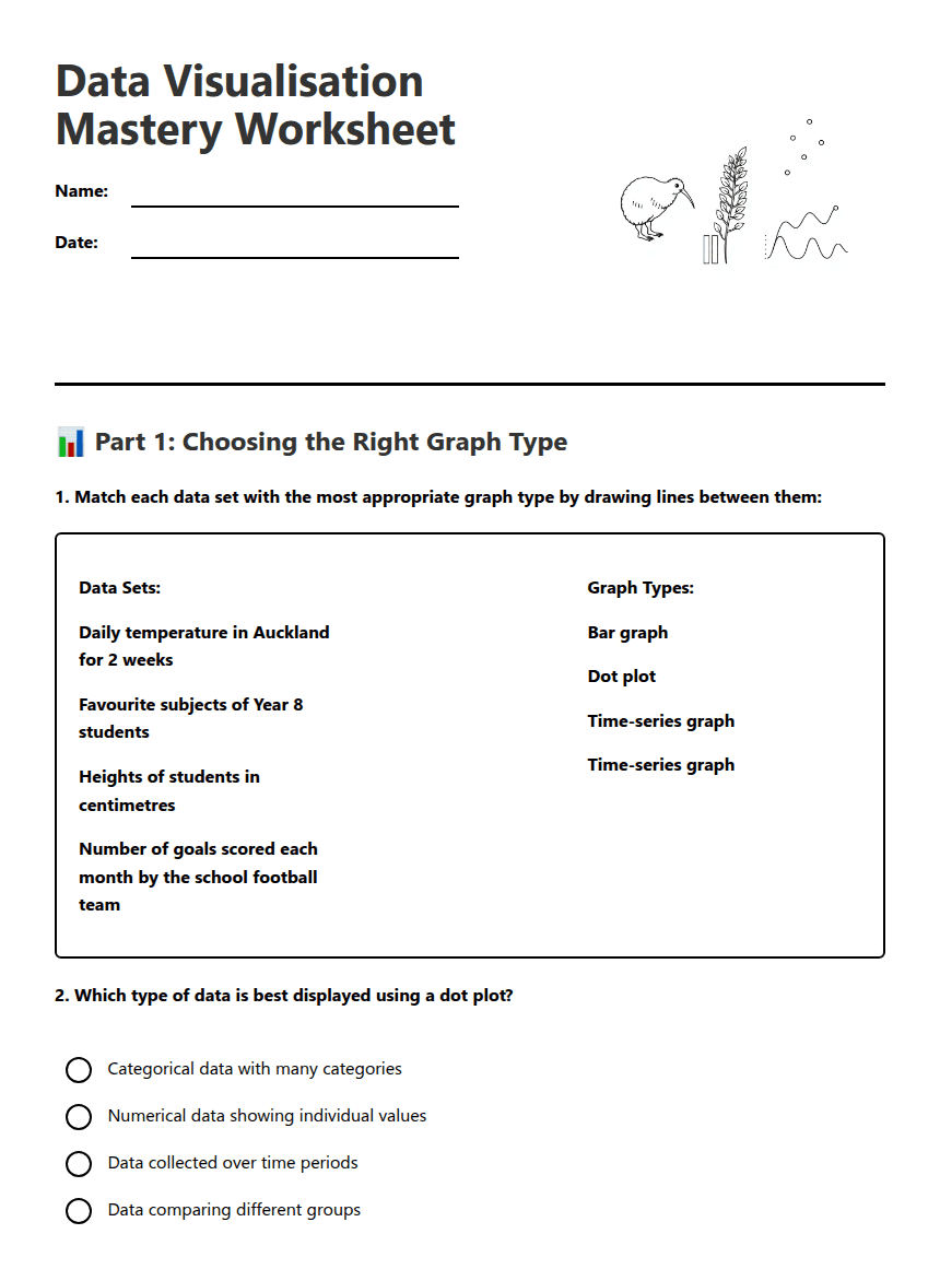
Data Visualisation Mastery Worksheet worksheet preview

Data Visualisation Mastery Worksheet

Data visualization graphs and charts

📊 Part 1: Choosing the Right Graph Type

1. Match each data set with the most appropriate graph type by drawing lines between them:
Data Sets:
Daily temperature in Auckland for 2 weeks
Favourite subjects of Year 8 students
Heights of students in centimetres
Number of goals scored each month by the school football team
Graph Types:
Bar graph
Dot plot
Time-series graph
Time-series graph
2. Which type of data is best displayed using a dot plot?

Categorical data with many categories

Numerical data showing individual values

Data collected over time periods

Data comparing different groups

3. You want to show how the number of library books borrowed changes throughout the school year. Which graph type would be most appropriate and why?

✏️ Part 2: Constructing Graphs

4. Use the space below to construct a bar graph for this data about favourite lunch foods in Year 8:

Data: Pizza (15 students), Sandwiches (12 students), Sushi (8 students), Salad (5 students), Pasta (10 students)

Remember to include: title, axis labels, scale, and data bars

5. Create a dot plot for these test scores (out of 20): 12, 15, 18, 12, 16, 20, 14, 12, 17, 15, 13, 16, 18, 15, 14
6. List three essential components that every graph must have:

a) _____________________

b) _____________________

c) _____________________

🔍 Part 3: Interpreting Data Visualisations

7. Look at the following information about daily rainfall in Wellington:

Week 1: Mon: 2mm, Tue: 0mm, Wed: 5mm, Thu: 8mm, Fri: 3mm, Sat: 0mm, Sun: 1mm

Week 2: Mon: 4mm, Tue: 6mm, Wed: 2mm, Thu: 0mm, Fri: 7mm, Sat: 3mm, Sun: 2mm

a) What pattern or trend can you identify in this data?
b) Which day had the highest rainfall and could be considered an outlier?

Day: _____________ Amount: _____________

8. A student created a graph showing the number of students wearing different coloured shoes. The graph shows: Black (25), White (15), Brown (8), Red (3), Blue (2). What can you conclude about shoe colour preferences?
9. Reflection: Explain why choosing the correct graph type is important when presenting data. Use at least three statistical vocabulary words in your answer.

About This Worksheet

Free in Kuraplan

Sign up free, grab the PDF, and customize it for your class.

Print-Ready

Formatted for standard paper. Clean layout, easy to read.

AI-Generated

Created with Kuraplan's AI, designed for real classroom use.

For Teachers & Parents

Use in classrooms, for homework, tutoring, or homeschool.

Need a custom version of this worksheet?

Kuraplan's AI generates custom worksheets in seconds — differentiated for every learner, aligned to your curriculum.

Generate Custom Worksheets — Free


No credit card Curriculum-aligned Under 60 seconds





