MathsFreePrintable

Statistics Refresher Worksheet

A free maths worksheet ready for your classroom. Open in Kuraplan to grab the print-ready PDF, customize it for your students, or generate a fresh version in seconds.
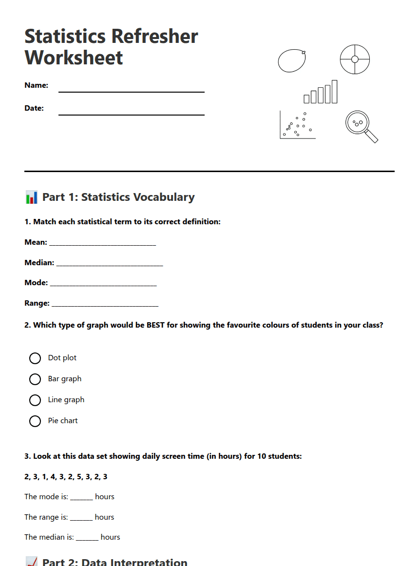
Statistics Refresher Worksheet worksheet preview
Statistics Refresher Worksheet

Statistics and data visualisation illustration

📊 Part 1: Statistics Vocabulary

1. Match each statistical term to its correct definition:

Mean: _________________________________

Median: _________________________________

Mode: _________________________________

Range: _________________________________

2. Which type of graph would be BEST for showing the favourite colours of students in your class?

Dot plot

Bar graph

Line graph

Pie chart

3. Look at this data set showing daily screen time (in hours) for 10 students:

2, 3, 1, 4, 3, 2, 5, 3, 2, 3

The mode is: _______ hours

The range is: _______ hours

The median is: _______ hours

📈 Part 2: Data Interpretation

4. The bar graph below shows favourite fruits chosen by Year 8 students. Use it to answer the questions:

(Imagine a bar graph showing: Apples-8 students, Bananas-12 students, Oranges-6 students, Grapes-4 students)

a) Which fruit was most popular? ________________

b) How many students were surveyed in total? _______ students

c) What percentage of students chose apples? _______%

5. Based on the fruit data above, which statement is TRUE?

More students chose oranges than apples

Bananas were chosen by exactly 40% of students

Grapes were the least popular fruit

Apples and oranges combined were chosen by more students than bananas

6. Create a simple dot plot for this data showing number of pets owned by students:

Data: 0, 1, 2, 1, 0, 3, 1, 2, 1, 0, 2, 1

🔍 Part 3: Critical Evaluation

7. A newspaper headline claims: "90% of teenagers spend too much time on screens!" The survey asked 10 students from one school. Identify TWO problems with this claim:
8. Look at this statement: "Our school canteen is the most popular because 15 students bought lunch there yesterday."

What additional information would you need to evaluate if this claim is reasonable?

9. Which of these would make a data visualisation misleading? (Select all that apply)

Starting the y-axis at 0

Using different colours for each category

Making one bar much wider than others

Using a broken or inconsistent scale

Including a clear title and labels

10. Describe one way you could improve the data collection for the screen time survey from Question 3 to make it more reliable:

About This Worksheet

Free in Kuraplan

Sign up free, grab the PDF, and customize it for your class.

Print-Ready

Formatted for standard paper. Clean layout, easy to read.

AI-Generated

Created with Kuraplan's AI, designed for real classroom use.

For Teachers & Parents

Use in classrooms, for homework, tutoring, or homeschool.

Need a custom version of this worksheet?

Kuraplan's AI generates custom worksheets in seconds — differentiated for every learner, aligned to your curriculum.

Generate Custom Worksheets — Free


No credit card Curriculum-aligned Under 60 seconds





