MathsFreePrintable

Types of Graphs Quiz

A free maths worksheet ready for your classroom. Open in Kuraplan to grab the print-ready PDF, customize it for your students, or generate a fresh version in seconds.
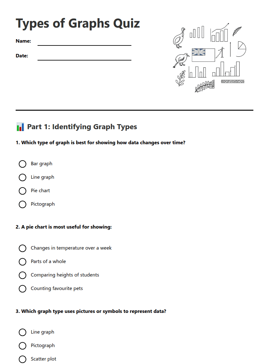
Types of Graphs Quiz worksheet preview
Types of Graphs Quiz

Various types of graphs and charts

📊 Part 1: Identifying Graph Types

1. Which type of graph is best for showing how data changes over time?

Bar graph

Line graph

Pie chart

Pictograph

2. A pie chart is most useful for showing:

Changes in temperature over a week

Parts of a whole

Comparing heights of students

Counting favourite pets

3. Which graph type uses pictures or symbols to represent data?

Line graph

Pictograph

Scatter plot

Histogram

4. Bar graphs are excellent for:

Showing percentages only

Comparing different categories

Showing continuous change

Displaying time series data

🔍 Part 2: Choosing the Right Graph

5. You want to show how many students in your class prefer each type of sport. Which graph would be most appropriate?

Line graph

Bar graph

Scatter plot

Histogram

6. To display how the population of New Zealand has grown from 1900 to 2020, you should use:

Pie chart

Bar graph

Line graph

Pictograph

7. Which features do ALL good graphs need? (Select all that apply)

A clear title

Labelled axes

Bright colours

A scale

3D effects

8. A scatter plot is used to show:

Categories of data

Parts of a whole

The relationship between two variables

Data over time periods

📈 Part 3: Graph Interpretation

9. On a line graph showing Auckland's monthly rainfall, if the line goes up steeply between March and April, this means:

Rainfall decreased quickly

Rainfall increased quickly

Rainfall stayed the same

The data is incorrect

10. If you created a pie chart showing how Year 6 students travel to school, and walking takes up the biggest slice, this means:

Walking is the least popular way to travel

Walking is the most popular way to travel

All students walk to school

Walking takes the longest time

🔑 Answer Key

1. Line graph

2. Parts of a whole

3. Pictograph

4. Comparing different categories

5. Bar graph

6. Line graph

7. A clear title, Labelled axes, A scale

8. The relationship between two variables

9. Rainfall increased quickly

10. Walking is the most popular way to travel

About This Worksheet

Free in Kuraplan

Sign up free, grab the PDF, and customize it for your class.

Print-Ready

Formatted for standard paper. Clean layout, easy to read.

AI-Generated

Created with Kuraplan's AI, designed for real classroom use.

For Teachers & Parents

Use in classrooms, for homework, tutoring, or homeschool.

Need a custom version of this worksheet?

Kuraplan's AI generates custom worksheets in seconds — differentiated for every learner, aligned to your curriculum.

Generate Custom Worksheets — Free


No credit card Curriculum-aligned Under 60 seconds





