MathsFreePrintable
Data Visualisation Basics
A free maths worksheet ready for your classroom. Open in Kuraplan to grab the print-ready PDF, customize it for your students, or generate a fresh version in seconds.
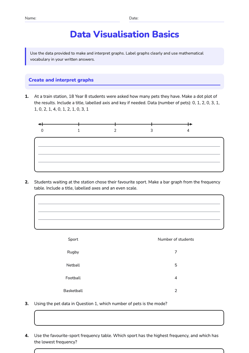
Name:Date:
Data Visualisation Basics
Use the data provided to make and interpret graphs. Label graphs clearly and use mathematical vocabulary in your written answers.
Create and interpret graphs
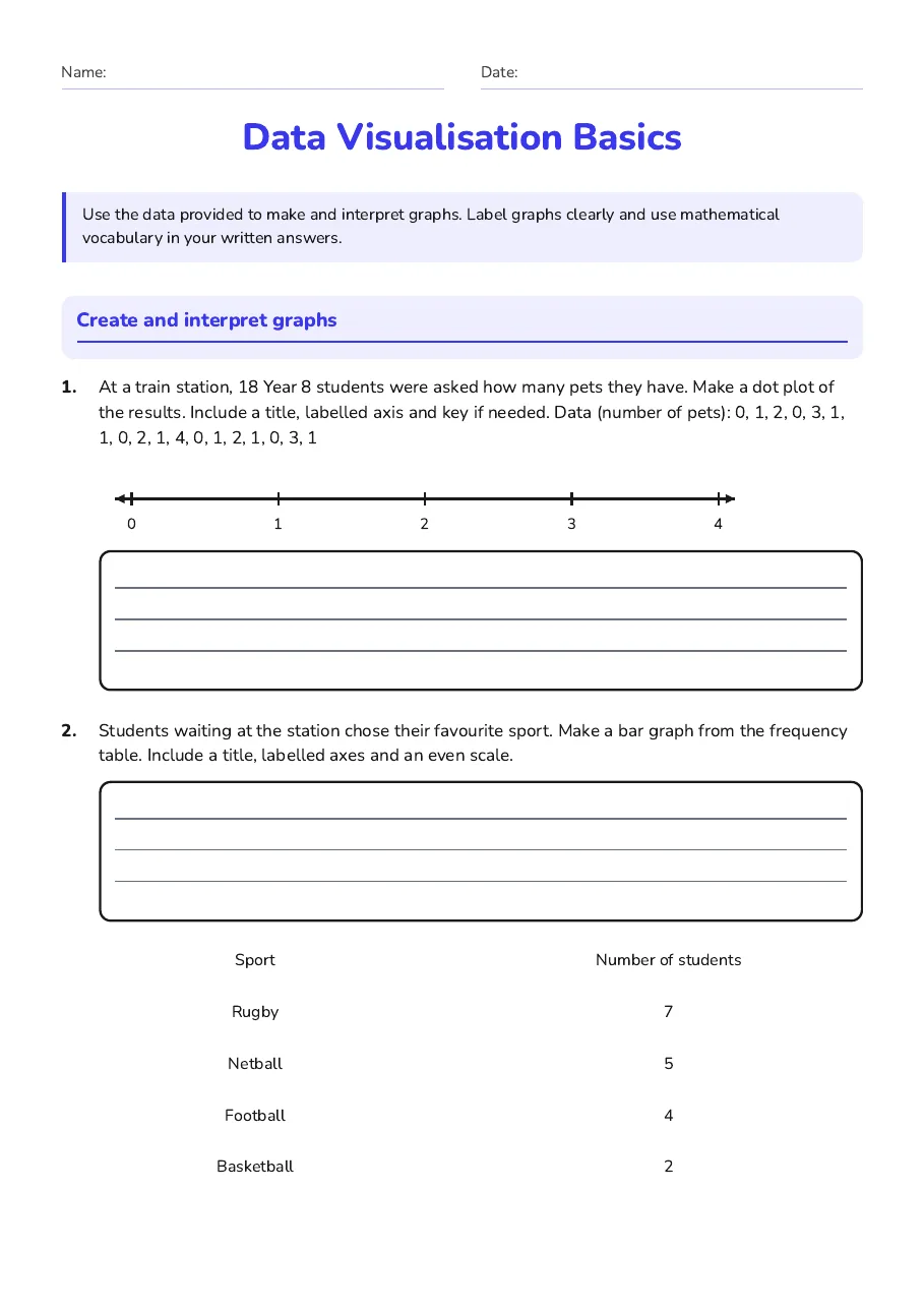
1.At a train station, 18 Year 8 students were asked how many pets they have. Make a dot plot of the results. Include a title, labelled axis and key if needed.
Data (number of pets): 0, 1, 2, 0, 3, 1, 1, 0, 2, 1, 4, 0, 1, 2, 1, 0, 3, 1
2.Students waiting at the station chose their favourite sport. Make a bar graph from the frequency table. Include a title, labelled axes and an even scale.
Sport
Number of students
Rugby
7
Netball
5
Football
4
Basketball
2
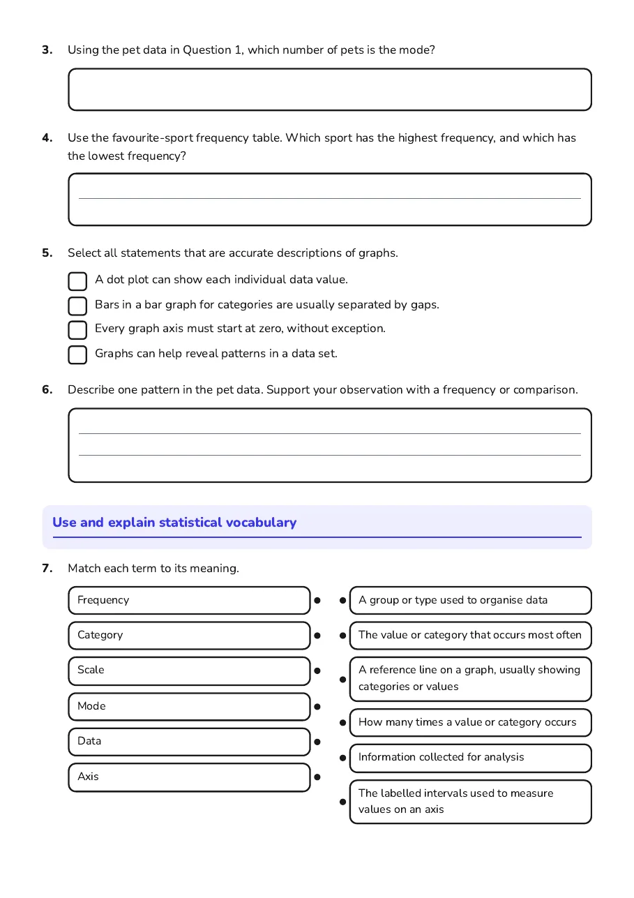
3.Using the pet data in Question 1, which number of pets is the mode?
4.Use the favourite-sport frequency table. Which sport has the highest frequency, and which has the lowest frequency?
5.Select all statements that are accurate descriptions of graphs.
- A dot plot can show each individual data value.
- Bars in a bar graph for categories are usually separated by gaps.
- Every graph axis must start at zero, without exception.
- Graphs can help reveal patterns in a data set.
6.Describe one pattern in the pet data. Support your observation with a frequency or comparison.
Use and explain statistical vocabulary
7.Match each term to its meaning.
- Frequency
- Category
- Scale
- Mode
- Data
- Axis
- A group or type used to organise data
- The value or category that occurs most often
- A reference line on a graph, usually showing categories or values
- How many times a value or category occurs
- Information collected for analysis
- The labelled intervals used to measure values on an axis
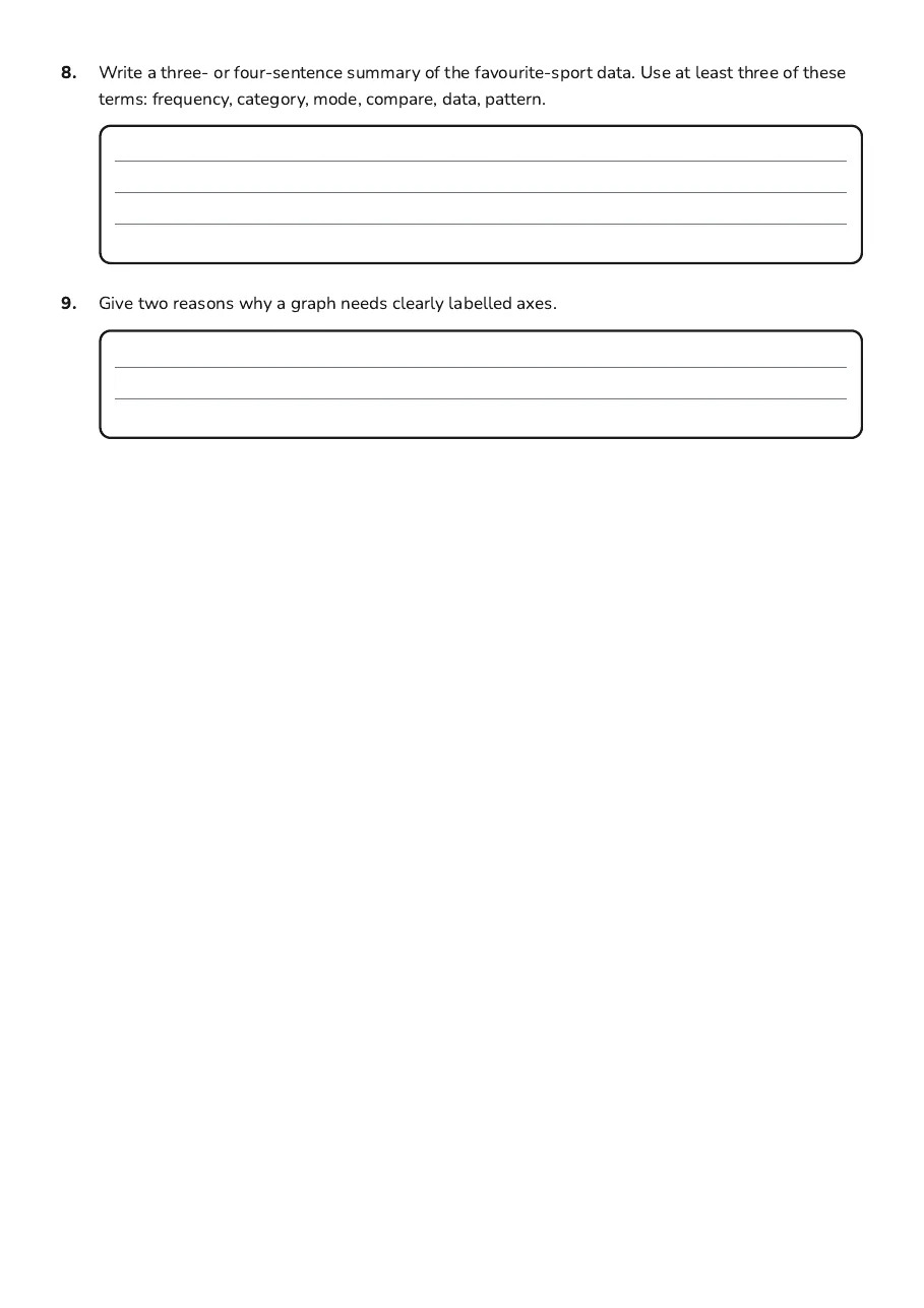
8.Write a three- or four-sentence summary of the favourite-sport data. Use at least three of these terms: frequency, category, mode, compare, data, pattern.
9.Give two reasons why a graph needs clearly labelled axes.
3 printable pages
Page 1
Page 2
Page 3
About This Worksheet
Free in Kuraplan
Sign up free, grab the PDF, and customize it for your class.
Print-Ready
Formatted for standard paper. Clean layout, easy to read.
AI-Generated
Created with Kuraplan's AI, designed for real classroom use.
For Teachers & Parents
Use in classrooms, for homework, tutoring, or homeschool.
Need a custom version of this worksheet?
Kuraplan's AI generates custom worksheets in seconds — differentiated for every learner, aligned to your curriculum.
Generate Custom Worksheets — Free No credit card Curriculum-aligned Under 60 seconds