MathsFreePrintable

Scatter Graphs

A free maths worksheet ready for your classroom. Open in Kuraplan to grab the print-ready PDF, customize it for your students, or generate a fresh version in seconds.
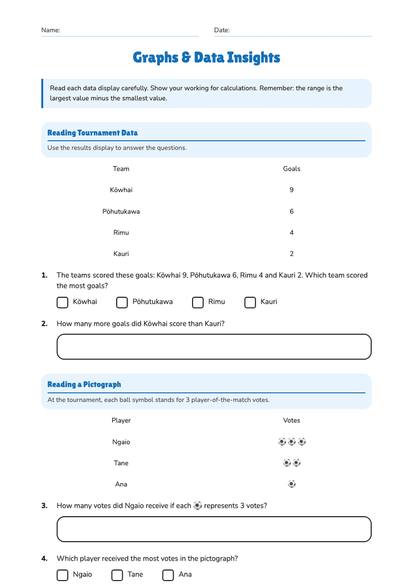
Scatter Graphs worksheet preview
Name:Date:

Scatter Graphs

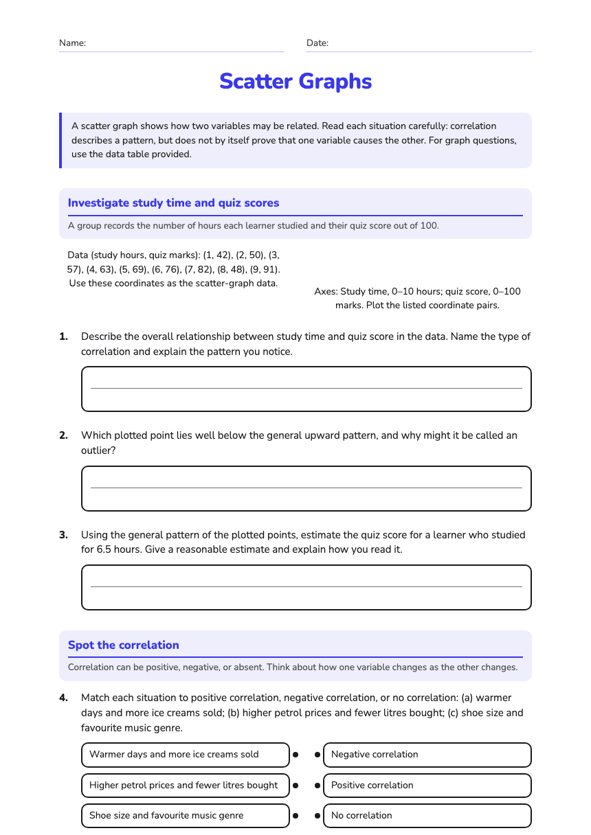
A scatter graph shows how two variables may be related. Read each situation carefully: correlation describes a pattern, but does not by itself prove that one variable causes the other. For graph questions, use the data table provided.

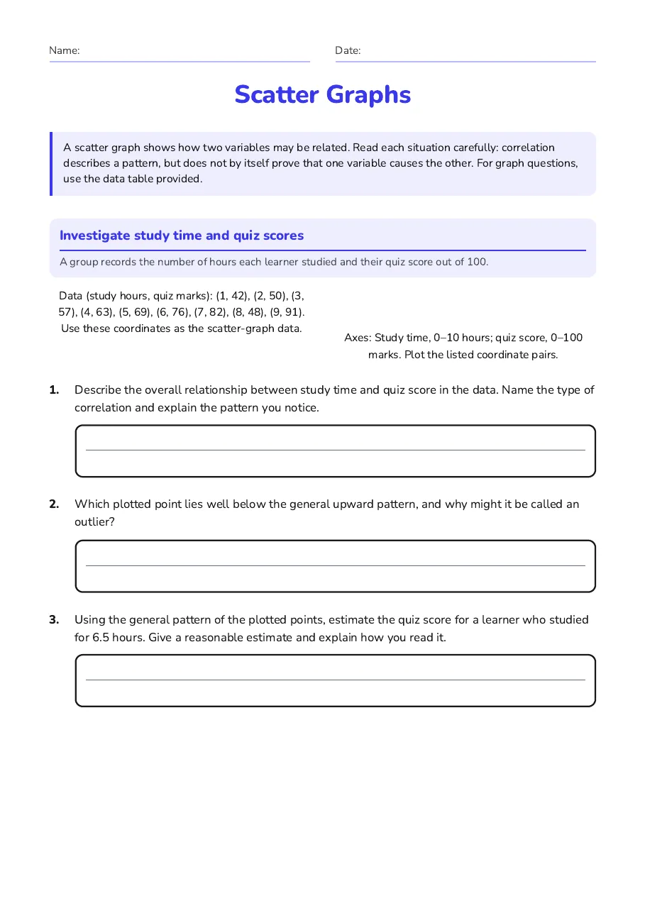
Investigate study time and quiz scores

A group records the number of hours each learner studied and their quiz score out of 100.

Data (study hours, quiz marks): (1, 42), (2, 50), (3, 57), (4, 63), (5, 69), (6, 76), (7, 82), (8, 48), (9, 91). Use these coordinates as the scatter-graph data.

Axes: Study time, 0–10 hours; quiz score, 0–100 marks. Plot the listed coordinate pairs.

1.Describe the overall relationship between study time and quiz score in the data. Name the type of correlation and explain the pattern you notice.
2.Which plotted point lies well below the general upward pattern, and why might it be called an outlier?
3.Using the general pattern of the plotted points, estimate the quiz score for a learner who studied for 6.5 hours. Give a reasonable estimate and explain how you read it.

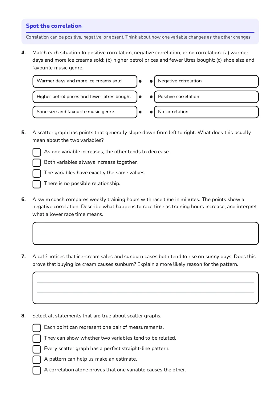
Spot the correlation

Correlation can be positive, negative, or absent. Think about how one variable changes as the other changes.

4.Match each situation to positive correlation, negative correlation, or no correlation: (a) warmer days and more ice creams sold; (b) higher petrol prices and fewer litres bought; (c) shoe size and favourite music genre.
  • Warmer days and more ice creams sold
  • Higher petrol prices and fewer litres bought
  • Shoe size and favourite music genre
  • Negative correlation
  • Positive correlation
  • No correlation
5.A scatter graph has points that generally slope down from left to right. What does this usually mean about the two variables?
  • As one variable increases, the other tends to decrease.
  • Both variables always increase together.
  • The variables have exactly the same values.
  • There is no possible relationship.
6.A swim coach compares weekly training hours with race time in minutes. The points show a negative correlation. Describe what happens to race time as training hours increase, and interpret what a lower race time means.
7.A café notices that ice-cream sales and sunburn cases both tend to rise on sunny days. Does this prove that buying ice cream causes sunburn? Explain a more likely reason for the pattern.
8.Select all statements that are true about scatter graphs.
  • Each point can represent one pair of measurements.
  • They can show whether two variables tend to be related.
  • Every scatter graph has a perfect straight-line pattern.
  • A pattern can help us make an estimate.
  • A correlation alone proves that one variable causes the other.
9.Create one real-life pair of variables that might show positive correlation, and one that might show no correlation. For each pair, briefly explain your choice.

3 printable pages

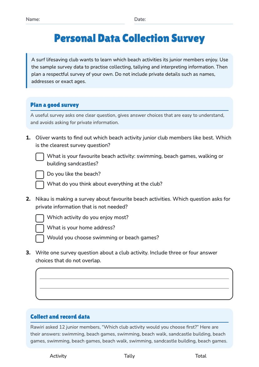
  • Scatter Graphs, page 1 of 3: Investigate study time and quiz scores

    Page 1

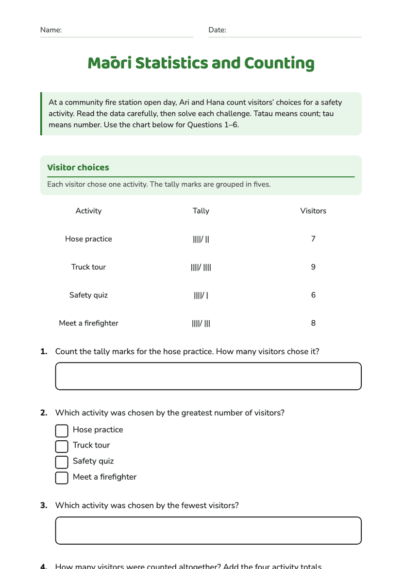
  • Scatter Graphs, page 2 of 3: Spot the correlation

    Page 2

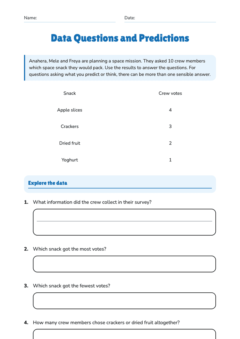
  • Scatter Graphs, page 3 of 3: 9. Create one real-life pair of variables that might show positive correlation, and one…

    Page 3

About This Worksheet

Free in Kuraplan

Sign up free, grab the PDF, and customize it for your class.

Print-Ready

Formatted for standard paper. Clean layout, easy to read.

AI-Generated

Created with Kuraplan's AI, designed for real classroom use.

For Teachers & Parents

Use in classrooms, for homework, tutoring, or homeschool.

Need a custom version of this worksheet?

Kuraplan's AI generates custom worksheets in seconds — differentiated for every learner, aligned to your curriculum.

Generate Custom Worksheets — Free
No credit card Curriculum-aligned Under 60 seconds