Data Analysis & Scale Drawing
A free maths worksheet ready for your classroom. Open in Kuraplan to grab the print-ready PDF, customize it for your students, or generate a fresh version in seconds.
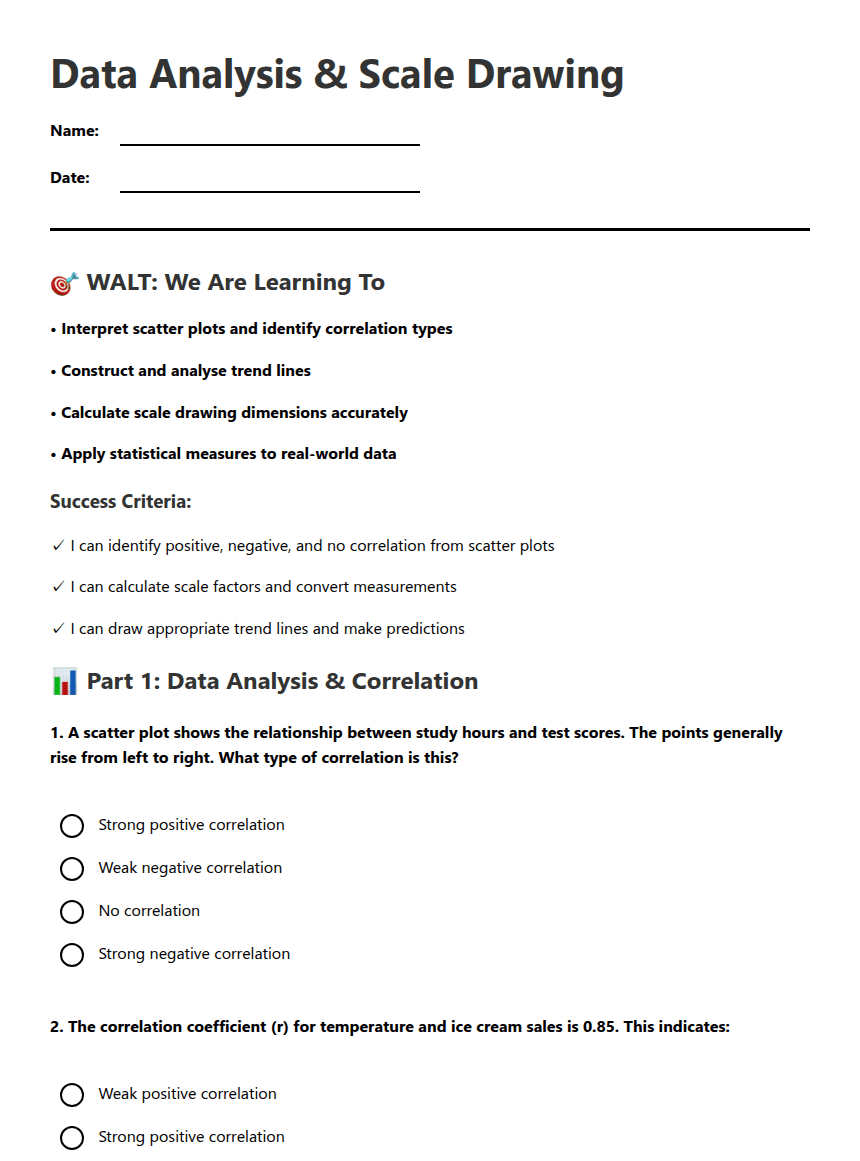
Data Analysis & Scale Drawing
🎯 WALT: We Are Learning To
• Interpret scatter plots and identify correlation types
• Construct and analyse trend lines
• Calculate scale drawing dimensions accurately
• Apply statistical measures to real-world data
Success Criteria:
✓ I can identify positive, negative, and no correlation from scatter plots
✓ I can calculate scale factors and convert measurements
✓ I can draw appropriate trend lines and make predictions
📊 Part 1: Data Analysis & Correlation
📐 Part 2: Scale Drawing Applications
🚀 Differentiation & Extension
Interpreting scatter plots: _____ Scale calculations: _____ Trend line analysis: _____
I need more help with: _________________________________
🗝️ Answer Key
Part 1: Data Analysis & Correlation
1. Strong positive correlation - The points rising from left to right indicate that as study hours increase, test scores also increase.
2. Strong positive correlation - A correlation coefficient of 0.85 indicates a strong positive relationship between temperature and ice cream sales.
3. The line should have roughly equal points above and below it - This is the correct approach for a line of best fit.
4. For x = 6, y = 2.5(6) + 10 = 15. The predicted test score is 15.
Part 2: Scale Drawing Applications
5. Length on drawing = 80m / 400 = 0.2m or 20cm.
6. Actual length = 4.8cm * 2.5m = 12m.
7. Scale factor = (A4 dimensions - margins) / actual dimensions. The scale factor is calculated to fit the field within the A4 size.
8. Architects use scale drawings to accurately represent dimensions and to fit large structures on manageable paper sizes.
Differentiation & Extension
Support Strategy: Students should create a scatter plot based on the provided points, showing the decline in car value as age increases.
Extension Activity: Correlation indicates a relationship between two variables, while causation indicates that one variable directly affects the other. An example is the correlation between ice cream sales and temperature; higher temperatures correlate with increased ice cream sales, but one does not cause the other.
About This Worksheet
Free in Kuraplan
Sign up free, grab the PDF, and customize it for your class.
Print-Ready
Formatted for standard paper. Clean layout, easy to read.
AI-Generated
Created with Kuraplan's AI, designed for real classroom use.
For Teachers & Parents
Use in classrooms, for homework, tutoring, or homeschool.
Need a custom version of this worksheet?
Kuraplan's AI generates custom worksheets in seconds — differentiated for every learner, aligned to your curriculum.
Generate Custom Worksheets — FreeMore Maths Worksheets

Year 7 Statistics Pretest
Free
Year 7 Statistics and Probability Pretest
Free
Rivergum Market Probability Revision
Free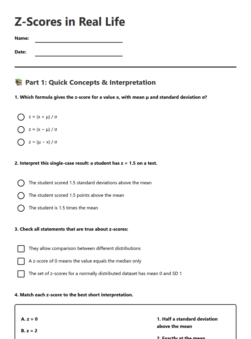
Z-Scores in Real Life
Free
Stem-and-Leaf Plots Worksheet
Free
Carnival Game Probability Challenge
Free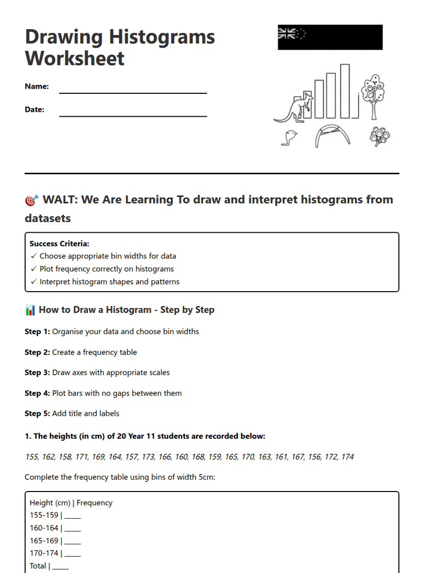
Drawing Histograms Worksheet
Free