MathsFreePrintable

Data Analysis and Presentation

A free maths worksheet ready for your classroom. Open in Kuraplan to grab the print-ready PDF, customize it for your students, or generate a fresh version in seconds.
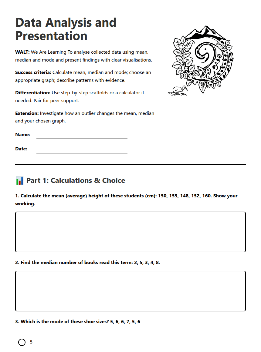
Data Analysis and Presentation worksheet preview

Data Analysis and Presentation

WALT: We Are Learning To analyse collected data using mean, median and mode and present findings with clear visualisations.

Success criteria: Calculate mean, median and mode; choose an appropriate graph; describe patterns with evidence.

Differentiation: Use step-by-step scaffolds or a calculator if needed. Pair for peer support.

Extension: Investigate how an outlier changes the mean, median and your chosen graph.

Worksheet illustration

📊 Part 1: Calculations & Choice

1. Calculate the mean (average) height of these students (cm): 150, 155, 148, 152, 160. Show your working.
2. Find the median number of books read this term: 2, 5, 3, 4, 8.
3. Which is the mode of these shoe sizes? 5, 6, 6, 7, 5, 6

5

6

7

4. For survey data about favourite sports (counts per sport), which visualisation is usually best? Pick one and explain why in one sentence.

Bar graph

Dot plot

Line graph

✏️ Part 2: Representing & Interpreting Data

5. Draw a dot plot for these daily step counts (hundreds): 6, 7, 5, 7, 8, 6, 7. Use the drawing box below (label your axis and scale).
6. Compare these two groups' quiz scores. Group A: 12, 14, 15, 13, 16. Group B: 10, 12, 18, 14, 20. a) Calculate the mean and median for each group. b) Which group performed better overall? Give one reason using your calculations.
7. Explain in 1–2 sentences how adding an outlier (e.g. a very high value) would affect the mean and the median. Which is more affected?
8. Write a short conclusion (2–3 sentences) that answers an investigative question such as "Which lunchtime activity gets the most participation?" Use evidence from your calculations or graph.

✅ Answers

1. Mean = (150 + 155 + 148 + 152 + 160) / 5 = 153 cm.
2. Median = 4 (when arranged: 2, 3, 4, 5, 8).
3. Mode = 6 (it appears most frequently).
4. Bar graph is best because it clearly shows comparisons between categories.
5. [Drawing of a dot plot with labeled axes and scale].
6. Group A Mean = 14, Median = 14; Group B Mean = 14.8, Median = 12. Group B performed better overall due to higher mean score.
7. An outlier increases the mean significantly but has little effect on the median, which is more stable.
8. [Conclusion based on calculations or graph, e.g., "The soccer activity had the most participation with 15 students."]

About This Worksheet

Free in Kuraplan

Sign up free, grab the PDF, and customize it for your class.

Print-Ready

Formatted for standard paper. Clean layout, easy to read.

AI-Generated

Created with Kuraplan's AI, designed for real classroom use.

For Teachers & Parents

Use in classrooms, for homework, tutoring, or homeschool.

Need a custom version of this worksheet?

Kuraplan's AI generates custom worksheets in seconds — differentiated for every learner, aligned to your curriculum.

Generate Custom Worksheets — Free


No credit card Curriculum-aligned Under 60 seconds





